New Kit Sneak Peeks!

It's almost time for the new Quirky Kits to be released! The next kits are shaping up and I've just got a couple of sneak peek pictures done for you. I've focused on some of the embellishy bits and pieces in the kits. This first peek is of some of the goodies from the main kit 'Urbaine':

 
We've got washi tape and wooden frames from Freckled Fawn. Snippets tags from Elle's Studio and a custom made note card. There's one of the custom note cards in each kit but there will be extras available to purchase in the extras store if you want more.
Look out for more embellishments from JillyBean Soup and Maya Road in your main kit.
 
Next I've got snapshots of embellishy goodies in the Lite kit 'Skyline':


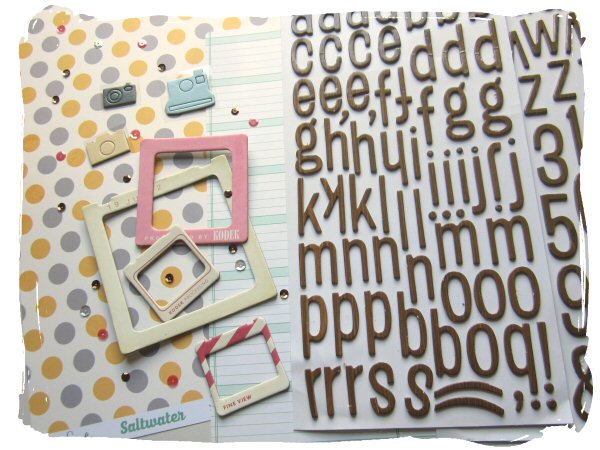
There are slide frames from Crate Paper, chipboard stickers from Studio Calico and Thickers alphabet stickers from American Crafts. The alphas have a cool subtle woodgrain pattern on them. Both kits mix up the natural and man made textures and colours of the urban environment. The Lite kit has a slight office stationary feel to it too.
Don't forget to check out the Pinterest page for the new kits to have a look at the fresh from CHA papers we'll have in the kits, http://pinterest.com/craftytemplates/urbaine-and-skyline-julyaugust-quirky-kits/
Kits will be out at the end of the first week of August, (pending the new releases arriving on time!). The extras shop will be opening on Friday (26th July). It'll be in the same page in the shop as before, if you don't have it bookmarked it's right here: http://www.craftytemplates.co.uk/subextras.html
The extras store is for kit subscribers only.

If you're not a current subscriber you can grab one of the last places for the main kit here. The Lite kit spaces are completely sold out. The next spaces will open up again in September for the Sept/Oct kits 'A Stitch in Time', 'Homemade' and the first subscription places for the brand new embellishment only kit 'Sampler'.

x Leo

Shoes!

Hi There!

Nikki here with another layout of my gorgeous DS3, Connor. He's got a thing about putting his own shoes on at the moment, and if he can't find his own, then any will do!

I didn't start out with any particular colour scheme in mind for this layout but that's just how it is sometimes, I like to play around and just go with what I like the look of. So I incorporated my favourite techniques, stencilling, stamping, layering PPs and making my own embellishments from both kits. What I ended up with was a layout with a similar colour scheme to the last one I did which I think will look rather nice side by side in my album :)

I'm all excited for my holidays now, I hope you're going somewhere nice too! I won't be around for a few weeks but hopefully on my return I'll have lots of lovely pics to scrap and share.

See you soon!

Nikki x

New CHA Goodies coming up in your Quirky Kits

It's that time of year again where manufacturers release new product and I know lots of you are busy writing up lists of new products you like. Lots of these products will be popping up in your next three Quirky Kits so here I've complied my list of goodies coming up in your kits so you know what to look out for in the new product previews popping up. This is still a working list at the mo but it'll give you an idea of what to look out for. I can't put images because the manufacturers like to release them first but I'll add links to the manufactures blogs if they've already been debuted. :) The July/August kit Pinterest Page is here I'll be adding images of what's coming up in that kit this week but look out for lots of new Glitz, (Finnley, Dapper Dan and Wild & Free) in the main kit and new Carta Bella, (Hello Again) in the Lite kit.

Sept/Oct Main Kit - A Stitch in Time

Dear Lizzy - Polka Dot Party (embellishments and paper)
Crate Paper - Close Knit (paper)
Amy Tangerine Die Cut Paper
Pebbles - Front Porch (paper and embellishments)
American Crafts Chalkboard stickers
My Minds Eye - Chalk Studio (embellishments)

Lite Kit - Homemade

Basic Grey - Persimmion (paper)
Dear Lizzy - Polka Dot Party (stickers and paper)
Studio Calico - Thataway (stickers)
Crate Paper - Close Knit (paper and embellishments)
Amy Tangerine - Cut & Paste (paper)

Embellishment Kit - Sampler

Teresa Colins - Family Stories
Heidi Swapp - Mixed Company
Pebbles - Me to you
My Minds Eye - Chalk Studio
My Minds Eye - Cut and Paste Flair


Nov/Dec Main Kit - Countdown

Cosmo Cricket - Creative Girl (paper)
Teresa Collins - Family stories (paper)
Dear Lizzy - Polka Dot Party (special paper)
Studio Calico - Magical (special paper and embellishments)
Crate Paper - Bundled Up (paper)
Amy Tangerine - Cut & Paste (paper)
MME - Cut and Paste Flair (embellishments)

Lite Kit - It's Been.....

Alison Kreft - Recorded (paper)
Heidi Swapp - Mixed Company (stickers)
Studio Calico - Magical (paper)
Amy Tangerine - Cut & Paste (paper)
Maggie Holmes - Flea Market (paper)
MME - Cut and Paste Adorbs (embellishments)
MME - Cut and Paste Flair (stickers)


Embellishment Kit - Five Gold Stars

TBA

Quirky Christmas Add On

This will be an optional add on available to purchase on the extras page in November. They'll be a little bit of paper but mostly embellishments as the idea will be to mix in your left overs from the main and Lite Quirky Kits. It's got a modern vintage feel (think Anthropologie Christmas brochure)

Glitz - Hello Christmas (embellishments and stickers)
Alison Kreft - It's Christmas (paper, transparency and embellishments)
Teresa Collins - Santas List (embellishments)
Studio Calico wooden veneers stars (think these are Magical collection?)
American Crafts - Peppermint Express (embellishments, tags)
Elle's Studio - Noel


The new July/August kit goodies are starting to arrive this week so look out for sneak peek photos popping up right here next week!
x Leo

Trends & Techniques - Ombre Effects

The Candy Floss Cart Quirky Kit has been filled with goodies featuring the current trend for watercolour and ombre effects.
You can also have a go at creating your own Ombre effects to decorate plain cardstock and embellishments to compliment the goodies in your kit.
I've played around with two techniques here one using Promarkers and one using the Kesi-Art colour ink mist from the Candy Floss Cart kit.

To start with here's an idea to decorate plain alphabet stickers or diecut lettering.
Start with collecting together your Promarkers and pick out a couple of pens one a dark hue and the other a light hue. Here I'm using some American Craft Thickers in white. These were in the Observations Quirky Kit so if you got that one you might have a few of these left over too. I've pulled out the word I wanted to use first but left it on the stickers sheet. If you accidentally get any ink or pen on the background it doesn't matter because it's on the backing sheet.

 
Start with the light colour and colour the lower half of the letters. I used the flat end of the markers as it's easier to blend with this side. Let it dry for a minute and then add just one layer over the rest of the letters.
 
Build up another layer over the top of the lower half again to make the colour deeper. Keep doing this making another layer half way up the letters.


Take the darker hue pen and add a layer at the very bottom of the letters then add a final layer of the lighter hue over the top to blend the colours together.

 
Here's the finished embellishment using the Promarkers:


You can also create the effect with the Kesi-Art colour ink mist in your kit. Paint on the ink as a light layer all over then let dry and build up a second layer of colour on the lower half of the letters. Let it dry again and then blend the two layers together across the middle of the letters with just a damp brush.


Here's the finished embellishment using the colour mist:
 
 
If you're working on cardstock or other porous card/paper start with a wet brush and dip it into your colour mist then paint on a stripe of dark colour. Follow it straight away with a second layer above it without re-dipping your brush. For the last layer dip your brush in just the water then add the final layer at the top and blend the other colours together with it. When it's dry if you need to go over the bottom layer again with ink to make it darker.

 
Here's the finished embellishment made from a scrap of the white Bazzill from the kits and the colour mist:

 
Finally a finished layout using the embellishments I've just made and goodies take from the 'Ice Cream Shop' Quirky Kit Lite:


This week Daring Cardmakers have an Ombre challenge and I used these techniques along with papers and embellishment from both the current kits to create my card:


Why not play along with the Daring Cardmakers this week and create your own ombre card using left over goodies from your kit?
Have fun!
x Leo

P.S I'll be back tomorrow with the first of the finished Project Life spreads using Quirky Kits and Quirky Kits Lite along with Project Life basics. x

That's my Boy

Hey there!

Nikki here to showcase another layout using the main Kit Candy Floss Cart. You may remember I said I had an adorable picture of DS3 that I couldn't wait to share, there were several to choose from actually, it was hard to pick just one, perhaps I should have made a multi-pic layout instead!

I always like to match the colours of my photo to my papers and this layout is no exception...

I used gelatos to create my background, scribbling them on a large acrylic block and spraying with water before smooshing it down on the card. I used a stipple brush to create some splatters with the red and also scribbled the same colour over a text stamp, using water to activate and randomely stamping it over the layout. The page needed some contrast so I scribbled a big circle and used that to dictae where I put my stamping and embellishments. I layered up a few leaves of white tissue paper with some of the vellum and a few scraps from the kit, echoing the stars around the circle with a small star punch. I used the stars I had punched to dotaround the page and got brave with the sweing machine and some black thread!

I love how this came together! Hope you like it too!

Will be back with more from both kits soon,

Nikki xxx

Ribbons and Bows

Hello! I'm back with another card using one of the templates
 from the latest set of Crafty Templates.

This time I'm using the set of 3 pretty bows. 
I decided to use them to decorate three gift boxes on a sparkly birthday card. To make the boxes I adhered my choice of papers from the Quirky Kits onto some scrap card, then just hand-cut the different box shapes.
I used:
From Crafty Templates; 3 Bows Template
From the Quirky Kit; Papers. Little tag, Sentiment sticker, 
Letter stickers, Tiny Star sequins,
From my stash; scrap card, inks for edging 


As you can see, I cut each bow 2 or 3 times to add extra dimension.  I tend to use tiny pieces of chipboard (cereal packet card) between the lauers.
I covered one of the tags from the kit with glue and sprinkled the tiny sequins over the glue, brushing off the excess, then adding the little sentiment sticker
I've used more of the tiny sequins in other areas of the card, they are a bit fiddly, but they help brighten up any dull areas!

I hope you're having fun with your Crafty Templates and Quirky stash, too
Thanks for looking

Some sheer layers

With sheer ribbon, beautiful patterned vellum and sheer alphabet stickers, I just had to try a layout that utilised all of these things together
I loved the colour of the background paper but didn't want it to overshadow all the wonderful shades of the photos of Florence. So I grounded it on some cream cardstock (I gutted the centre to use it later on) and then cut a large piece of the pattern vellum to lay on top. Smaller snippets of the other papers were gathered together and moved around until I was happy with them. I matted the photo on some of the cream cardstock which helped it to stand out.

I then went a bit ribbon mad! I used the sheer vellum from the kit, attached with my tiny attacher, and stuck the letters on top. I LOVE the way it turned out

I remembered I had some ribbon in my stash that echoed the pattern of the bridge so used that under the photo - with another piece snipped in half used as well. They I layered the gret ribbon from the kit with some taupe ribbon from the stash.

Some feathers, some arrows, some of those lovely glass drops and some 1cm journalling strips and the layout was done

Just keep going

I always try to be brutally honest with my creating process on this blog as I always hope that if I make mistakes and show them up, then you can avoid them! But this one was big and I was very, VERY tempted to chuck this layout away and start again.
Only I didn't have any more of the paper that I had reserved for this photo and so I gritted my teeth and kept going.
And the result? Not the best layout ever but it has some things I like about it and is another memory put down on paper.
It isn't helped by the fact that the paper has warped slightly! Or that the photo was taken on an overcast day.
Enough excuses!
Anyway I laid my papers out on an off centred grid. I knew i wanted to echo the colours in the photo but the other way up. When the first two papers were down I decided to add some colour with a mask and the mist. I of course am a little cack handed with mist and misted where I did not want mist to be (I always forget this and don't cover said areas up). I added a few more dots of mist.

Then I got ambitious and whipped out the texture paste. Florence is full of old plasterwork so why not add that idea to the page. I think the problem came with 1: the mask having a lot of small dots and 2: me not finding the plastic card thingy I should have used with the texture paste and using my finger to spread it around instead. Which meant it was not even and some paste got under the mask.
You can't take it off again! I decided to do what I could to save it by putting the title on top of the worst bit and also adding some glitter paste onto the textured stuff. I also added the glitter liberally to other parts of the layout to help it to "reflect".

Just about saved then.
Until...
"What this layout needs is a little more definition with a Sharpie pen" I said to myself
Well, mostly it went ok. I am a dab hand at drawing long lines with a marker. But every now and then, as I know, a hand will wobble and a line will go where it should not.
At least once.
To cover my black marker wobbles I used a row of sequins all along the border strip.
Now that bit I like!
(There isn't anything I can do with the extra bit of black line at the top of thepage,  so we are going to pretend it isn't there, OK?)

to be honest I am thinking of giving up on trying to be arty on pages as it so often seems to go wrong! but I am still glad I perseveredwtih the page.
I'd love to see how you move out of your comfort zone with your Quirky kits!

Painting with mist

I've never tried this technique before but was inspired by Corrie Jones (she has a video on the Two Peas forum showing how she does that here. I'm in awe)
I decided some simple circles would be best. I have some circular chipboard so used that as a starting point to draw around - but a plate would do fine! I did a couple of fairly circular goes around (there is not much mist on your wand each time) and decided that was a good start for a layout that ended up looking like this
I'm so pelased that my dress is the same colour as the mist!
My next step was to double mat the two small photos (just under 3x2" each). I spent a while trying to work out the best placement for them.
Whilst pondering I decided to stamp and die cut some feathers onto some of the papers from the kit. Perhaps it was the feathers on the yellow paper that inspired me. A bit random as there are no feathers featured in the photos and words but hey, the photos are quirky anyway so why not.
Once I had settled on where the feathers and photos were to go, the rest came together quite quickly. The fab arrow stickers added to the movement round the circle
as did the mix of sequins, enamel dots and tiny sprinkles to be found in the kits this time round. It was hard using so many enamel dots at once but sometimes you need to splurge the stash in order to make a layout look right. (And it provides an opportunity to buy more)
My initial thought had been to add the title and journalling outside the circle but it just wasn't looking right. The die cut letters felt much more at home in the centre of the circle and I do like all the restful white space left around. After all rest was what we needed when we sat on the bench!