New Kit Peeks!

Hi!

It's almost that time again, new kit time! I've done some quick sneak peek snaps for you so you can start to get a feel for the them.
The next kits are based around a mix of things. I've gone for more naturalistic colours and textures this time with it being spring and the weather turning and we're getting more of those blue sky days. I also picked up on a few trends for us like using the negative die cuts and all those super cute new shaped clips. There's lots of 'natural' textures in the embellishments too with cork, wood and burlap embellishments across the kits. I've also used a little bit of metallic which is still a big trend but I've gone with a silver in the main kit and a steely beige in the Lite kit which are both the softer side of metallics and it's also another way of using grey which is still trending right now too and popping up in lots of scrapbook collections.
OK so onto the pictures!

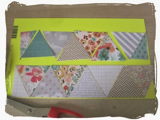
Here are the main kit papers:


You can tell a little bit here but you can see more in real life, the My Minds Eye chevron pattern paper on the far right has a lovely silver shimmer tone it's not flat grey but that along with the We Are Memory Keepers Metallic Sheer floral pattern paper, (which also has a silver print) works with the grey based papers to give them a lighter feel. The pops of colour come in the red, yellow and turquoise all work to keep it fresh and fun and Spring has sprung kind of feel.


I also tried to pick out paper that you can use in different ways so it's not all 'Spring/floral/pretty so here you can see if you pull out all the grey and blue tones and mix them with some of the embellishments you get a completely different look. The paper with the skyline print is a Basic Grey one called 'Rue' which I think is just great for so many different subjects. I love that die cut with that paper too, there's just something really attitudey about it.

The back of that 'Rue' pattern has a lovely yellow ochre colour pattern that works really well with all the 'natural' themed bits so you can ditch all the grey and work with these warmer colours instead. 


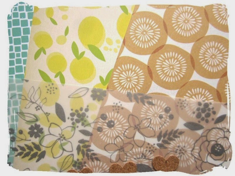
The Lite kit has more yellow tones so it's much warmer in feeling. In place of the bright red that's in the main kit you get little bits of soft pink and orange coming through in the papers. The My Minds Eye shimmer paper in this one, (it's on the far left here) has a steely beige tone so it's silver but with more beige so it's warmer and works well with these warm yellow colours of the papers. I've added a couple of the Lite kit embellishments to the photo too with the papers.


The embellishment kit has the same natural tones mixed with pops of brighter ones. I've snapped a picture of the burlap stickers here and the Basic Grey Capture tape which will mix well with the wooden and cork embellishments in the main and Lite kits if you like mixing up your kits. There's some more of the negative die cuts too but in colour this time around, these are from Simple Stories.

Don't forget that the extras shop is open this week so you can add some extra bits and pieces to your kit box. You can get there from the new look shop homepage. Click on the button that says 'subscribers extras'. When the shop's open you'll be able to order your extras any time. There's still a few things left to grab.
I think the cardstock sold out really quickly so I'll try and get some more added next week.
I've also got all new packaging for your kits from this month onward. I'll take a photo while they're being packed next week so you can see the changes.

x Leo

Toning down the neon

I have to admit I struggle with neon. I reckon I wore too much of it in the 80's to appreciate it again now. But I hated having that big sheet in the kit and not using it so gave myself a challenge to think creatively.

When I saw the Creative Journal and Pocket Diary kits I realised that the colours would go well with a fun photo I had ready to scrap.
I covered the backing cardstock with two different distress inks, then took out an 8" square from the middle which I was going to use for my title (but didn't!) I cut the green Basic Grey paper down to 11 1/2" per side and inked and distressed the edges.
Then I took some gesso and smeared it over some of the neon cardstock, making sure I kept it quite rough and textured and leaving some hints of the bright colour still visible. When it was dry I used a tree bark mask and sponged the distress inks over the top. I tore the paper and inked the edges and voila - neon I feel comfortable using
I built up layers behind my photo using thin strips of paper (including the bits left over from trimming down the green paper), some of the ribbons and the multi coloured twine. I made sure that I did not add adhesive right to the edge so that I could tuck more things in.
The title was going to be in cream but when I saw that these speech bubbles were the perfect match in terms of colour, I added more of the Project Life alphabet instead.
A few days before I had made a card and had put little dots of liquid pearls onto washi tape. It turns out that when they dry, they do not stick to washi tape and all fell off. But I kept them (why? who knows!) and they filled in a space I didn't like on one of the speech bubbles. Apparently you can get some matte glossy accents which means that your glue overloads are not so visible. I think I had better buy some! (but actually you can't see as much glue in reality)

One of these is not like the other....

This is one of my favourite layouts using this set of kits. And it really came from the fact that I was challenged by having photos I wanted to scrap but with papers that didn't really feature much of the dominant colour. It would probably have worked as well if I had just ignored the turquoise and used other colours to highlight it but decided to have a go at adding colour using watercolours.
And this is the result
 I began by colouring blue circles randomly across the white cardstock. To be honest when I started I thought "oh crumbs (or words to that effect) it looks terrible". But I added a Kaisercraft stamp randomly over the top and outlined the circles messily with black pen and then it looked much better.
NB when I use large background stamps like this I don't put them on a perspex block. This means that the ink goes on less evenly which I prefer.

For this layout I followed a Stuck sketch really pretty faithfully. I added more colourwash to the black and white paper and made sure that I outlined all the patterns on the other papers. I used to do this all the time and do love the graphic lift it gives. I put some of the vellum through a little ribbing machine. That is because I tried to add some watercolour too it, which was a disaster as it all rolled up. The ripples straightened it out a bit.

I trimmed one of the journalling sheets into a circle, adding more of the watercolour circles to it.

I outlined more of those lovely leaves with black pen and the little sticker is raised on foam pads.

 The title used glitter thickers which leads me to see if you managed to spot why one of these things is not like the other...
Yup, only after I had taken loads of photos of the layout did I notice that the "!" had fallen off. These Thickers are really not very sticky so here is a reminder to use adhesive to put them where they need to go.
Oh and in case you were wondering, the super soft and comfy (and bright and silly) PJ's come from Primark :)


Patchwork Papers - Scrapbooking and Cardmaking

Hi! Leo back again.

This month I wanted to have a play at using papers in a patchwork style. You know the beautiful patchwork quilts with squares or other shapes made up of loads of different patterned fabrics? Well how can you not be inspired by those and try out the same effect with patterned paper. I did also think that a kit is perfect for working a patchwork design into your projects because all the paper co-ordinating is done for you so all you need to do is cut up the papers and then stick til your hearts content! You can use it as a fun way of embellishing and making your own patterned paper up. You could go crazy and create a whole background of patchwork patterned paper or a whole mini book! Make your Project Life cards with smaller cut out shapes, so many possibilities with this so it's a great starting point.

I've seen some work done using quilting patterns and folding paper and making really fancy patterns to be honest that;s too fussy for me so I've gone really simple for mine and stuck to cutting out circles with a die, squares with my paper trimmer and triangles using the Kesi'Art paper in the Lite kit because it already has a patchwork design on it. I just nicked one of the triangles from that and used it as a guide to cut around to make more of them!

The neon card in the Jan/Feb main kit is wackily neon so it's nice if it's used in little pops like the interiors trend. I've used it here as a backing for the patchwork paper I'm making so I'm just leaving really small slivers of it between each of the triangles.


Here's the finished page I used it on. I've gone really scrappy with this one making lots of layers with paper pieces I had left over as well as the stickers from the main and embellishment kits and the card embellishments from the main and embellishment kits. The chipboard stickers from the embellishment kit I've stuck down so they're underneath the journalling card so it both acted as a bit of decoration and made the journalling/photo bit lift up away from the page to help it stand out against everything going on.


I also made a little series of notecards using the same idea. Little note cards are handy to keep in to add with parcels or for notes. A co-ordinated bundle of them make a nice gift too.
 I started out printing some messages onto the plain white cardstock, (using Word and some nice decorative fonts) and then cut out some squares of paper and some little circles using a Nestabilities pinked circle die and my Cuttlebug.
The squares were 1 inch and the cards I cut out were 6x4 inches. I played around with the placing first and then I picked out some foam pads to fix them down to the card.


The circles were a bit more difficult to place because there's no straight edges so I put the middle on down first and then two each edge then filled in the ones in between.


Here's some more using the same squares and circles. I've put these squares together with no gaps to make a 'proper' patchwork design.


Another circle one with flat circles stitched in place with the sewing machine. I've used some of the notepaper from the main kit and the greeting is printed on white card and cut out and stitched on like a clothing label. 

This one's a proper opening card not just a flat notecard. I made some larger 2 inch squares from the paper and then cut them apart on the diagonal to make triangles then pieced them back together to make the patchwork design.


The paper I stuck the patchwork design onto was the lovely Basic Grey paper from the main kit and I really liked both sides of that so I cut out a square from the front of the card to let some of the back show through inside the card so it just gave it a bit more interest and didn't waste the pattern!


I hope it's inspired you to have a go at playing around with paper patchwork on your projects. I think it's a fun way to use up any of your ready co-ordinated kit papers from this kit or any of the previous ones too.
Have fun!
x Leo

My lovely Valentine

My sweet husband filled a photo frame with photos of the two of us from the last 27 years and has put it up on our landing. It was such a romantic gesture that it needed commemorating and as Leo had furnished me with the perfect paper in the kit, what could I do but scrap it!

I mainly used papers from the Lite kit but stuck in some scraps from the main kit and the cameras from the embellishment kit as well. I just had to use that Feb 14 paper as the background, but loved the other side as well. I had another sheet so could use quite a bit of it but with some careful gutting you could do the same with just one sheet.

I made sure that everything had a coating of Vintage Photo distress ink so it didn't look too busy. I felt that some more pops of colour were needed at one point as it was in danger of looking too brown and red so I added a little turquoise - mostly using the tear off strips from the bottom of the papers. I find them very handy for this sort of thing. I added some detailing with a fine brown pen so that it looks more like two pieces of paper than a scallop printed onto the pink (see below)

I love those clips!

I drew a rough heart shape for my journalling, making sure I knew where it would be tucked in before I wrote. There was a tiny heart on the "Do all things with love" journal card but it wasn't big enough so I hand cut another one using one of the Daily Grind paper red chevrons. Another part of it appears in the top right hand corner!
The "right now" sticker comes from a previous Quirky Kit.
Phil reckons there are not many photos of just the two of us - even over 27 years. So don't be like us -  take as many photos of you and your significant other as you can :)

Tell me the old story

The trouble with digital cameras is that you don't always print out your photos and if a hard drive gets corrupted then you have lost the lot. So it was a lovely surprise when Phil found some photos we thought we would never see again. The quality is terrible, but the story of the day has gone down in family history so I knew that I wanted to record it with paper and glue!

This layout features papers from the lite kit Pocket Diary along with the Theresa Collins paper from the main kit. I spent some time playing about with the shapes that I cut out from the papers but decided that the background looked a little plain so before sticking anything down I sponged some Delicta gold ink through a chicken wire mask around my page. The ink is very wet so does need to be left to dry or dried with a heat gun for a while.

While I was waiting I went round the edge of every paper with a Sharpie Pen then added a border on the papers with a thin black felt tip. I created a banner at the top using papers and ribbon. Some of them were raised on foam pads to add dimension.
I stapled one of the cameras from the vellum in the Junk Drawer kit onto one of the journalling papers and slipped my photo underneath.
The little flower was painted with Distress Inks and some more of the Delicta gold ink. I smoosh a little ink onto a perspex stamp mount and pick it up and paint with a fine tipped waterpen.

I added the Project Life alpha stickers and wrote my journalling directly onto the page. If I could do it again I would have started the journalling further to the left of the photo - but I am pretty happy with it as it stands and think that the whole page is a great backdrop to a special family memory.