Breaking all the rules

I managed to squeeze out one more layout from the last set of Quirky Kits. Truth be told I still have an embarrassment of riches in terms of embellishments which are going into my QK embelly box for future use. I love diving into my treasure box for inspiration!
But I managed to use up almost all the rest of my paper with this one.
It was inspired by this sketch
and here it is

So why breaking all the rules? Because there is gold AND silver AND grey AND white AND brown all gathered together. But I like to think it works!

I decided that to help with the colour scheme I needed a little more brightness so I got out my new Kuretake watercolour paints and added bright yellow to one of the papers (the most cream coloured dot one, just so I didn't clash everything!), gold to another and blue to a third. I also trimmed some of the words from the Kaisercraft "Document" paper and coloured them with a light blue wash.
I then remembered that I had a raindrop stencil so painted on some pearlescent white and blue raindrops. In the end after sticking the paper down I decided that they would stretch across the whole page - but they didn't to begin with.

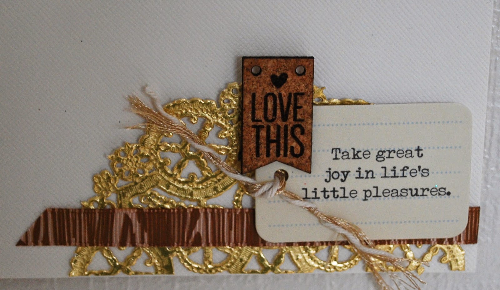
I did think about trying to make the fab gold doily silver but decided it was bound to go wrong so left it! I did use the whole thing which inspired me to start breaking those style rules. Brown word stickers, grey and gold letters, silver sequins, gold and white arrows....
I wanted to use three flair buttons but two didn't really match. One then got the krylon gold pen treatment to add extra gold stripes
The other I covered with Versamark ink and tinsel gold embossing powder. When I used my heat tool something cool happened (well, hot really). The top of the flair button expanded and then melted back down with this ridge effect. I tried heating it again to make it smooth but it won't... but I rather like it like this
I painted the back of one of the brown and white tags with blue watercolour paint and a tiny strip of gold. I added a yellow rub on. I then discovered that you can't just write on the rub on with any old pen so I had to cut off a bit of the tag with smudged writing on it. I still managed to say everything I wanted to :). I used a black brush pen
Why not see how you can break your style rules? It is a lot of fun :)

Spot the difference

Colour is slightly different yes, taken in different places.
But the second one doesn't have a lump of blu tack on it.
So that is the one we will focus on! (Although #1 is more in focus. Sigh)
I wanted to use some off white cardstock to back my work and found that I already had one with a square cut out and another identical piece. In hindsight I could have used any old cardstock on the back as you can't see it. But that gave me the idea to have a raised frame for the layout and play about with it a bit.

First I gathered strips of the various papers from the kits, inked the edges and adhered them to the bottom cardstock. I did trace round where the aperture would be to help with placement. I also used a stencil with a coppery glitter paste on the top cardstock. As near to the dimension of lego as I could get.
When that was dry I did more edge inking and then adhered the two cardstocks together with foam pads

I added more strips of paper and ribbon across the top to act as a bridge on which to rest my photos. Then I took one of the tags and had fun piling embellishments over it.
I realised (as ever) that my inky fingers had left ink where I didn't want it. Luckily I hadn't added the date as yet so was able to stick that over it with more foam pads.
The title was cut with alphabet dies three times - twice on cardstock and once using patterned paper. Once it was stuck down I applied Glossy Accents to give even more dimension
Job done. And much better without the blu tack


Lots of bits and bobs

aka a layout that lets the embellishment kit have the focus.
I am so in love with that gold striped paper bag and made it the main focus. But in the end I stuck a few strips of patterned paper underneath as well, just for a bit more colour.
I then spent a happy half hour or so with all the embellishments I could grab from all the kits and put them together. Tags and cork and vellum and rub ons and wood veneer and threads and ribbon and ooooooh the gold doily.

The paper bag is raised on foam pads and so are the photos on the top, which meant I could tuck more things behind.
I did sneak in some letters (well numbers) from an old kit.
Oh I love that wood look tag...

I carefully added the gold rub ons to the photos. I ran out of "h" so cut the bottom off a "g". Perfect! And that ampersand is another of those Jillibean Soup alphas this time given a gold embossing powder coating.
My husband came and found me in the house to tell me how much he likes this layout which is a huge compliment. I rather like it too :)


Oh those camels

This layout came together really quickly. It just uses the Makin a List Lite kit which is now sold out (I'm not surprised as it is lovely). I wanted to showcase some of that wonderful patterned Websters Pages vellum. Did I manage it?
I am a bit cross with myself that I didn't let the gold krylon pen dry enough and so the top piece of vellum has some extra gold bits on. Sigh. I have an extra wide gold pen which is great for edging. But needs drying....
I gained some consolation from the fact that the pink/purple (can't really work out which it is) Lawn Fawn Sweater Weather Collection ‘Cold Snap’ patterned paper is an exact match for the cover on the camel. That sort of thing always makes me happy! 
The first thing I did was sprinkle some Heidi Swapp gold Colour Shine onto the white cardstock. I added some papers to the left hand side and stuck down my vellum pieces with some gold washi tape from a previous kit. Honestly? It didn't stick very well at all so I added some tiny glue dots around the vellum which holds it better. The three photos were mounted on foam pads. Which meant that despite my trying to consider it beforehand, when I realised that the photo on the far right wasn't where I wanted it to be, I had to leave it there. Sigh.

I put the gold letters onto some acetate so that I could give them a black outline using a Sharpie pen as I thought they might need some more definition with all the gold about. You need to be careful doing this as the letters are very delicate.
I layered up tags at the top and bottom of the page, raising some on foam pads for interest.

I couldn't decide where to put the journalling as I didn't want to distract from that vellum so in the end I wrote it down the side with a thin gold Krylon pen.
What I missed from the journalling is that the camels are about 40 years old :)


A bit personal

Sometimes in order to scrap the whole of your life you have to get a bit personal. Well you don't have to but I would hate anyone in the family to feel that I had left something important out. But it doesn't mean that you have to let the whole world know the entire story either. There are two easy options to consider- to write what you want to say on the back of the layout or to do some hidden journalling. That is what I decided to do in this case.

Its not the best photo in the world as it is snatched from Facebook but it does make me smile.
This layout features the Main Dear Diary kit and the Good Times Embellishment kit (now sold out so if you like it, and don't have it then be sure to join the subscribers list here for the next one)
I thought that using a lot of the calendar type papers would be just the thing to talk about something life changing. But when I initially began putting the papers together it all looked a bit plain. And I do like a sparkle. So firstly I adhered the bottom few sheets to the blue cardstock and sprinkled a few different blue and turquoise glimmer mists over the place. "Not enough" I said to myself and so I dug out a Theresa Collins heart mask and some turquoise Imagination Crafts Sparkle Medium Paste.
Better.

I then grabbed a few of the papers and gave them a black pen outline, adding in a hand cut big heart shape. The layers were carefully stuck down so that I could add my hidden journalling and also raise up the photo on foam pads.
It doesn't look like you can take the journalling tag out - but you can!
I added in badges, rub ons and the little acetate shapes which I adhered with  tiny glue dots.

The title took a bit of work but I like it. Once more I have adapted the letters from the main kit. There was a panic when I couldn't find one of the "N"s that I had carefully saved for this layout but it turned up (under the desk!) just as I was experiemnting with other letters I could use!
I pushed each letter into versamark and then embossed with either green or Kingfisher blue UTEE. These two powders have slightly different textures. I did triple embossing (which means that you repeat the versamark and embossing powder stage three times in all) but made sure on the second and third layers not to coat the whole of each letter with powder. Fiddly but fun!
I love the size and font of these letters. One day I might use them in their usual hue!

Being inventive

I live in lovely Devon by the sea, as you may be aware if you have been following this blog for a while. The downside of living in lovely Devon by the sea is that this year, when everyone else has been enjoying snow and the amazing photo oppportunities it brings, we just had rain. (to be honest you can replace any weather choice at the beginning of that sentenve and it would still end "we just had rain"...)

Its not really a problem except when your Quirky Kit has some gorgeous snowflake type embellishments and you have no snow. So what should you do? Use them anyway!
 
Again I just used the Dear Diary main kit
I had the idea of cutting some of the papers to echo the colourful umbrella. But when I first laid it all down it looked a bit bare. I had also noticed the song lyrics on the Kaisercraft Hello Today Collection ‘Document’ paper and that inspired me to add some more sunshine to the page (plus there wasn't really any yellow to match the umbrella in the papers). So I got out a yellow gelato and rubbed it on the cardstock, smearing it about with my finger. The Bazzill Salt dot textured cardstock has a lovely tooth to capture the colour. 

I also decided that even though there was no snow on this day, it was cold so I would use the acetate shapes anyway. I covered some of them with Frosted Lace stickles and some with a more translucent one. The "Brrr" was coloured in with a blue gelato on one side and has the Frosted Lace stickles on the other (which made a bit of an escape, but did help to attach the acetate to the photo)

The other acetate pieces were stuck down with glue dots, hidden under the sequins.
All the papers were given a good coating of Black Soot Distress Ink on the edges and also given an outline with a thin black pen for extra dimension.

I used one of the Pretty Little Studio, train ticket tags to record the date and another as a journalling spot. This might be because I circled the wrong date on the first tag but I couldn't possibly comment....
I cut out the title using some letter dies, paper and cardstock. I cut each letter twice from scrap cardstock and once from the patterned paper and stuck them all together with matte Medium from Ranger. This gives the letters some extra dimension.
And there you have it - a not so snowy, snow embellished page