My Au Pair Journey

Ok so for the last 6 weeks I have been fortunate enough to have a job in France as an Au Pair looking after a little 3 year old boy, and yes he kept me on my toes!
During this time I was lucky to visit a lot of places, and decided I wanted to document all the places I went in a unique way.
I started off by choosing my background paper the October Afternoon Summertime Sunshine sheet and then my photograph. I was wondering what to do, but knew I wanted to use the rays of the sun to write in or something else. I came up with this...


Using up a large portion of the October Afternoon Mini Market alpha sheet from the Lite kit and both the large and small October Afternoon Daily Flash alphas from the Main kit I spelled out all the places I visited in France and Paris.

I used one of the Project Life Inspire 4x4 cards from the Embellishment kit reading "So the adventure begins, I not only chose this because the colour coordinated with the alpha's I chose, but because this is going to be the opening page in my new album and found the quote fitting. I also used one of the Pretty Little Studio Treasure Island note strips to do a little bit of journalling.
I finished the layout with some of the puffy stickers from both the Main kit and Embellishment kit and also some enamel dots from the Embellishment kit (can't get enough of these babies)
I am really pleased with the results


Different ways to use transparency

Hi!
Leo here :)

One of my favourite bits of the new kits is the Bella Blvd. Confetti Clear Cut transparency sheet in the main kit so I wanted to stretch it out a bit and use it for different things.
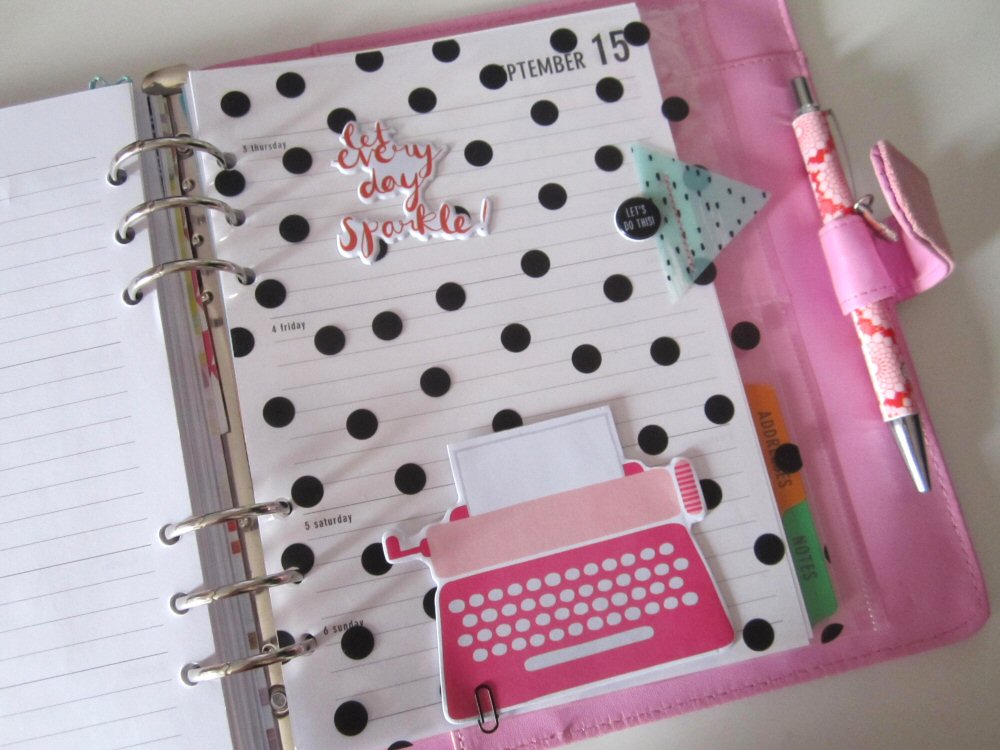
The first thing I did with my sheet is to make a new dashboard/divider for my planner for the next month ahead. I'm still going strong with my Paperchase planner I started in December last year. I have one page in it that I use as a template, it was the first page in the planner when I purchased it, (like a plain page with the Paperchase logo on it) so I swapped it to the back of the planner to use as a template to add in my own custom pages made from kit stash. I cut out the page size from the transparency making it a little larger than the paper pages so it works as a divider and cut out the holes in the right places, (really handy to have a one hole punch if you're making your own planner pages, I think I've mentioned before that the one I'm using is one of those little ones from a Christmas cracker, it works!). I've rounded the edges, (with the punch on my WRMK envelope punch board) and then added a few embellishments from the main and embellishment kit then I fixed some of the typewriter note papers from the Lite kit to the bottom of the page using one of the mini paperclips also from the Lite kit.


Here's the finished article in my planner all ready for September. Can't believe it will be September already next week, how crazy fast is this year going!


OK another thing I made with the transparency is this little shaker box. I'm not sure yet whether to put this on a birthday present with a gift tag or on the card I'm making for the same birthday but I think they're really fun to use as embellishments for all kinds of things. You could even make one into a Project Life filler card.


Really really simple, if you've done this before you probably know all the steps but if not.
1. cut out a piece of card and piece of transparency the same size, get some sequins or other bits for the shakers, (I added a puffy sticker with paper covering the sticky back). 2. line the outer edge of the card piece with foam pads or foam tape. 3. Stick the transparency over the top. 4. cut out another piece of card slightly larger than before and cut the middle out of it, (really simple to do if you have a paper trimmer with a ruler on it). Glue the frame over the top. Done!


And that transparency sheet is still going! Here I used a bit as a layer under my photo on this scrapbook layout. There are the fab printed acetate triangles in the embellishment kit and the vellum paint brush chips in the main kit which are great to layer with cut out bits of the transparency sheet.


I used a little bit of stitching to hold down the transparent layers and also there's tape under where the photo covers the layers and the puffy sticker on top also acts as an anchor gluing the transparency and vellum embellishment in place.


So there we go three different ways with transparency!

I'll be back soon with a few card projects and a 9x12 size page I'm still working on. 
x Leo

Hey There Tink

This is the first layout I made using the July/August Quirky kit...and wow is it gorgeous!
After filming the unboxing video's for my youtube channel I arranged all the goodies out on my desk and took a couple of minutes just to stare at them all.
I then decided on my photo's and used the colours in the photographs to help me design my layout.


I started by laying out the some of the pink and green triangles that are available in the embellishment kit along the bottom to ground my photographs. I knew straight away I wanted to lay my photo's side by side and that I wanted some hidden journaling in the form of a tag that came in the main kit.
I then wanted to frame my photographs and add a pop of colour so I used the paint brush strokes that came in the lite kit, and cut the orange one in half, laying one half on either side of my photo's.

Once I had framed the photo's I was really pleased with the appearance and got to one of my favourite parts...the embellishing. This month's kit came with such a variety of embellishments I was spoilt for choice. I decided I wanted to form 2 clusters and started with one of the puffy stickers that reads "let everyday sparkle" from the main kit and a camera puffy sticker from the embellishment kit. I then added some enamel dots also from the embellishment kit and voila one completed cluster.

I then switched my attention to the title and the other embellishment cluster. Using some more puffy stickers and enamel dots from the main and embellishment kits I formed my second cluster and decided on the title Hey There Tink as she looked straight at me when I took these shots.


I finished my layout by adding some journaling on the tag and also the date on one of the copper flags from the main kit. I added a piece of twine from my stash to the tag and used the xoxo washi tape from the main kit to form a border all around the outside of my layout to frame it and the layout was complete!

Scrapping with gusto

Its a third page about the Big Wheel (I think there is one more to go) - and this one doesn't actually have a wheel photograph - rather one of how I was feeling travelling SO fast and SO high (for a scaredy cat)

I love the Pink Fresh Studio Happy Things Dream Big paper from the Lite kit and decided to make that the main focus of my layout - but with a little Lythan adaptation...
 (which of course features black pen)
Because the lovely hand drawn elements mainly replace patterned paper I wanted them to be more visible and so traced round them with a thin black pen.
I pulled out the Project Life Inspire Edition 4x4 speciality cards from the Palette embellishment kit to be features as well, adding my title with the mini market letters
 My photo was cropped down and layered on some of the lovely Lite kit papers - another finding a space in between the cards and the drawings
I decided that there ought to be a big wheel on my layout. I drew a lovely one on a spare scrap of paper and was so pleased I decided to go straight onto the layout with pen. This was not the best decision of my life. But as the rest of the drawing is whimsical I have decided that I can live with it. Besides it is too big to cover up! It was painted with Zig watercolour pens.
I love the Pink Fresh Studio Happy Things printed acetate triangles but didn't want triangles so I turned them into circles using some dies. I ran them through a xyron machine and you can't see the glue on the back at all. These were placed along with some of the Happy Planner Puffy Stickers and pink enamel dots across the layout.


Its a wheely big part of life

(groan)
told you there would be more wheel photos. This one features a rather fab photo my husband took of the wheel from the ground as well as two views from the wheel itself. I wanted to talk about how this has become an icon in Torquay - but it is only around for tourist season so I am always happy to see it go up and a bit sad to see it dismantled as it means that winter is coming.

I so nearly made this quite a stark page but as my last layout was rather clean I decided to go a bit more messy. And I photographed some of the stages as well.
 As I have said before I am a huge Missy Whidden fan and love the backgrounds she makes. I am nowhere near as skilled but "technique-lifting" is a good way to learn. She talked this week about smooshing gelatos with a baby wipe, so I had a go - just using blue and yellow
I am a bit heavy handed and probably need to be lighter in my scribbling. At this stage I was thinking "What are you doing - this is one hot mess". So I decided to add some stamping on top. I used a Kaisercraft background stamp. I have a fair few of these stamps and I don't put them onto blocks in order to stamp a background. This means that not all of it will hit the cardstock with the same pressure - which I prefer. I also stamp a few times before reinking
(its a sideways view)
I still wasn't totally sure but thought I would go for it anyway. I took the papers from the Lite kit - Sketchbook and cut them into strips. The Pink Fresh Doodle Borders got a wash with the blue and  yellow gelatos and I also added some blue to the Simple Stories So Fancy Triangles as well. Everything got my usual two stage black pen outlining.
 I matted the photos on white card stock and adhered them with foam pads. I tucked a Pretty Little Studio Treasure Island Note Strip into the papers, having coloured that with the blue and yellow gelatos as well.
Then I placed the October Afternoon Treasure Map Mini Market stickers towards the bottom left adding one of the vellum paper arrows with little glue dots (I tried to space them evenly so even if they are seen they kind of look like a detail)
I did add some enamel dots from my stash - I do need little circles of something - but they were a pretty good match I think.


More sketch love

Leo sent out a card with sketches to all those who purchased the main kit this time. They will appear on the blog for all to see in due course. This layout is based on one of the sketches which has most of the detail near the bottom of the page in a rectangle area. I've actually kept quite close to the sketch, whilst still moving things around a little - partly because I have such a large title.
which also pushed everything up a little bit. I used more of that fab Bella Blvd. Color Chaos Clear Cut Oreo Confetti - without backing it this time. NB be very careful with it. I am not the tidiest of crafters and managed to get some fibres from another crafty project on the back of the acetate. I have wiped it loads of times and there are still some little blighters best so keep it safe and pristine as much as possible in the first place is my advice!

I then took the two Pinkfresh papers and made one a photo matte (exactly the same greens and greys as my dress - result!) and cut some of the triangles out from the other one.
I decided to hand cut the title - inspired by the "dream" puffy sticker that came in the kit. I used the
Kaisercraft canvas texture cardstock and hand drew some letters. The advantage with going for a childish font is that wonky is ok! Also choosing a look that doesn't mean cutting out the centres makes it a lot less fiddly.


It was actually trickier cutting the other letters as my new Sizzlits Decorative Strip Die is not the best I am sad to say - but I do like the mix of letters you get! After outlining all the letters I added some clear Wink of Stella pen to give some extra gleam.

I put foam pads on the backs of all the letters - and then made the mistake of starting to stick them down before checking the placing. I was not happy. So I pulled up some letters - only the foam pads stuck to the acetate and wouldn't come off. I was not happy. So I had the great idea of trying sticky stuff remover. It worked! However I got some of it onto the actual card stock and it left a mark. I was not happy. Washi tape to the rescue. I was quite happy but still wished I hadn't been such a fool in the first place.

I tucked one of the Pretty Little Studio Copper Metallic labels on the left hand side with one of the Pink Fresh puffy stickers on top and did my journalling on the matching banners - these were raised with foam pads too.

 As a family we have always joked about the blacked out cab being for vampires to enjoy the sights (thinking in reality it was some kind of maintenance thing) and always look out for it as we drive past the wheel, seeing who can be the first to spot the death cab. You would think we had small children rather than the youngest being 19... It was a bit of a disappointment to find it is actually  the VIP cab (why would you choose to go in one with tinted windows and pay extra? Its a mystery to me...)

This is the first of a few layouts about our trip to the big wheel in Torquay which was part of my 50th birthday celebrations. It turns out that I have quite a few stories about this feature in our summer landscape!

Tra la laaaaaaa!

is what I sing to myself as the new kits arrive at my house. Oh the excitement of seeing the lovely goodies in real life :)
Here is my first layout using the Paintbox main kit
 I love all the transparent goodies in the kit but because I used that gorgeous smokey grey cardstock I backed everything on white card so that they showed up better - and stuck them together with my tiny attacher.

The main kit came with some sketches and I have used one for this layout.
As well as my usual pen work I also added in some more lines to give the October Afternoon Summertime Heatwave paper more definition. I also added some white to the centre diamonds of the Crate Paper Journey ‘Wander’ paper. Subtle but there!

The tiny weeny washi tape is just adorable isn't it? Alongside those puffy stickers and the little deer (no real reason for adding a deer - perhaps because my kids are dear to me and I fawn over them? I'll get my coat...)

I had to photograph the page on the dullest August day in the history of the world which sent my camera bonkers so you can see the journalling a litte better on this close up
which also features those fab October Afternoon Daily Flash Flannel Grey Alphabet Stickers.

The white mist splats were a bit of an afterthought but the whole thing did look a little stark before I added them.

I hope you are singing a happy song as you delve into the kits as well :)


Cheeky little extra

I've still got loads of the embellishments from the kits left and one whole paper so I thought it was only fair to make another layout. This might be the last one from our family holiday from 2014 which will be good as we have already had our 2015 holiday for me to start on!

 The base is the Amy Tangerine Rise and Shine ‘Kirsten’ kraft patterned pape. I then layered up all the bits of paper I had left that I thought would tone in with the photo. Goodbye sweet vellum clouds I have loved you but you are all gone now.... Still at least I have more of the cute washi that is very similar to keep playing with
As the Bella Blvd stickers are called "Just add color" I thought I would. This little sticker had some yellow added and I also tried the same with red on another tag.
The yellow peeking underneath is one of the Crate Paper Poolside Ephemera. I chopped off another at the top
I love the wooden embellishments - perfect for a layout about the importance of comestibles on a walk.
As my son's red t-shirt draws the eye on the photo I wanted a few pops of red around the layout so the main kit Want 2 Scrap self adhesive pearls in red were a perfect choice :)
The little hearts paper is the branding strip from the Amy Tangerine paper, with the hearts coloured in with white gel pen. 
I used the fabulous Freckled Fawn Puffy alphabet stickers for the title together with one of the black vellum hearts from the embellishment kit, raised on a foam dot.
Writing on spotty paper makes it difficult to read so if you want a better look...
Again, having all the food embellishments helped me to choose the story for the page. I was just going to talk about the view (again). On reflection I think it is a far better story about how some of us were feeling on the walk and is what the photo is all about (see the hand sneaking into the backpack?)