2016 Album catch up - Part 2 Title page

Hello everyone,

I have been quite absent and had no time to participate in all of the fun activities I saw in our Facebook group. I wanted to partake in the challenges, although my work schedule has been quite packed, especially my training comes to an end. Here and there I had few minutes to spare, and I started to catch up with my 2016 project life album. This meant that first thing I decided to make was the first page of a new album.


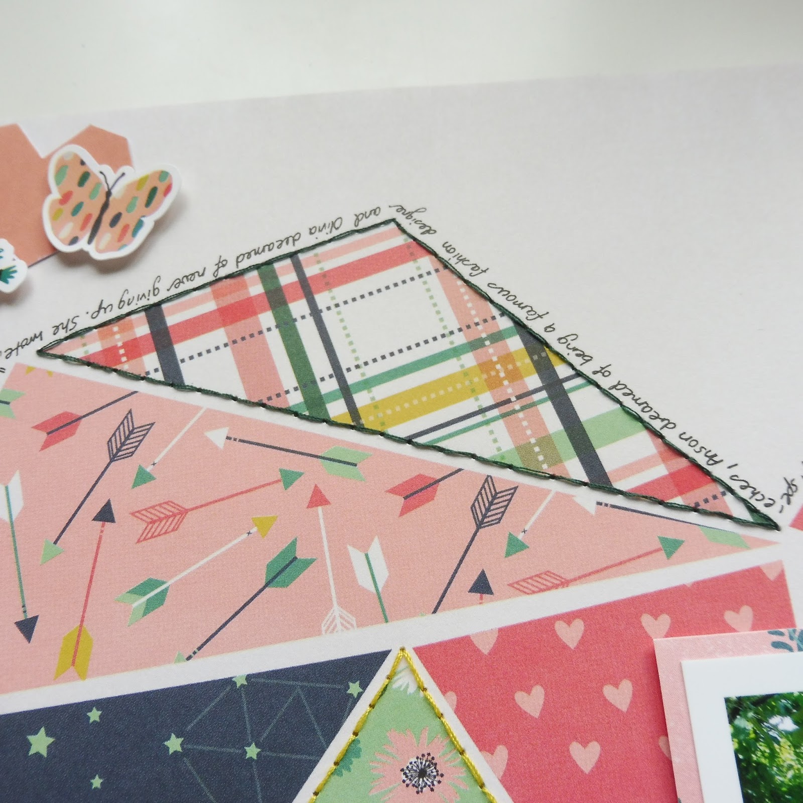
I have seen everyone's ideas and inspiration on how to use this lovely page that was in this month's kit, although, I think mine is as simple as it can be. I thought that the patterns on this page are so beautiful that I wanted to only highlight few parts on this page with a pink pen and use the vibrant thickers for the title. All of this would make it an excellent and straightforward starting page of an album. On another note I also felt that this page represents my style very well, especially the colours - navy, yellow, mint and pink. These colours are my favourite to scrapbook with and my stash has a lot it. I hope to catch up with you once again and expect to see a bit more project life in upcoming future. Talk to you soon, Agnese

Surf's Up

So the weather is getting a bit warmer where I am (then colder then warmer then colder...) so I thought it would be nice to do a bit of a throwback to a very sunny photo of my cousin, brother and me with surfboards. 


 I really wanted to use the bold yellow cardstock as a background because there is just no getting away from the fact that the surfboards are BRIGHT. I used a more neutral pattern paper to tone it down a little, then a border cut from a pattern paper between. I used my photo and embellishments to make the transition between the papers less harsh.
I was worried the teal glittery alphas would be a step too far but I love how they pop on the yellow, it gives a really summery vibe. I also used some stitching on the neutral and yellow paper as an extremely subtle way of adding texture. I love the size of the dream catcher sticker and that it breaks up the straight lines on the right. 
You can see how I used very thin layers to back my photo and a cut apart label for basic journalling.
 To balance the dream catcher I created a small cluster on the left, incorporating colours from the rest
of the layout. I hope you like my fun summer layout, thanks for checking it out!

Circle of Trust | 12x12 Layout | ScrappyNerdUK | March 2017

I was so excited to see the large circle wood veneer piece in this kit and immediately knew it was time to get out my circle punch to use for this layout.


Firstly I decided to heat emboss my wood veneer piece and this is one of my favourite techniques to alter wood veneers.

I used some gold Papermania embossing powder and my heat tool to set it and I love the effect it gives. It is a great way to make bespoke changes to your wood veneers and so why not give it a try on your next project - even use the same technique on your circle wood veneer from the Jan/Feb kit.


Next I used a 3 inch punch to punch out my photographs and formed a circle of photos.

 I punched a total of 8 photographs and left the 4 corner spaces blank for embellishment.


I then added some patterned paper to the middle 4 circles and I chose to use the special Quirky Kits papers that said "All you need is love" and some Chasing Dreams paper by Maggie Holmes to complete the 4 inner circles.

I then used the shape of the circles to add my title "Circle of Trust" as this was a layout all about the friends in my life that I adore and trust.


I finished the embellishments in the middle with some stickers from the Echo Park sticker sheet and loved the 3d effect of the butterflies in the recesses of the wood veneer.


I then added stickers and sequins to each of the four corner circles. I mounted my layout onto a sheet of white 12x12 cardstock as I was going to include this in my album and completed the edges with a straight black border with a few messy squiggles to add interest.


And here is the finished layout. I hope that this has bought you inspiration as to how you can use your wood veneer piece and made you think outside the box when it comes to using multiple photos, heat embossing, different textured papers to fill the circles and using the lines of the layout to create some interest with the shaping of the title.


The Best


Hey everyone, I'm back again with a 3rd layout made using the Jan/Feb Quirky Kits. And again I'm working with the geometric theme! I was inspired to use a hexagonal pattern on my layout thanks to some of the hexagonal die cuts and enamel dots in the kits.


Using one of the die cut hexagons as a template, I cut out a dozen hexagons from a range of papers from all of the kits. I laid them out diagonally across the white cardstock and left some gaps to stitch hexagons instead. 
I used one of the hexagons I cut out as a template, piercing holes in it, so all my stitched hexagons would be the same size.
I stitched using green, black and pink thread to match the colours of the layout. 
I also added some of the smaller die cut hexagons from the main kit, and these gorgeous Freckled Fawn enamel dots from the embellishment kit. 


I matted my photo with white cardstock and then a lovely peach coloured patterned paper by Dear Lizzy in the main kit. I added foam tape on the back, to help lift the photo up from the busy background.

Across the centre of the page I added a ripped strip of the "Stay True" paper from Chasing Dreams by Crate Paper in the main kit, which has typewriter font on it. And then a strip of the "Lovely" paper again Chasing Dreams.

To this I added my title, "The Best" using the gorgeous teal thickers, a camera sticker from the Echo Park Just Be You sticker set and a rubber star by Amy Tan. These embellishments were all from the main kit. I also added a few Dear Lizzy "Lovely Day" tickets which were not included in the kits. 

I typed my journalling up on my computer using a typewriter font I downloaded, and printed it onto white cardstock. This is one of my favourite ways to add journalling!


And so here is the finished layout. I hope you like my geometric pattern and that the Jan/Feb kits have inspired you to try something different! 


Cyber Crop Challenges and Classes

Over on the Facebook Group today we're cyber cropping and there are a bunch of challenges and classes to follow along with popping up over the weekend. If you want to join us we're here: https://www.facebook.com/groups/1049144365178929/
If you can't join in over the weekend all the downloads I'm adding them here on the blog too as we go along so you can download and keep or print them off ready for when you get your scrapping time to play :)

Class One: 4 Squared, creating a layout with paper scraps and random embellishments, http://www.craftytemplates.co.uk/QuirkyClasses/CraftyTemplatesCyberCropClass4Squared.pdf

Challenge One: Sketch Challenge, Creating a layout based on the sketch provided, http://www.craftytemplates.co.uk/QuirkyClasses/CraftyTemplatesCyberCropSketchChallengeWorksheet.pdf

Class Two: Concertina Box Minibook. Create a minibook in a box keepsake following along with the class instructions, http://www.craftytemplates.co.uk/QuirkyClasses/ConcertinaMiniBookClass.pdf

Challenge Two: Lists, Create a layout based on your favourites right now, http://www.craftytemplates.co.uk/QuirkyClasses/ListsChallengeWorksheet.pdf

Class Three: Stripes, a layout class about simple design principles you can use over and over.

Challenge Three: Alpha Sticker Mix Master. Every scrapbooker has random alpha stickers to use up so this challenge is all about becoming a mix master!


Thursday Challenge

Hi, here's another Thursday Challenge for you. Don't forget too there's the cyber crop this weekend over on the Quirky Kit Facebook Group, https://www.facebook.com/groups/1049144365178929/

Here's today's challenge:

Make a layout about something you cherish
-Use your favourite colours.
-Feature something you've created/homemade
-Use florals or something else beautiful found in nature as an embellishment.

Don't forget to share anything you've made, leave a comment to a link or post up on Instagram tagging @craftytemplates or on the Facebook group.

x Leo

Hey everyone,

I'm back with my second layout using the Jan/Feb Quirky kit, and again I used a geometric pattern.


I was inspired by this lovely paper in the main kit by Maggie Holmes Chasing Dreams called Delightful.
I cut out colourful triangles mainly from the Dear Lizzy Lovely Day "Tag You're It" paper in the main kit, because I wasn't a big fan of the sentiments on the cut apart tags but I loved the colours. 
I then spent quite some time trying to decide how to lay out the coloured triangles, whether to cover the whole page, or just one side etc. In the end I decided to form a triangle at the top of the page and another at the bottom to draw the eye to the photo in the centre.


I matted the photo with a thin piece of the blue paper from the Chasing Dreams Maggie Holmes "Lovely" B side. 


I then added this beautiful rose ephemera piece from the Dear Lizzy Lovely Day ephemera pack, in the embellishment kit. 
Along with a Quirky Kit exclusive cut-apart arrow from the embellishment kit, and a silver mirror acrylic heart sticker from the main kit. 
I love the Maggie Holmes Chasing Dreams paper titled "Memories" from the Lite Kit, because the cameras are just calling out to be fussy cutted! 


To complement the rose on the left hand side of the photo, I found a sheet of paper in the Dear Lizzy Lovely Day 6x6 pad (not included in the kit), which has the same rose at the same size, so I fussy cut out another to add to the other side of the photo. And added another two of the exclusive cut-apart arrows.


Finally I worked on my title. I knew I wanted to keep this layout quite whimsical and that the teal thickers would be too much for the whole title, so I used some white puffy letters from my stash to spell out "class" and used the teal thickers for the number 6. To give the title something to sit on, I used a Quirky kits exclusive green geometric heart embellishment and another of the acrylic mirror hearts.

I hope you like my layout! I haven't added any journalling to this layout which I normally always do, but I know I will be making many more layouts and project life pages about this class, so I'll journal on those.
P.s. I have permission to share photos from this summer camp online. 

Thank you for looking!
Natalie xx

Love These Girls

Hey everyone, hope you are keeping well.
I'm back with my first layout created with the beautiful Jan/Feb Quirky Kits! 
I've created another two today, so look out for more layouts from me coming soon!
The latest kit has a lot of geometric aspects, and as I haven't done any geometric layouts before I decided to challenge myself to try it on each layout!


I started with this lovely heart paper (Echo Park Just Be You collection), from the Prismatic main kit. 
The first thing I did before I even knew what photo I was going to use was to stitch around 3 of the triangles with pink, yellow and green embroidery thread. 


I then decided which photo to use. I really liked the green, blue and pinky tones of the papers and stickers, they reminded me of a jungle, and I thought of this photo of me in China with the lovely green trees in the background. 
I matted my photo, which I printed with a white border, onto a piece of paper from Maggie Holmes Chasing Dreams called Delightful. 
For my title I used the word love from the Dear Lizzy ephemera pack, which was in the Rhombus embellishment kit, and the lovely glittery teal thickers from the main kit. 


For my embellishments I added 3 clusters, one next to the title, one in the top left, and a small one above the photo. 
All of the embellishments next to the title came from the Echo Park Just Be You sticker sheet from the main kit, but I used foam tape to create some depth, and folded up the butterfly wings.


I added a similar cluster to the top left, including one of the geometric heart embellishments, exclusive to Quirky kits. 


I used one of the exclusive hexagon embellishments which said work/play and cut it in half and put it above and below the photo, along with another butterfly.

Finally I journalled around the outside of the heart. 

I hope you like my layout, and it gives you some inspiration.
Natalie xx

True Friends | 12x12 Layout | ScrappyNerdUK | March 2017

I love love love this kit. I couldn't wait to really get working on some 12x12 layouts and I am really pleased to be sharing with you my newest layout.


I've been watching some YouTube videos recently for inspiration and stumbled across Paige Evans using a "stamping off" idea where you masked an area that you didn't want to stamp and then stamped in the areas you did, leaving your masked off area unaffected.

So I used some inks from my stash (a light pink and light mint) to complement this kit and I used a random bunch of stamps.


I then removed the mask and it left a completely crisp line. I then decided to add some stitching around my masked area and used white embroidery thread for a tone on tone effect. This created a really soft look but you can try it with darker inks for a more bold, bright look. Try to match the ink pad you use with your papers.

I absolutely love tearing paper and the effect it gives. I use scissors or a trimmer to trim around the layers that I use behind my photo and I tear the bottom edge of the papers to create the look as detailed in the photo.

I decided to pop this up on some fun foam for a bit of height, to create a nice shadow underneath the layers.


Do you recognise the shape of the image that I masked off?

I used the heart paper from the kit for another project and I used it to trace around after I had fussy cut it out. I used this as a template to create this layout. I loved the straight lines of the heart and thought it would look perfect with the stamping off technique I was going for in this layout. I added some Thickers from the kit for the title - True Friends. I also used the acrylic shapes, a couple of the rubber embellishments and the gorgeous sequins as accents. I finished this off with a label tucked just underneath my photo to the bottom left. I added a tiny word sticker from my stash and a couple of teeny enamel hearts from my stash to complement this all.

I really hope this brings you some inspiration and I would definitely recommend giving the stamping off technique a go. If you're unsure how, then you can head on over to YouTube where there is a process video for this one and you can follow along with me.

https://youtu.be/wIXc0Y4zFbs


See you all again really soon.

Claire


Texture and Layering Ideas

Hi, Leo here!

I've been posting some of the cards I'm making this month following the Daring Card Makers challenges to Instagram. Today I wanted to share a couple of ideas I've been playing around with. Making cards for me is a good way to play around with ideas I can then move over to scrapbooking. It's good to grab a stack of card blanks, (I make my own with spare card and my paper trimmer with the score blade in, easy as pie and you can even use up some of the heavier card weight patterned papers you have) and grab your stash and start just layering and messing around with the bits and pieces. A challenge is also a good way to help narrow down what you're using and that's what started off these two cards for me.
This week the Daring Cardmakers challenge is to create a card that features rough and smooth elements. So I sat with my Jan/Feb kit stash in front of me and thought about what to do. My first thought was to create some texture on the plain heart shapes but then I had a second thought and decided to add the texture to the stickers and keep the plain hearts the smooth elements. I cut out the stickers from the sheet and rolled them through a swiss dot embossing folder and my cuttlebug to add the texture.


The paper pieces were all scraps that were similarly sized and I then just trimmed them to be uniform and layered the three together to make into one piece with doublesided tape on the back. With them all coming from the kit and already being matched up I didn't really need to think about what matched but I did pull together all the coral/orange embellishments. That's another good way to help you pick out what you want to use just sticking to two or three colours. The "It's Your Day" bit was cut out from the Pink Paislee #16 paper from the Lite kit. 

This next card I made for last week's challenge which was a picture challenge you can see the picture here. Lots of the elements in the picture were black and white so I pulled out the black and white stripe bit of the Pink Paislee #16 paper and then I went into my other kit leftover stash to pick out more black and white elements. The picture had wooden furniture too so I picked out some wooden bits and pieces to use.

The embellishment kit this month has these mini transparency cards I've been thinking of ideas for. I picked one out to work into the card as it reminded me of the square windows in the image. I thought to use it as a layer to raise the title stickers over the top of the embellishments. To add it to the card I used some mini pegs and some of the super sticky tape to fix the pegs to the card then the transparency is fixed to the pegs to create the dimension off the card surface. That super sticky tape is really sticky, it even stuck itself to my desk! I wanted it to be good for sticking little embellishment bits down like wood veneer and rubber shapes and things like chipboard Thickers that don't always want to stick to pages. It does the job and then some! 😃 It's supposed to be crystal clear too so you can use it with sheer and clear embellishments.


Check out the new Daring Cardmakers challenges there's a new one every Friday and see what you can come up with. It's a great way to just get started with your supplies and if you're anything like me once you get started and get the playing bug it's pretty difficult to stop cutting and sticking!
x Leo

A wooden layout

I was intrigued to find the wood veneer sheet in my kit this month (the awesome Prismatic main kit, now sold out) and then decided it was the perfect host for my vanity project page! Et voila

 I've been a Church Minister for 24 years now (yes, I'm old!) and last summer changed jobs which means wearing a clerical shirt and dog collar much more often. So I decided to start an Instagram # to look at what I wear. It turns out I'm not in a shirt in all the photos but almost all of them show my love of 50's style skirts and dresses. It has become a real thing where I live that people are interested in what is on my skirt today! 

I picked out a fair few photos that I thought might work. I tend to take photos on my phone or Ipad and then transfer them to Instagram which is why I have copies! When I printed them out, two per 6x4 photopaper, some of them were not the right size for the circles so I was left with these. I always wanted a balance of photo and papers/decoration so that worked.


Looking at the clothes and the house can you tell what my favourite colour is?
Yup, it is red. There wasn't that much in the kit so I found what I could in the stickers and papers, added black (the other colour I spent most of my time in) as well as pops of yellow because yellow makes me happy too!
I traced around the outside edge of the circles onto the photos and the chosen papers then trimmed them out, stuck them down and trimmed again as I don't think I got it totally right the first time once!


The patterned paper circles were vehicles for my embellishments - mostly popped up on foam pads, and the journalling strips. Those lovely Thickers were just too big so I found some little Maggie Holmes letter stickers in my stash and used them instead. 
The Pink Paislee mirror acrylic star and heart were the final additions.
It was such fun playing with the wood veneer and I don't think I would have tried it if it hadn't been in the kit :) 
 

Sketches ahoy!

Leo put one of her lovely sketch booklets in with my Prismatic main kit this month and here are the two layouts that I have done that have been influenced by the sketches.

Here is one based on the front page sketch
 Mine is a pretty simple version. I cut strips of some of the kit papers and layered them up vertically but with a little bit of overlap to add interest. When I laid my photos over they top I discovered I had a little gap so covered that both with the "Bonjour" from the cut apart sheet but a tiny bit of branding strip (the soft green spotty paper just seen). I added the tag from the cut apart sheet partly because I like the note of surprise it adds to seeing a swing in a kitchen but also because it brings out the blue in the photos.

Before sticking the photos and tag down though i got out my Heidi Swapp gold mist as I knew I would be using the "Ooh lala" as a title and wanted to add some more gold to my base layer.
Here is a warning - those letters are VERY sticky. Should you decide that you want to move them, chances are you can't so try and put them on straight first time round!

I love the metal paperclips and so used two of them. To make that easier the photo on the far left is on foam pads.
Then it was just a case of writing some journalling on two of the jumbo labels and adding a shiny and a squidgy heart and some of the Echo Park element stickers   


For the next layout I also challenged myself to use a non white background - in this case the flat yellow cardstock. I used a sketch that had lots of lines on it. But before I got going with lines I decided to soften the yellow a little using white gesso and some glitter paste
I added some lines and made holes in the page for faux stitching. But after the layout was almost finished I went back and added more plain lines because there weren't enough to make sense but my hands begged me not to do any more pricking!

Here is the finally finished page
 I matted my two photos with black and white papers then grabbed some of the stickers and card heart shapes. I wasn't too sure about adding pink to the yellow and so turned the pink heart to the other side and had white instead!


I love, love, love the teal glitter thickers but they just didn't go on the layout so I grabbed a very old black foam sheet and some alphabet dies which worked pretty well.


 I thought I had finished but it didn't seem right. Then I thought "lets go really old school" and added the black/white border. If you have never done one like this the secret is to do the black first which seems really counter intuitive, but the white gel pen goes on a treat over the black but black pen never looks so good on the white.

I thought I had finished it then, but later had to go back and add the sequins. It is really done now!

Both layouts took the sketches as a starting point, but as ever with a good sketch, there was room to put in something of my own as well, helped by all the lovely embellishments in the kit!