I'm always so pleased when there are sketches and ideas included in the kits. Is it because I am lazy or I like to riff off someone else's inspiration? You decide! This layout used a sketch from the kit that was about layering up papers on either side
I immediately thought of these photos of a set of canal locks in Bingley that we visited in February. Just amazing!
I stuck pretty closely to the sketch. I think that the letters would have got a bit lost on the blue so giving them the white bit to rest in is perfect.
I tried to pick out the most watery patterns that were in the kit, often using both sides of papers. They were all outlined with a silver pen. I had decided that some white mist drops would be great for the page - and then covered most of them up...
I also realised that there was an empty space in the middle that just didn't seem right so the butterflies came into play again. I gave them silver pearl bodies and also used white opal liquid pearls to add more dots of white
I just had to share this layout on the Quirky Kits facebook page, but of course then didn't get round to blogging straight away (I had a holiday then a week of work after holiday!)
This was a simple page to put together thanks to that awesome Pink Fresh Freedom paper. Because I like a graphic style I did go round all the square with black marker pen to make the coloured blocks stand out more. Then I just riffled through the delicious pile of papers to find some that would tone in with the blocks and the fabulous letters.
I was sent the main Rainforest kit but Leo also popped the vellum butterflies in for me and they were a perfect addition to this page. I carefully outlined them with black pen. You do have to be careful with vellum as any wet medium causes them to curl, but this pen worked fine.
I outlined my stack of papers and photo and stuck them just on top of one the cut apart cards. I found lots of lovely little die cuts from the Elle's Studio Live Laugh Love pack and also used one of the watercolour effect labels.
I had planned to put the "enjoying this moment" die cut with the cluster on the right hand side but lost it on my desk. I hunted high and low and even tidied a bit (shock!). It was only when I realised my photo stack wasn't properly stuck down and lifted it up that I found where it was hiding - right underneath! And I had put other things in its place so it got moved somewhere else (meaning you can still see a bit of the fridge I was hiding but it didn't work there anymore) (must make a note to ask that selfies are not taken right by a fridge)
The finishing touch was the lovely Nuvo Jewel Drops. The kit has made for a great time of transition page that expresses some of what I feel about this time of change
This is my first layout using the gorgeous March/April kits! I decided to take the 'Rainforest' theme quite literally and use the Succulents paper with a leafy photo of me, my brother and my cousin in the Lost Gardens of Heligan. I cut it into circles and arranged them diagonally across the page and decided some soft watercolouring behind would add a nice touch.
I built up the paint in layers and topped it off with some splatters. I used a staple in the centre of each circle (hint: I stapled first then glued them down!) I used minimal layering behind the photo so I wouldn't cover too much of my watercolour.
I love how the butterflies add dimension without making the page busy. I adhered them in the centre then used the Nuvo Jewel Drops to make them stand out more.
I was not in a title creating mood so went for a very basic 'garden' with the cute mint Elle's Studio Letter Stickers. I loved how it coordinated with this adorable arrow paperclip, so I put it underneath very subtly(!) pointing to our heads.
A few bits of ephemera added to the layers and I topped it all of with a sprinkle of puffy stickers and journalling.
Thanks for looking at my layout, if you want to see my process please check out the video below:
I freekin love this months kit. All of the bright colours just really gets me in the mood ready to scrap summer photos again!!
I found inspiration as soon as I opened my kit and couldn't wait to get started so here I am with my first layout as part of the Quirky Kits Design Team.
I started with the Flip Cards that were included in the main kit and I knew straight away that I wanted to create a grid layout using these.
I wanted to stick to the colours on these cards so used only accents of green, orange, yellow and a small amount of pink and black.
So, I used the "Hey" card and kept this very simple by adding one of the Freckled Fawn arrow clips, which was also from the main kit. I then added a tiny word die cut from the Elle Studio pack and finished this card with some Nuvo Crystal drops (which are amazing - do watch the process video on Youtube for help with using these if you are nervous!!). This card was done.
On the middle card at the top I included the "today" word from the Jillibean Soup die cuts pack (from the lite kit) and stuck it straight over the sun in the middle of the card. I added a yellow heart die cut which i drew a messy circle around and finished this card off with a pink heart sticker from the Jillibean Soup stickers (lite kit).
The top row was completed by using the green card with the camera. I love cameras and it is always a natural choice to chose cards/papers/diecuts with cameras on and it works with whatever your layout is about. I added the small circle with a black heart in the middle and put a foam dot underneath to give it some height. I finished this card with a phrase sticker from the Jillibean Soup sticker sheet which said "Wherever you go, go there with love" and I cut this into 2 and placed it above and below the camera. This was finished off with a couple of Nuvo drops.
The card underneath was again a perfect card and it had "my guy" written in the heart. I drew a messy heart shape in a black pen to bring in another element of black. I then added the xoxo and arrow die cuts from the Jillibean Soup die cut pack and finished this card off with a small green heart from the sticker sheet.
The final card I had chosen was the perfect choice to add some journalling to. I kept this card very simple and just added a tag from the Elles Studio die cuts and threaded it with some black and white twine from my stash and stapled the twine to the page. I added a small brown heart from the sticker sheet and again the Nuvo drops were used to complete this card.
You can see in the photo to the right, I did add a tab at the top of the photograph and to this I added 2 word stickers from the sticker sheet "captured moments". I like to date stamp on tabs and labels but I had no recollection of the date this was taken so included the word stickers instead.
I just wanted to add a little something in here about the Nuvo Jewel drops that were included with this months main kit.
They are fab!!
If you are like me and love to add some texture to your layouts then you'll love these. They dry just like enamel dots and I have fallen in love with them. Just squeeze the bottle so the liquid comes out and stop when the dot is big enough for your liking. Gently flick the back of the page to help the liquid settle and remove the air bubbles and leave it to dry, preferably overnight. Tip: Don't dry them with a heat gun as they will just bubble.
Here is the finished layout. At the bottom I added a strip of the Elles Studio paper "Pennants" from the Lite Kit and used the Die Cut Words from the Main kit to create my title "Holiday Adventure". The Adventure word I used was an acrylic piece from Freckled Fawn which was also featured in the Lite Kit.
And I'm done.
I hope you find inspiration today to recreate this layout and see you very shortly with my next layout. If you have any questions, please leave them in the comments below and I'll come right back to you.
And don't forget to check out the process video on Youtube here:
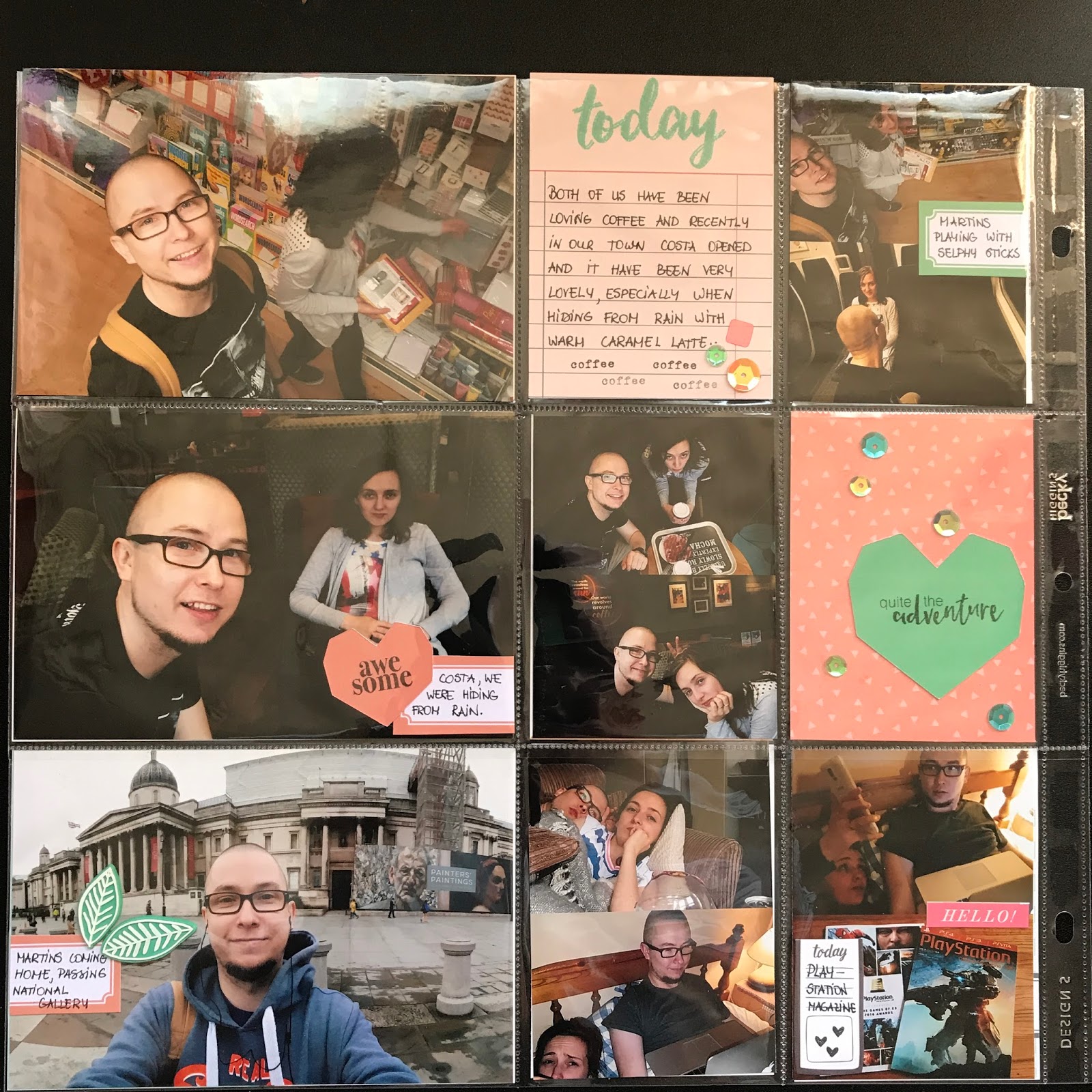
Again I'm back with a layout for you, and I have been still trying to catch up with our album, just I was quite busy with my work to post it. Now today, thanks to my hubby I have been able to share these with you. When it comes to this month - June, the best way to describe it - a waiting game. While Martins were working and me looking for a job, there was a stillness to our activities, and it continued to be a hard time for me, as interviews and the realisation that's it I have achieved what I wanted for so long. :) Looking at the pages, you might seem that they aren't as cohesive, because all of the have been completed at separate times, but still I think these pages go together quite well, and I had fun in making them as well. These layout pages forced me to sort my thoughts by reflecting on this period, and I'm grateful for these memories. :)
Similarly to previous post, here are things I used from the this month's kits:
Geometric shape and sequin confetti pack custom colour matched to kit.
Cut apart jumbo labels sheet.
Dear Lizzy Lovely Day 'Darling Daisy' 12"x12" doublesided patterned paper.
Freckled Fawn triangle and diamond shapes sticker sheet.
American Crafts pink puffy Thickers alphabet stickers pack.
Freckled Fawn geometric and enamel dot stickers pack.
Labels cut apart sheet
You might think that this page differs from the previous two, but there is the reason, as the next page is of July and once you will see it, then you will notice it. Throughout all of these pages, I have been using stamps more, as that they I wanted to use more of my stamps and bring the black colour. And this was my first time putting sequences on my pages, and I think it has come out quite lovely.
I hope you enjoyed this post and talk to you soon, Agnese.
As promised I'm back with my Project Life album catch up, my second part of 2016 album starts with May. You might not know this, but I scrapbook and record our memories based on a monthly basis, as there aren't so many things happening in our life that needs to be put in our album. However, once in a while if there is a major event that takes place I will include it on the monthly pages. Another thing to note that I don't restrict myself with only 2-pages per month, the main thing I focus is on telling story and recording things that should be recognised - even it's me doing laundry :D
The inspiration for this month's colour scheme was taken from the phrase you see below - messy bun & getting things done - mint, yellow and pink. I used some things from the kit, and at the same time, I included other things from my stash, as I try to decrease my collection, as it seems otherwise I will need to buy another Alex unit from IKEA and my husband will not be happy about it. :) So here are things I used from the kits.
Crate Paper Chasing Dreams 'Delightful' 12"x12" doublesided patterned paper.
Crate Paper Chasing Dreams 'Stay True' 12"x12" doublesided patterned paper.
Crate Paper Chasing Dreams 'Lovely' 12"x12" doublesided patterned paper
Cut apart jumbo labels sheet.
During this period, I finally had time to catch up on chores and other things, because April was a hard period for me both exams and at the same time I had to write my dissertation. There were a lot of days in April when I slept only a few hours and then kept working on my assignment and revise for exams. Once May came, I had so many other things required to do, and also, because of such a strain, my immunity went down as well. So I did everything I needed, and at the same time, I did some crafting.
I hope you enjoyed this post and talk to you soon, Agnese.
As I was flicking through my photos I noticed one from a girls' trip to Paris with the Eiffel Tower in the background and I thought it would be fun to do a graphic representation of it. This triangle paper kind of had the structure of the tower already, so I decided to use that as my main piece. I cut and backed a couple of sections, I could definitely have done something more intricate but I felt like making my life easier.
I chose the title from the mirror stickers mostly because 'ooh lala' is a kind of French thing to say (I think!) but I also love the chunky reflective gold.
I somehow created a mostly yellow colour scheme and found this cute hot air balloon fitted it really well. Completely random but I think it still works.
I also used a couple of pink flower stickers to add a bit more embellishment and stop the layout being too yellow.
I wanted to go for really chunky layering around my photo using a combination of yellow, a multicoloured print and graphic black and white. I used cardboard behind the cluster to layer it up even more. I hope you're inspired to make a shape in your photo a feature of the layout, thanks for reading!
This layout is part of a series of 3 I'm doing about my time on NCS (National Citizen Service) which I took part in over the summer. Part 2 of the experience is about learning a skill and sharing it with the community, so we spent time practising art then doing it at a local care home. I noticed that there are several monochromatic papers in the kit so I decided to use them to create a minimal and mature design, then I used brighter embellishments.
At first I thought the black and white matched the atmosphere of the care home well but I realised it was a lot more fun than that, so I brought in pops of teal and coral.
A theme of my series is using Part (then the number) as the title of each layout. The teal glitter alphas really stand out even against a pretty bold pattern.
I did minimal journalling because I created a separate journal during NCS, this was really helpful as I could look back to see the name of the care home.