Perfect Getaway

Hey everyone, Zoe here!
What a heatwave gah, I'm hating it sooo much. I don't know about you but It's even putting me off scrapbooking...if that's possible! haha
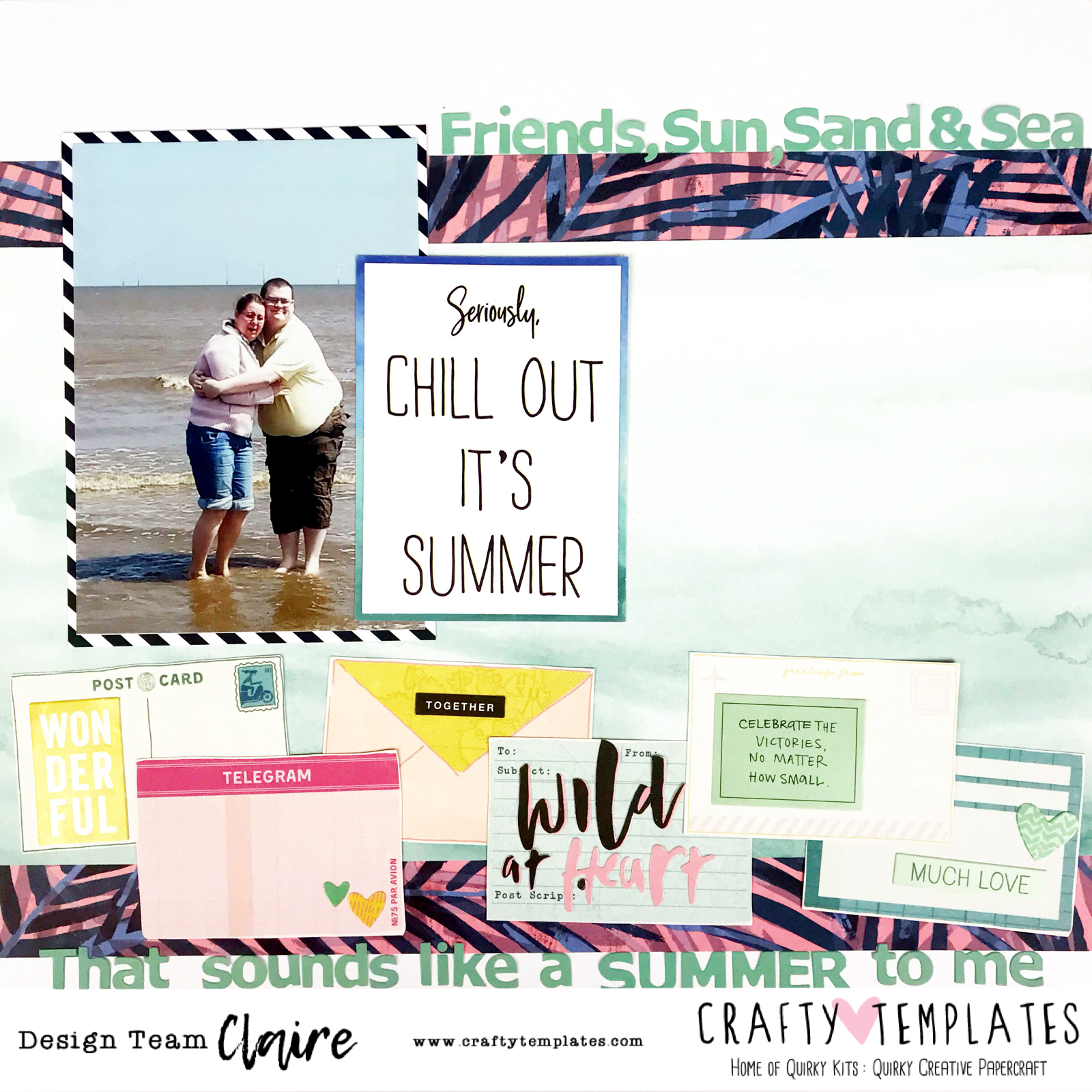
Luckily we had a couple of cooler days last week, so once I got back from my holiday, I was able to sit down and create a couple of pages. This first one features the lovely Heidi Swapp Pineapple Crush South Beach paper from the Main kit. I was almost certain that I would use the B side of this paper as I usually back away from big/elaborate designs, but it just goes to show, if you have the right embellishments and photo's to go with it, anything is possible!

Firstly here is what I used and how I created this layout.

Main Kit:
  • Heidi Swapp Pineapple Crush - South Beach 12x12 patterned paper
  • Crate Paper Wild Heart - Foiled speciality paper
  • Crate Paper Wild Heart - Sticker sheet
Lite Kit:
  • Crate Paper Wild Heart - Chill phrase Thickers
Embellishment Kit: 
  • Pink Fresh Studio - The Mix #2 Puffy Stars
  • Pink Fresh Studio -  The Mix #2 Cardstock ephemera pack
Custom Card Kit:
  • 1) 3x4 card
And here is how I created the layout:

I started off by choosing to print my pictures slightly smaller than 3x4. To do this I used my Silhouette design software on my PC, sized them, and printed them out onto photo paper. 
I knew I wanted to use one of the Custom cards for my journaling, so I laid the 2 photographs either side of that with the bottom corners slightly tucked under the card and adhered them all down, making sure to put the double sided tape in the middle of the card and photo's in case I wanted to layer anything around the edges of them later (which I did)


I then decided I wanted my title to frame the 3x4 card and photos and draw attention to that area, so I picked the Perfect Getaway phrases from the thickers sheet that came in the Lite Kit and popped it above and below the card.

I felt the photographs looked a bit naked on the page and needed a little something, but I didn't want to add more papers, as the backing paper was already busy. I grabbed the wild heart speciality paper and cut a 4 inch strip from it, saving the rest for another project, and cut out 2 of the banana leaves from it and placed those under the left and right photo's. I knew then that I needed to incorporate this in other places on my layout, so I started working on my 3 clusters. This time in a diagonal format.

The top right hand corner features 2 pieces of the Pink Fresh ephemera layered onto a banner sticker from the Wild Heart sticker sheet, and a glittery heart to pull in that gold/coppery foiling.

I had now brought a pop of yellow into the mix so I used another piece of the ephemera in the bottom left hand corner, which also featured yellow, and the same aqua colour, added another copper heart and some stickers with the same colour tones in from the Wild Heart sticker sheet.
To finish off the layout I carried on with the yellow and added two PFS puffy stars next to the top part of the title, and a foiled paradise found sticker to the left photograph.

I measured the space available in the journaling part of the 3x4 card and made my page that big on the Silhouette design software, so I knew what I had to work with. I typed up my journaling, printed it off and adhered it to the card...Layout complete!

I love that I'm using more bold statement papers. I really do encourage you to go out of your comfort zones, because sometimes, it might just surprise you!
I hope you like my layout, and I will see you soon with a pocket page spread.
Until then... Happy Scrapping!! xxx


Chill Out It's Summer | ScrappyNerdUK (Claire) | May/June 2018

Hello friends....

I've been having lots of fun with the current kit and bring you another layout using this kit.

I have worked on a white piece of cardstock for this layout so I could use the pink and blue floral leaf paper. Having too much of this paper on one layout I think would be too much so setting it onto white and just using hints of the paper really helps to tone the whole layout down.

I layered this paper with the aqua watercolour paper (my absolute fave from the kit) and this formed the basis of my background.

I chose a photo of some friends at the beach as when I think of summer, the first thing I think of is a beach photo.

I matted this onto one of the cards from the custom card kit (which is a great way to use the custom cards and they're not necessarily just for project life!!).

I then added another card from the custom card kit as my title and backed this onto yet another card and layered this over my photo.

I didn't add any embellishments onto this card and I love the pop of white on the layout that it gives.


Next onto adding some details. So I decided to add on a sub title and I used the Kaisercraft alphas to do this. I found a quote on Pinterest and used the top and bottom white edges to place the quote.

These alphas co-ordinate really well with the aqua watercolour paper. A little hint for these alphas - they don't seem to want to stick very well so pop a little dot of glue before sticking them down. I found that they'd all fallen off when I went back to the layout a week later so i'll give you this hint to save you the heartache later on. Or stitch through them would be another idea?! I then fussy cut the envelopes from the Here and There collection and decided to add stickers and sentiments onto each of these and this is where the main area of my embellishments would be. I normally embellish around the photo but wanted to try something a little different this time - and I really like it!

And here is the finished layout. This was very quick to come together and I love how it turned out.

Thanks for reading my blogpost and i'll see you all again very soon!!

Claire


BBQ Time | ScrappyNerdUK (Claire) | May/June 2018

Hello everyone...

I'm back with another layout using the current kit and I need to confess something. Green is not my colour so this kit was something that I thought I would really struggle with. But, I have made it work. And how have I done that? I have paired the green colours with other colours that I love and I think I have found a new way to incorporate colours into my scrapbooking that I ordinarily wouldn't include.

Wanna see some photos?

I loved the cards from the custom card kit. I usually use these in my project life or travellers notebook, but I also use these in my scrapbook layouts. They are perfect for creating a grid design and that is exactly what I have done here (loosely).

So I started with a strip of the aqua green paper measuring about 4 inches wife and laid this horizontally across the middle of the page. This was going to be the basis of where my design was going to go.

I chose 6 of the custom cards (all 3x4) and used 3 of them as they were and laid these horizontally along the strip so half of the card was on the strip and half was on the white cardstock. I then used the other 3 but cut them down to 3x3 inches and placed these underneath the top 3 cards.

I then set about embellishing each of these cards. I knew I wanted to put my photo onto the top middle card so I left that one until last. I added on the camera from the Wild Heart sticker sheet from the Main kit and to this I layered underneath some of the holographic gold leaves from the clear stickers in the Custom Card Kit. I loved how this looked and it really toned down the green colour.

I then added the hexagonal acrylic piece to the centre bottom card. I needed this pop of black and also the layout was very square and so this shape really broke up the monotony of a square pattern also. This is a great tip if things are too square.....add another shape in to break it up!! You can see the word Sun Shine on the top right card and these are also clear stickers from the Custom Card Kit.

I added a stay wild sticker and again layered underneath this the holographic gold clear stickers. I did add a little cluster to the top right of the layout also....another great way of breaking up the shape of a grid layout. This was a mixture of the stickers from the Main Kit and the clear stickers from the custom card kit.

Here is my third tip for breaking up the grid design - Ensure that you don't just embellish inside the squares - make the embellishments come outside of the squares to break up those harsh lines.

And here is the final layout. I hope that this has bought you ideas and inspiration and don't forget to share what you have made over on the Quirky Kits Facebook Group.

See you very soon.....


Two Different Ways To Use Pocket Cards That Aren't Project Life

Hi Leo here again!

This past week I worked on two pages both using pocket cards from the Custom Card kit. I don't personally 'do' Project Life' as I just find it too difficult to keep up with it but that's not to say I'm not scrapbooking everyday life just little pockets, (ha!) of it to add to my albums. I also like working with pocket pages as it helps to push me to use more than one photo on a page. They're really good for events too, like where you have lots of photos from one day and you're not sure how to scrapbook them. You can pick out your favourite one or two to do full pages of then add the rest in pocket pages and fill in journalling here and there with your pocket cards. Loads of possibilities!
OK onto my projects! I created a regular scrapbook layout using cards to make a 'cluster' base and I created a second layout using a pocket page protector but I've twisted it a bit to make it non-conventional too. I've made two process videos to show how I've made the pages you can view if you want to too.

Traditional Layout Using Custom Cards:


I used the Brusho from the current main kit plus a few off cuts of patterned paper and bits from the Jan/Feb 2018 Quirky Kits. If you've not had a play with your Brush yet watch the first part of the process video as I run through how I've been using the Brusho the most using the kit packaging to make a mono print, it's really simple to do and you don't get too messy either so it's worth having a play.
 
 
I also based it around the monthly sketch on UK Scrap Addicts:
 
 
Process Video: 


Pocket Page layout using a Design A pocket page protector:


For this page I started out with a Design A page protector and I've used cards and embellishments from the current Custom Card kit plus a few extra stickers from the Kaisercraft sticker sheet that was in the July/August 2017 Quirky Kit Lite, not the Jan/Feb one as I say in the video! I was using the Jan/Feb main kit Kaisercraft sticker sheet in the previous layout so I got totally confused!
 
Process Video:


But Everything Has Changed Now | ScrappyNerdUK (Claire) | May/June 2018

Hello Everyone....

I'm back with some inspiration using the May/June 2018 kit. I must admit, I've got a few layouts to share with you over the next couple of weeks so I hope you like everything I will be sharing.

I decided to tackle a topic that is often spoken about in scrapbooking and that is the topic of scrapbooking difficult times or situations.

When I saw the Heidi Swapp paper with the palm leaves, I immediately wanted to use it. However, I have no photos that would really fit the theme of this paper. Except one. This photo has been in my box ever since I started scrapbooking 2 years ago and I didn't want to scrap it due to family not being now what it once was. But, the photo of the sunset on our family holiday was perfect.


I couldn't bring myself to look at this photos in my photo scrap box and so I bit the bullet and dealt with it the only way I know how.....Make the page fit the memory I wanted to keep. So I decided that I was going to add a lot of journalling to this layout and so I folded one corner of the paper back to create a nice big clean space in order for me to do my journalling. This also bought another pop of white to complement the white matt I had put behind both of my photos.


I used a mixture of bits from the kits to create my title. Firstly I used the "Everything" sticker from the Wild Heart Sticker sheet in the main kit. The sticker read "This is Everything" but I just cut off the last word to make this work in my title. Next the little teal alphas from Kaisercraft were from the Lite Kit and finally the "Now" acrylic piece was in the embellishment kit.


This shows how well each of the kits complement each other and I love the different fonts altogether and it makes the title a real focal piece on the layout.


And here is the final layout with the addition of a butterfly and a couple of word stickers from the Wild Heart Sticker sheet. The addition of the 2 dates - 2012 and 2018 to signify when the photo was taken and when the journalling was written. And finally I added some gold holographic leaves and a heart in the top left cluster and also down in the bottom right of the journalling and these were from the custom card kit.


I hope this layout has inspired you to tackle some photos that might be difficult to journal about or scrapbook but these are all stories in our life and always think about wanting to remember what you thought and felt at the time and whether you would want to look back on that in years to come. I have overcome my hang up about completing a layout using photos that I can't bring myself to look at any more but they are scrapped and in my album and I feel great for getting down on paper exactly how I feel today. 

Claire x