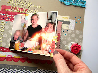
I've got more layouts to share today. I love the mix of fun bright and subtle tones in the kits this month so I thought I'd try and make some layouts keeping to the bright side and then going to the more subtle side. These bright papers said to me party/ fun so I picked out some fun photos of a little birthday tea party.
I started with the Amy Tangerine paper using the bright zigzag side and added strips of the Echo Park paper along the bottom and top edges. I used the cut off strip from the Amy Tangerine paper as a decorative strip stitched to the top of the page, I thought it was too pretty to throw away! I've used more of the fabric tape I made for the other layout, (see post bellow from yesterday).
I made two rectangles of paper, one the Crate Paper with the bright red/pink dots side and the lovely deep red Pebbles paper for the photos to layer over. The strip of calico I had a go at making pink using Cosmic Shimmer mist. There's a little bit of pink in the photos so I wanted to introduce a pink to the layout. The plain calico is perfect to add your own spray mists to. I also kept a piece plain because I really liked the texture. The chipboard stars I covered with turquoise glitter to match the turquoise lace. They do match in real life, the photo is making it look navy but it's defo bright turquoise ;-)
While I was playing I found out the paper bag from the main kit makes a perfect pocket for the tag from the lite kit so I used it like a pocket and put the journalling on the tag.
Now from bright to a more subtle layout. The subtle side of the kits lent themselves really well to a vintage photo of my grandma I had on my desk so I grabbed that and got to work.
All the papers I've used here are from the Lite kit. I added a little bit of the denim fabric from the main kit and a vintage label and kraft tag from my stash. The butterfly is from the 'Downtown Tea Party' kit from last year. Because the photo was small and subtle I really didn't want to add much to this page to take away from it. I used the Crate Paper with the subtle chevron pattern as the background. The pink paper is the opposite side to that, it's a strip that I cut off to make the page size, (8.5x11). I used a strip of the American Crafts grey toned paper along the bottom. It just helped to make the middle bit of the layout not so 'floaty', same with the little tag at the top of the page. I've used some of the Crate Paper border stickers as layers too. The shape for the title was cut out using a Nestabilities die, (labels 1).
After that I decided to mix up the two looks so I've mixed up the subtle tones and the bright tones on one layout.
It's going to be the opposite page to the cake page so I started with echoing the same chevron paper strips at the top and bottom of the page. The middle of the page is made up from the different off cuts I had left from making the other layouts. I used the border stickers for layering again and one of the narrow ones for underlining the title. The paper flower from my stash I coloured with the same Cosmic Shimmer pink mist to again pick up on the colour on the calico from the first layout. The same with the little dots of glitter. (I saw the glitter dots on Shimelles layout in the UK Scrappers class and really wanted to have a go at glittery splatters!). Under the flower is a piece from the felt garland I cut off to use as a layer. The photo here isn't just one photo I used more underneath it that pull out. This is really simple to do just using strips of washi tape.
Put two photos together then fix the two sides together with a strip of washi tape or masking tape.
Glue more photos over the backs of each photo you use but remember to keep one side the photo back so you can glue this side to your layout.
For the pulls I used some of the border stickers sticking them back to back over the edge of the photo.
I Concertina folded the whole thing up and glued the original photo on top so it lifts up:
Then pulls out to reveal the other photos.
I know interactive pages can be tricky in albums but I love 'touchy feely' pages. When they go in my albums I tend to just use cardstock pages glued to the front of the page protector as they're protected well enough with the page protected pages either side of it. You could also just add a layer of velum over the page or cut the front off the page protector so you can peel back the front of it to get to the interactive bits. :)
I'll be back soon with some card ideas to share.
xx Leo


No comments:
Post a Comment