Leo put one of her lovely sketch booklets in with my Prismatic main kit this month and here are the two layouts that I have done that have been influenced by the sketches.
Here is one based on the front page sketch
Mine is a pretty simple version. I cut strips of some of the kit papers and layered them up vertically but with a little bit of overlap to add interest. When I laid my photos over they top I discovered I had a little gap so covered that both with the "Bonjour" from the cut apart sheet but a tiny bit of branding strip (the soft green spotty paper just seen). I added the tag from the cut apart sheet partly because I like the note of surprise it adds to seeing a swing in a kitchen but also because it brings out the blue in the photos.
Before sticking the photos and tag down though i got out my Heidi Swapp gold mist as I knew I would be using the "Ooh lala" as a title and wanted to add some more gold to my base layer.
Here is a warning - those letters are VERY sticky. Should you decide that you want to move them, chances are you can't so try and put them on straight first time round!
I love the metal paperclips and so used two of them. To make that easier the photo on the far left is on foam pads.
Then it was just a case of writing some journalling on two of the jumbo labels and adding a shiny and a squidgy heart and some of the Echo Park element stickers
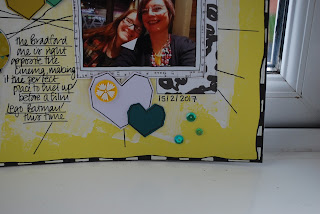
For the next layout I also challenged myself to use a non white background - in this case the flat yellow cardstock. I used a sketch that had lots of lines on it. But before I got going with lines I decided to soften the yellow a little using white gesso and some glitter paste
I added some lines and made holes in the page for faux stitching. But after the layout was almost finished I went back and added more plain lines because there weren't enough to make sense but my hands begged me not to do any more pricking!
Here is the finally finished page
I matted my two photos with black and white papers then grabbed some of the stickers and card heart shapes. I wasn't too sure about adding pink to the yellow and so turned the pink heart to the other side and had white instead!
I love, love, love the teal glitter thickers but they just didn't go on the layout so I grabbed a very old black foam sheet and some alphabet dies which worked pretty well.
I thought I had finished but it didn't seem right. Then I thought "lets go really old school" and added the black/white border. If you have never done one like this the secret is to do the black first which seems really counter intuitive, but the white gel pen goes on a treat over the black but black pen never looks so good on the white.
I thought I had finished it then, but later had to go back and add the sequins. It is really done now!
Both layouts took the sketches as a starting point, but as ever with a good sketch, there was room to put in something of my own as well, helped by all the lovely embellishments in the kit!


Love how you've used the yellow cardstock Lythan. Two amazing layouts! xxx
ReplyDelete