Lazy Days and Sun Rays | ScrappyNerdUK (Claire) | July/August 2018

My favourite time of the week is 7pm on a Tuesday evening (fortnightly) and this is because I get to do a Facebook Live video for the Quirky Kit community over on Facebook!

So this week I was working with a sketch I found online by Lisa Hidy. And here it is -
I was inspired to use this as I had quite a bit of paper left in my kit and I loved the challenge of trying to incorporate the layers. That was my plan!
My plan soon turned into something completely different. However, I did draw inspiration from the top and bottom borders of the sketch (I just missed all the layers in the middle). Some more muted papers would have worked fine but I only had busy patterned papers left to work with. But a sketch is only a design guide and its there for inspiration.
So, onto my layout....
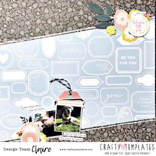
I loved the floral paper from Pink Fresh Studios and knew it was destined to be fussy cut! I grabbed my scissors and I am like a woman possessed when I am fussy cutting and hacked away at the patterned paper until I had 3 flower clusters cut out (I only actually used 2). One of the flower clusters was going to be used to the top right of the layout and one to the bottom left - with the photos placed somewhere between. I added into each cluster a circular element to break up the straight lines and even tucked a tag behind one of the photos. I used the tab from the Pink Fresh Die Cut pack to create my title. These photos really didn't need a bigger title as there wasn't really a story to tell but the die cut piece said "Lazy Days and Sun Rays" which was perfect for these photos. 

I then added in a few Tim Holtz tiny word stickers (from my stash) and added some white pen lines onto the black patterned paper - and hey presto. This layout took me less than 40 minutes and that included the time it took for the fussy cutting. And the layout was finished pretty quickly and for someone that loves white backgrounds (thats me, guilty as charged), I love the blue background on this one.


Thanks for reading and i'll see you back here in 2 weeks!!

Claire x

Love and Laughter

Hello everyone! I am back today with another blog post, and as promised in my last post, I have a double page spread for you featuring 7 photographs!
I tend to not make many of these kind of layouts, but it is a great way of documenting lots of photographs, from the same event, in one go.
So below you will find a breakdown of what I used and how I created this 2-page layout :)

From the Main Kit:
  • Crate Paper Willow Lane - Blossom 12x12 patterned paper (both sides)
  • PFS Simple and Sweet - Ephemera Pack
  • Pebbles Jen Hadfield My Bright Life - Little Thoughts 12x12 patterned paper (both sides)
  • Silver pocket watch decorative brad
  • 2 x white 12x12 cardstock
From the Lite Kit:
  • PFS Simple and Sweet - Fresh Air 12x12 patterned paper
From the Custom Card Kit:
  • 1 Black Label
From the Extras Store:
  • PFS Simple & Sweet - Gold puffy alphas
Here's how I created my layout:

I started off by using 2 pieces of white cardstock as my bases, and cut 4 strips measuring 1.5"x12" from the CP Willow Lane Blossom paper, which I adhered to the top and bottoms of both pieces of cardstock.

I then positioned my photos roughly where I wanted them and used some pieces of the Pebbles Little Thoughts paper as accents, placing one big piece where I will later type up my journaling, one under the photo and one in the bottom right hand corner to highlight my embellishment cluster.


From the same sheet that I cut the border strips from, I used the other side to fussy cut some of the flowers to use as ephemera alongside the PFS simple and sweet ephemera.

For my title, I cut up one of the pieces from the Fresh Air patterned paper, which reads LOVE with an arrow, and underneath placed the words and Laughter in the PFS simple and sweet gold puffy alphas (available in the extras shop from today) 

That was that page completed. 
The next page all I had to do to finish this one off was to cut out two of the square cut aparts from the Pebbles paper, this time using the other side, and layered them on some of the B side using foam squares. I pierced through the top corner of the left one and pushed through the silver pocket watch brad.

The finishing touch was one of the black labels from the custom card kit, which I will place the date on that the photos were taken

And here is the 2nd page completed. So as you can see from both pages that I manged to use a total of 7 photographs which is great if you don't want to bulk out your albums too much by scrapping 7 individual layouts of the same event.


I hope you like my layout(s) and I will be back in a couple weeks when its new kit time! Until then be sure to keep an eye out on my Instagram @Plcraftygal, for more layouts using all quirky kits as well as other layouts I upload. 

See you all in October...Happy Scrapping!!!

Love - Natalie

Hi everyone,

I hope you are enjoying this month's kit. Here is my 2nd layout using the kit. 


Supplies used:

Main Kit:
- Pinkfresh Studio (PFS) Simple and Sweet - Good Company 12x12 paper
- PFS Simple and Sweet - Happy Life 12x12 paper
- PFS Simple and Sweet Ephemera pack.

Lite Kit:
- Pebbles Patio Party 3D flower stickers 


Embellishment Kit:
- PFS Simple and Sweet Puffy Stickers

Own stash:
- Alphabet stickers


I started off with the beautiful "Good Company" paper and I knew I wanted to use the side with the heart in the middle and the concentric rings. I spent far longer than I care to admit staring at the paper, trying to figure out how to use it, until I saw a photo pinned on my noticeboard that I thought I might be able to cut into a heart. Allowing me to use a photo without taking away the design of the layout. 


I then created my first flower cluster around the photo. I used the gorgeous 3D flowers from the Lite Kit, along with fussy cut flowers from the "Happy Life" paper. I love how these fussy cut flowers look in black and white, but you could also try colouring them. 
I added my main title using alphas from my stash, making them fit around the curve of the heart.


To the bottom right I added a second cluster. Using more fussy cut flowers and a 3D flower. I then also added a yellow puffy flower sticker, and a pink flower from the ephemera pack. And again I added 2 more words along the curved lines.


To the top left I added a matching cluster with similar elements. 

I then added a 1/2 inch strip of paper from the "Happy Life" paper to the top and the bottom of the layout, to contain it, and to co-ordinate with the fussy cut flowers.


Overall this is a very simple and minimalist layout for me, but I love it! The photo is very small and there is no journaling, but I have already scrapped this photo before, so this layout was just for fun really!

See you soon with another layout,

Natalie x

Cousins | ScrappyNerdUK (Claire) | July/August 2018

One of my favourite things to do is share my layouts being made live on Facebook on the Quirky Kits Facebook group. This is something that is going to be a regular feature every 2 weeks and I love seeing layouts made by others during this live scrap along.

The layout I made today took roughly 30 minutes so this is great especially if you find yourself short of time.
I took inspiration from a sketch I found online by Amy Kingsford based on a layout by Kelly Noel.


 I absolutely love using the custom cards from the custom card kit, in as many different ways as possible. One of my go to techniques is to use them on a scrapbook page and this sketch was absolutely perfect for one of the 3x4 cards to be used.

I then placed the photos, all backed on some white cardstock, around this card in almost a grid formation.

Next I added a 1/2 inch strip of patterned paper at the top and bottom of the layout. This was to help contain the layout as I was working on a light coloured background. An alternative to this would be to draw a border around the edges of the layout, or remove a 1/4 inch from around each side and mat the layout onto a darker piece of cardstock or patterned paper.

I then added a couple of thin strips of patterned paper to the left of the photos, keeping in line with the details on the sketch.

I then embellished in 3 areas, using the amazing layered stickers (Pebbles Patio Party) from the Main Kit.

I then added a piece of ephemera into each cluster and this was to move the black around the page as the black was featured underneath the custom card and needed moving over to the left hand side of the page also.

I then added a few gems which were from the Extras Shop, and I tucked 2 of these into each cluster.


And here is the final layout. I loved the composition of this one and it came together so quickly and easily - especially with the help of a sketch.

See you back here again soon for another layout from this kit. And be sure to join me every other Tuesday (2 weeks from today) for another Scrapalong Live.

Claire xx


Seek Out The Joy

Hello everyone! How are you all?
I'm here today with my 2nd layout! After a tonne of sewing, sore and pricked fingers and a few choice words (hehe) It is finally finished.
Here is what I used and how I created it.

From the Main Kit:
  • PFS Simple and Sweet - Good Company 12x12 paper
  • PFS Simple and Sweet -  Denim fabric Die Cuts
  • PFS Simple and Sweet - Ephemera Pack
  • American Crafts - Gold Glitter alpha stickers
  • Gold Pocket Watch Decorative Brad
From the Lite Kit:
  • PFS Simple and Sweet - Fresh Air 12x12 paper
From my own stash:
  • Multi Coloured Threads
From the extras shop:
  • PFS The Mix#2 Puffy Stars
Here's how I created my layout :)

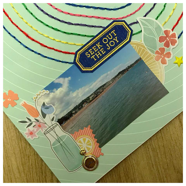
First I used my Sizzix stamping secret mat with the pokey tool to punch lots of holes around the heart outlines. If you don't have this, a simple mouse mat with a sharp implement such as a needle or pin would work. I used a selection of different coloured threads from my own stash, with no real colour theme in mind. Once I'd used each colour once I decided I wanted to repeat the colours again. I wanted the heart to be quite big and bold and stand out.

Once I'd finally finished all the stitching (it took me a few days on and off) I arranged where I wanted my photographs to go and started laying out the ephmera and other cut aparts i'd chosen and layered them under/over the photographs before adhering anything down (as pictured below)

Once I was happy with how they all looked I popped some adhesive underneath trying not to move anything. I used some of the cut apart labels from the PFS Fresh Air paper that came in the Lite kit and also some of the Demin Fabric die cuts. These added some bold elements that your eyes are automatically drawn to.

To finish off I used the American Crafts gold glitter alphas to pop the date onto a piece of the PFS ephemera and layered some more pieces with it to make my 3rd cluster. I also popped in the gold pocket watch decorative brad from the main store in the bottom left hand corner as I wanted to bring in a tad more gold. They are so freaking cute, I love them!
Some small puffy stars from the extras store were added as a finishing touch.


Here is the finished layout and I love it! Such bright fun colours and summery elements which went perfectly with my holiday photo's taken in Torquay. 

I will be back next week with my 3rd layout using the July/August kit. Don't forget to add your layouts to the Quirky Kit Facebook group as we love to see what you're creating and how you've used your kit.
Until then...Happy Scrapping Everyone!!!

Family Gathering | ScrappyNerdUK (Claire) | July/August 2018

Hiya Friends....

I have here the layout I created in last weeks Facebook Live on the Quirky Kits Facebook Group. 

I love when layouts come together so quickly and this is purely down to having a fantastic kit to use. It takes a lot of the hard work out of deciding what products go to together - which leaves more time for scrapping and having fun.

So, what did I do on this layout...

Well I started with some patterned paper to the left and the right of a 12x12 piece of white cardstock. I knew I was going to use both areas as a base for where my photos were going to go. I used both frames from Pink Fresh Studios. There frames are great as they are already embellished which takes all the hard work out!!

I used a corner of each photo/frame to add my clusters of embellishments. I used some die cuts from the Pink Fresh Studios pack, some gems from Kaisercraft and the pocket watch brad was one of my faves to use and this was added into the cluster also.
I then added the title into the white area between the 2 photographs. I loved the gold of these Thickers and the title was perfect for using some old school photos of the parents!!


For more Live scrap alongs - be sure to head on over to the Quirky Kits Facebook Group!! 

See you soon - right here!! 

Claire xx