Its funny how using the same kits for several layouts can still mean that you end up with very different looks. Here is a case in point - a (fairly) clean and simple and a (more) distressed kind of look. Both use (almost) only the Lite and the Embellishment kits for this month.
I loved the strips paper that came in the lite kit. But I am not so keen on "flat" paper. So I cut up a load of those strips and also added a few bits and bobs from other papers as well. I drew a square on the paper with pencil where I wanted the photo to be and then added the strips all around, incorporating some of the letter and word stickers from the embellishment kit as well.
I knew that I wanted to use that wonderful gold die die cut from the lite kit and so once the papers were adhered I added a copious sprinkling of Gold Lame mist. I don't always manage it but my tapping skills worked well and I had lots of lovely big spots. I also decided to add some gold to the vellum leaves. I forgot that vellum and wet stuff don't really go well together. However mini glue dots were my friend and you can't tell now, but it did all furl up totally.
I inked the photo (but not the papers just for a change) and stuck it on the top with foam pads. The die cut word was attached with a tiny attacher. I coloured some of the staples gold with a krylon pen. I was able to attach it by opening up the attacher in the rather clever way you can. I am not that clever with my aim though :)
I wrote my journalling reflecting more on the die cut phrase than the actual photo. I liked the idea of using a photo of travelling upwards but without the whole family in it.
Then I added more of that lovely confetti from the Lite kit and a wooden Prima leaf from the embellishment kit.
For the second page I started off with a sheet of plain white cardstock. It doesn't look like it now though - apart from the warpiness (which you can't see once it is rammed into a scrapbook)...
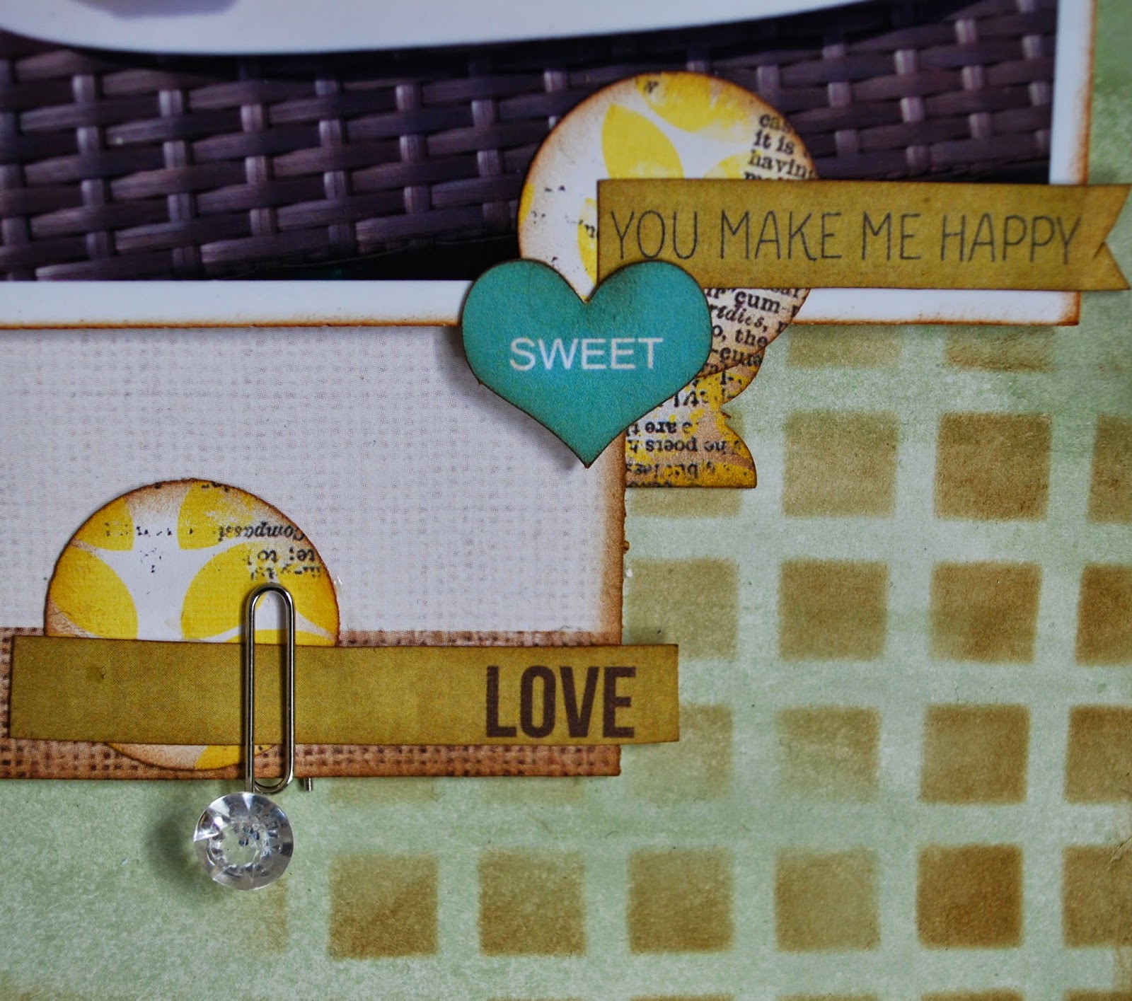
I used a Donna Downey damask stencil with some white texture paste. When it was dry I painted over the whole page with water colour, making sure that I dabbed it off the white parts as soon as possible.
Then I went a bit mad with a square stencil and some brown distress ink. The idea was to echo the texture of the table.
I chose some elements from the
Kaisercraft Take Note Collection ‘Journal’ patterned paper and I also punched some circles from the Bo Bunny Sweet Life ‘Spring’ paper, trying to make sure I had some of the yellow in the paper showing. I also used a scalloped border punch on the same paper.
I layered up my photos onto the Crate Paper Craft Market ‘Textures’ paper making sure everything got an inking with brown Distress Ink. I added in two of the pins from the embellishment kit, folding them over so that you can see the gem better. I also used some of the adorable wooden frames. I did sneak in the "yum" from the main kit as what better word could there be to describe the food we ate :)
The finishing touches came with the title and the cute wooden bird. Added just because it was a cute wooden bird to be honest.
I've got very little paper left from any of the kits now, but I did squeeze out one more layout which I will share very soon.


I love both of these layouts but particularly the first which I may have to scraplift if you don't mind!
ReplyDelete