Quirky snap

I love the photo that is on the first layout that I did with the Lite lit - Carrot Cake Muffin
The quality of the photo is not great - I travelled for 2 hours on 2 ferries from one end of the Shetland Islands to the very top of Unst... and found I had left my camera at my friends house. So all I had were rather grainy Blackberry shots (Blackberry's are not famed for their photo quality) and that will have to do.
 
 And I think you can see why I had to take a photo. This most notherly in the UK bus shelter gets a new look every year. I was going to try and make a layout with just the Lite kit but you will see that I could not resist a few extra embellishments from the other kits that were just the perfect finishing touches - especially that chipboard "good idea" in South African colours! 
The layout is based on another Leo sketch. To begin with, the red cardstock (the leftover strips from the Beautiful bus stop layout in the post below) was the top and bottom of the right hand side but it didn't look right so I found some vellum, inked it and filled in the gaps. 

Geometry not being my strong point, it took a bit of working out to get those diagonal stripes in place but I managed in the end!
The letter stickers are the Jillibean Soup ones from the kit but my trusty Sharpie pen came into the fore once more and turned them black.
After adding the journalling, it was just a case of adding that red heart and two of the gorgeous Prima flowers from the Lite Kit.
Who needs a great photo to make a great page?
(Well.... they are nice but basically don't beat yourself up if you don't have one. Better to get the memory recorded in my opinion and use lovely papers and embellishments like this kit to show them off as best as you can)
And if you want to see the Unst shelter in all its glory look on Facebook or go here to see what it was like in past years

Simply sketchy

Leo put some more sketches in with the main kit this time round and I was very taken with one in a simple graphic style.
I've started to do a lot of pretend Instagram photos by cropping them square in Picasa and printing them out. These photos were mounted on white cardstock after having the corners rounded and being outlined with black pen. I loved the way that the red of the bus shelters matched the red of the cardstock in the kit but wanted to have a bit more restful white. So I gutted some white cardstock (taking 8x8 from inside) and trimmed down the red to 11 1/2 by 11 1/2. That left me enough for my photo mats and journalling block which I cut using a metal die.

I adore those wooden clouds from the Marshmallow dream bar embellishment kit so added them to the top of the page.

The rest of the layout pretty slavishly follows Leo's sketch - except that I overlapped the journalling panel with the strips of patterned paper.
I added two of the chalkboard style stickers - one of which forms the title along with some letter stickers from the last kit.
I turned the orange and cream chipboard button to red and white using sharpie pens so they would fit better with my colour scheme
and also customised the stripy paper to harmonise everything better - with black pen, washi tape and some of the green/yellow dot paper.
And finally I added journalling and a few gems. Everything looks better with a few gems :)

Adventures in Planner making - Shopping for your perfect planner

Hi! Leo here

Today I want to give you a quick heads up on a new little series of blog posts coming up here on the Quirky Kits Blog all about planner making.
Have you got caught up in the scrappy planner trend yet? Lots of stationary style scrapping goodies have been popping up this year inspired by the planner trend and there's more set for next year too, (there will be some in the upcoming Nov/Dec Quirky Kits!).
With the turn of the year coming up I think it's a good time to get set with a planner for everyday, (whether that inspires you to scrapbook in a planner too is another thing?).
I think they are brilliant projects to start the new year with and major plus, it's a project you can do with supplies that are in your kits and stash already so I wanted to do a blog series about ideas customising planners with your scrapbooking supplies.
This first introduction post is about looking for that essential bit you need for planner making and that's the planner itself!

Shopping for your perfect planner

I have looked at some of the scrapbook planners online and while they are nice, for me I think there are so many lovely planners and personal organisers already on the highstreet to choose from I didn't want to be limited to scrapbook company ones. I'm also thinking of a planner as a personal organizer as well as somewhere to keep notes and inspiration bits in so I wanted my planner to be a standard size so I can use standard size refills in it if I wanted to, as well as it having a week to view diary in it. So taking all this into account I ended up at one of my favourite UK highstreet stores, Paperchase!

There are so many pretty planners/organisers to pick out and it's a personal choice to which you go for so first off ask yourself what you're using your planner for? That should dictate which size would work best for you. I like lots of space to work in and it'll primarily be a desk based one so I went with an A5 size one and the one I picked out was this one:


Paperchase have so many planners to pick out, from really colourful patterned ones like the one I picked out to classic ones, if you preferred a simpler style this one I think is lovely!


It's a personal size one so it's slightly smaller than A5 at 140mm x 188mm which is about 4cm smaller than the A5 size ones.
There are also lovely original Filofax ones in pretty patterns like this one:

http://tidd.ly/20d1446

Another thing I liked that I could pick up from Paperchase at the same time were some matching pens to add inside the planner. I went with fineliners because I like writing with them. One is a black fade proof ink one, (uni-ball eye black pen, these are good for scrapbook journalling too) and the other is a pink one I can use for highlighting, (Pilot V5 pink). Both of course I also had to pick out because they matched the planner colours!


I wanted to share another planner base idea too, not just a personal planner, one that you could make completely your own inside and out. So I've picked out one of these A5 ringbinders:


Paperchase A5 Kraft Binder

It's the same size as the A5 organiser:


The inside has 3 rings rather than the standard 6 rings organisers have though:


These would be really good to create a planner completely from scratch or make use of the printable planners you can download online to make your inside pages, mixing in note paper and scrapbooking paper pieces to glue things on top of. You can get ready made filler pages for them here so you could if you wanted to use those to alter with your own papers. I will work out a template page to fit it for us though.

That's all for this first post in the planner making series. I'll be back with the second installment in just over a weeks time where we'll start picking out items from your scrapbooking supplies good for planner cusomising! There's an accompanying Pintererst Board I've started up here, http://www.pinterest.com/craftytemplates/planners-organisers-stationary/
x Leo 

Enjoying a blueberry scone

the fat free version that is the main Quirky Kit that is!
Although the kit has lots of autumn tones and I am still scrapping summer pics it all still works I think - mostly thanks to the fabulous colours of those cute puffins!
I had decided that I wanted to lay them on some strips of paper but when I first put everything on the page it all looked a bit sad and bare so I decided to do a little something with the green cardstock first.
I pulled out a Kaisercraft background stamp and some orange/yellow distress inks. I don't use a stamp block with these stamps so that I can get a varied pressure and density of colour. Next I grabbed some texture paste and a stencil. It is really leaves but I think it just about gets away with looking like feathers! When that was dry I sprinkled black, gold and shimmery yellow mist about the page. And while that was drying I inked everything with loads of Black Soot ink.
I also took some of the hessian and die cut three different heart shapes with it, spraying some more of the yellow mist over it as well.
I took the oak leaves from the kit and using distress ink turned them orange to match those awesome puffin feet.
Then it was just a case of putting everything together, adding the copper satin ribbon for extra texture.
I made some embellishment clusters
and dotted some of those lovely buttons and brads around the place
In order to bring some more of that lush blue from the Heidi Swapp letters into the layout I cut into an "X"  and added the bits in two other places. The ribbon looks extra bright in the main photo but really is just a lovely tonal echo to the puffins feet and beaks.
Can you tell I like puffins?
And I love the kit even more :)

Mixing and Matching

Hi! Leo here again.

I've been playing around with the three new kits some more. First up is my card for Daring Cardmakers this week, which I've made mixing up goodies from all three new kits:

Used: Paper, charm, navy shell button and sequins from main kit. Washi tape, wooden heart and plastic flower from embellishment kit. Gems from the Lite kit.

The label was made by typing out the sentiment onto one of the kit digi labels, (you can get them here) before printing it out. I also found that the smallest gems in the pack from the Lite kit fit into the centres of the flower sequins and I think they look really pretty against with the white on white? You could use them like this on a scrapbook page background too. The gems in the embellishment kit would work too.

Next I made another autumnal recipe layout using just the main kit. The recipe card was made with white card edged with patterned paper strips and a printed digi label glued in the top corner. The card is loose and it's slipped inside the top of the paper layer on the lower half of the layout which has the top edge open.


I could've left the letters blue as they are but I wanted to colour them to match the layout theme so I first used white acrylic paint to colour over the top and left that to dry.


 I then painted over different colours over the top. I liked the texture so I used a dry paint brush and neat paint, (with no water) to allow some of the white to show through. If you wanted to recolour the alphabets and keep them glittery you could paint over the tops with glue and sprinkle a different coloured glitter over the top.


Finally I've got another mix up layout. Here I've mixed up the Sept/Oct Lite kit and embellishment kit. I've also used some of the digital cut out files that were in the extras store, (you can try out one of these here, to cut out with your Silhouette just open the saved image in Studio and use the Trace feature to get the cutting line then delete the original image).
I use some kraft coloured card left over from the Jan/Feb kit. I love how you can make new embellishments like this from old scraps of paper.


I cut up the Echo Park 'Simple Life' paper to make more embellishments for the page, don't think of the paper just as cut-up-able for the card shapes as there are lots of cute illustrations and patterns to cut out on each card that you can snip out and mix up.

On the edge of the layout I've used three strips of paper glued down at slight angles just to create a different layering effect. Layer them down along the edge and then cut off the overlapped edges to the straight edges of the background cardstock.


Hope these have given you some ideas for mixing up your kits and matching kit goodies to your layouts!
I'll be back over the weekend with something a bit special - if you're looking to get into scrappy journals but not sure where to start I've got some ideas to share - be forewarned there will be links to buy pretty goodies so you may want to grab some paper to make your wish list for Santa!

If you have a Christmas Quirky Kit too and are looking for ideas I'll be starting the mini album properly in November to give me the push to finish using the Sept/Oct kits first. I have been playing a little with the kit before I made myself put it away and I'll be adding cool things I find online to the Christmas Kit Pinterest Board, http://www.pinterest.com/craftytemplates/christmas-2014-quirky-kit/

x Leo

A Simple Recipe

Hi Leo here!

I made a layout for Simple Recipes over on UK Scrappers using bits from the new kits so I'm doing a little more of an 'in depth' look at some of the ideas I used making the layout.


The background of the layout is built up with four patterned papers. It kind of looks like four papers layered on top of each other but each of the upper strip are just 2 inches wide and they're graduated and stuck together on the back with doublesided tape.


If you use doublesided tape you can use it to stick the layers of paper together first then when you're happy you can peel the backing off and use the same tape to fix it down to your cardstock.


The last layer is the largest, it's the size of the rest of the sheet minus the size of the top strips you want to showing. It's a nice easy way to get the effect of lots of layers of paper without use up your whole sheets.


The next technique involved creating recipe cards stamping with rubber bands.
To start with use a wide band and wrap it around a clear stamping block. Ink the band up well, I used a chalk ink as it had lots of pigment in it so it was easy to get a good impression from.


Line up the band with the edges of your cut out piece of card and stamp around the edge. This is a 6x4 inch stamp block I'm using so I cut out the card to 6x4 inches too. Obviously you can make it smaller but it's much easier to do one line rather than try to match up the lines so I wouldn't go larger than the stamp block size you have.

Narrow rubber bands are good for stamping lines. You can use these for any kind of journalling card, doesn't have to be a recipe card.


Here's a finished recipe card where I've mixed the wide and narrow rubber band stamping. Because you're stamping rather than printing with this idea you can experiment with what types and colours of ink you're using and even try embossing so you can create metallic gold or silver ones or glittery ones with the glitter embossing powders you can get. 


Another thing I did is use one of the Teresa Collins vellum stickers to make a glittery title. When I went to use these I discovered just how sticky they are! Really sticky so that got me thinking of using something like glitter on the back. It was just a case of sprinkling the glitter of the back of the sticker and it was sticky enough to cover the whole surface. I don't have micro beads to try but I'm sure something like that would have worked too. There are other things I want to try too like gold/silver leaf, any of those kinds of gilding flakes or foils could be good!


I'll be back with more soon. I'm working on a series of blog posts about planner making with your existing scrapping supplies. I've really been determined to do something without spending more money so my base for my planner is a trimmed down ring binder I wasn't using anymore. I'll let you know more as I get to properly start it. I have set up a planner making Pinterest board here where I can put ideas and cool printables as I see them.

x Leo

The new Quirky Kits run through part 2!

Continuing the run through of the new kits the next one is the new Lite kit 'Carrot Cake Muffin'. Carrying on the kit theme too, (and to get your inspiration going for Baking week this month!) here's a recipe for carrot cake muffins, http://www.bbcgoodfood.com/recipes/470640/carrot-and-cream-cheese-cupcakes
I use carrot cake recipes and substitute the carrot with pumpkin to make pumpkin cake too, adding a little bit of nutmeg to the icing instead of cinnamon or vanilla really works with pumpkin cake too.
OK onto the kit!
In the embellishment bag are these fun quirky note cards in cloud shapes. You can use these for journalling or just as embellishments to highlight a title.


Prima Coffee Break flowers. 


And some super cute mini envelopes from Jillibean Soup. Again these are good for adding journalling inside, (maybe on a tag) or to use as a layer. The little size makes them good as embellishments on cards too.


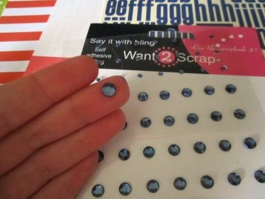
More embellishments in the kit include a pack of navy coloured bling stickers,


and a cardstock alphabet sticker sheet.


You also get some coloured raffia, this is another May Arts trim. You can use it on cards or home decor projects or my personal favourite would be to use it in gift wrapping. It's a little touch of rustic that works well in Autumn.


In the papers with this being the Lite kit I've picked out a paper with cards on so if you want to you can use the paper as an extra sheet of embellishments. The jewel tones of this Echo Park one work really well for Autumn I especially liked the top three cards on the sheet.


The other papers are all jewel toned too. We've got a new manufacuter to try this month in Chickaniddy Crafts paper. I liked the deep orange colour of the stripe paper and it's a good on for Halloween or Autumn or everyday.


If you're not feeling the brighter colours I also made sure the other sides had a subtler look so you can flip them to get a different feel.


This kit like the main also has a hint of mint and navy which has been a key inspiration for the kits this month. Mixing just the subtler tones in the kit gives you a different look again.


Next we have the Embellishment kit 'Marshmallow Dream Bar' There are a few different recipes for Marshmallow Dream Bars I found online. Lots of them involve chocolate and Rice Krispies. They're also Rice Krispie treats, the kind with the marshmallow. With it being half term this month I did think this could be something fun to do with little ones so I've picked out two recipes for Marshmallow Dream Bars this one, http://www.sheknows.com/food-and-recipes/articles/1027417/copycat-starbucks-marshmallow-dream-bars-recipe and then for adults how about this one, http://www.cupcakediariesblog.com/2010/10/marshmallow-dream-bars.html#_a5y_p=1890508 which is basically a brownie recipe with melted marshmallows on top and then an icing similar to a chocolate fudge cake one. I've not made the second recipe but reading it I think I'd have to put some strong dark coffee in the icing, (along with the cocoa) or use some real dark chocolate in the brownie base just to make it not as sweet with all that marshmallow but still chocolately! Let me know if you have an experiment with the recipe. 

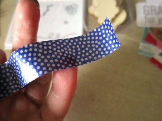
On to the kit. One of the first things I picked out for the kit was this lovely washi tape from Love My Tapes. It's sold as navy but for me this is more of an indigo colour, it's lovely and it set me off looking for slightly brighter colours in the embellishment kit but still using the inspiration of the jewel tones.

These little Prima Coffee Break stickers are a bonus for you, they weren't meant to go in but I just couldn't resist them!


These little clouds are by Maya Road. I've put a half pack in per kit just because they were all the same design repeated four times so I figured that was too many of the same thing. Wooden embellishments are great for adding a rustic element but you can also ink them or paint them to give them a look you want. How about making them all grey and black for a Halloween project!


The Elle's Studio Sycamore Lane line is adorable but there were quite a few of the things very 'US' with thanksgiving and fall themes so I picked out the Little Bits and Pieces embellishment packs for kits as they have great universal sayings and look Autumn!


These chipboard stickers from MAMBI are really fun too. I loved all the different fonts and the addition of the colour to the chalkboard just lifts the look.


The mint hint is here in the embellishment kit in the form of these yummy gems from Kaisercraft. If you're lucky enough to have the Lite and embellishment kits you have to mix your navy and mint gems embellishments together for at least one project, lush!


These vellum stickers I thought were interesting too, they don't go quite clear they take on the colour of what you stick them to. 


You also get a pack of buttons from Fancy Pants. Some are chipboard and some are resin and they have foam dots so you can use them as a quick stick embellishment or sew them on like buttons. You may also notice if you have a main or Lite kit some of these colours and patterns are in your papers too!


Last but not least are these amazing metal flower embellishment packs from Prima. I absolutely love these, they so remind me of 1950's/60's brooches. I also like how they're some that are flat so you can use them on scrapbook pages.


Even the ones that have a bit of dimention you can squish down to make them flatter.


You can also stack them up and mix them with the resin ones to make 'jewellery' style embellishments that would be brilliant for cards or home decor. I'm so going to use some of these to make jewellery!


OK hope you enjoyed the little kit run throughs! I'll be back with my first layout for you on Sunday. Don't forget to check out the Pinterest Boards for inspiration too, http://www.pinterest.com/craftytemplates/ I just started a new board for planner inspiration. I'm in the process of making a planner type project using scrap supplies which I'll share when it's a bit more finished. I've used an A5 ring binder as the base for it and it's just a case of chopping and clipping in so far!
x Leo