Adventures in Planner Making Part Two - customising with your scrapbooking stash

Hi! Leo back with another round of planner making/decorating ideas. I left off last time with what to put inside your planner. You can read the first part of planner making here, http://quirkykits.blogspot.co.uk/2014/10/adventures-in-planner-making-shopping.html where I showed you what planners I started with, one is an A5 planner and one is an A5 plain ring binder both from Paperchase.

This weekend Paperchase have a special offer for us with 20% off your order when you shop online. All you need to do is enter code PAPERTREAT20 at checkout to get the discount. 

OK onto part two of planner making. This time I'm looking at what you can use in your scrapbook/papercraft supplies to customise/make your planner with. I've gone through my supplies from all my bagged up Quirky Kit bits and pieces left over and pulled out the kinds of bits and pieces I think would work well in planners.


  1. Patterned paper off cuts are always handy and I don't like throwing away some of my favourite patterns even if they're only little bits but the little bits are perfect for little planners!
  2. Mini cards, these were all cut down from the sheets of paper that have the mini cards on them, we've had a lot of these over the year in kits.
  3. Tags
  4. Pockets
  5. Mini alphabet stickers
  6. Rub Ons
  7. Washi tape
  8. Little embellishments
  9. Stickers
  10. Clips and charms
There's so much in your scrapping stash you can use in customising planners. The only rule I think I'd stick to is to not use anything too bulky because you want your planner to last though the year so you don't want to be taking up too much space with bulky embellishing.


OK onto what I've been busy doing inside the planners. To start with I'll show you the inside of my kraft ring binder one. Because the inside is empty I can really go all out with this one and completely customise it. I had a think about what I had in my supplies already and one thing I have plenty of is paper and cardstock so what I decided to do is make all my pages with that. This planner for me is going to be all about jotting in and clipping in lots of arty bits and pieces but don't be put off by that if you prefer a neater look because the beauty of starting with the plain kraft binder is you can totally customise the inside and outside to suit you. You can also make it to suit what you need to organise like maybe a recipe planner or one just for lists or for finances or work whatever you like.
I started off with a 6x8 inch piece of card from some packaging and made a template of where the holes on the binder are. This was just a case of drawing a line a half an inch from the edge then butting the card edge up to the rings until it was central then I made lines with a pen where the rings sat against the card and where the lines crossed I punched out the holes.


With the template I can then use it to mark where the holes need to go on each of the page I make:


I went ahead and made a whole bunch of pages at a time. Some is cardstock and some is scrapbook paper. The nice thing about ring binders is you can take out pages or change them around later on so it doesn't really matter what you put where.


As well as regular flat pages I made a couple of different ones too like a fold out one like this which I edged with washi tape where it folds out:


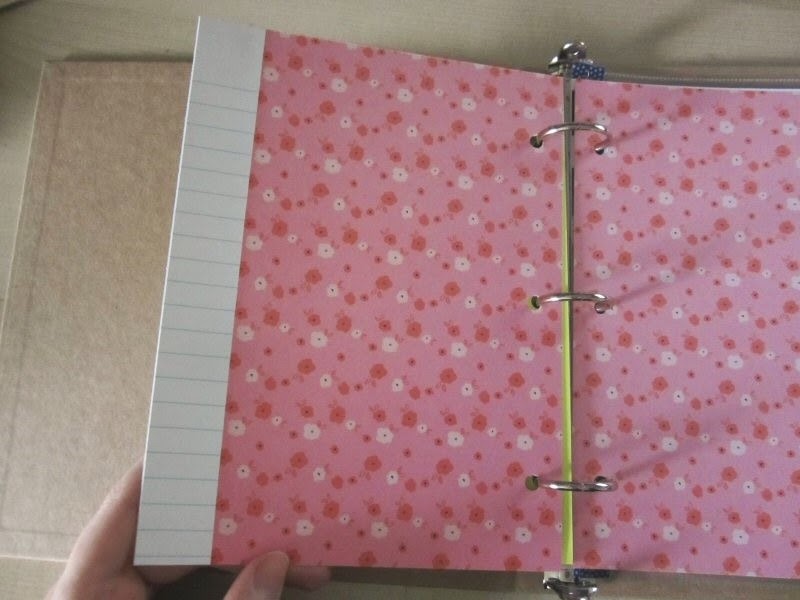
This one is scrapbook paper with note paper edges just to make it look different.


This one is a pocket I made with printable acetate. I printed on the words and then cut it in half, (it was an A4 sheet) then I stitched it around the sides and bottom so it made a clear pocket where I can stick in loose bits and pieces.


Then I also had a go at cutting down page protectors to fit inside. this one has two 6x4 pockets and I used washi tape to cover over the original holes then punched in new ones using the page template I made. I also sealed the cut edge with a bit of washi tape too.


If you didn't want to make your own inside bits there's lots of stuff out there in the scrapping world you can buy to use. I had a go with these Simple Stories Sn@p chipboard page dividers. The holes you can either cover and re-punch out or if you're using a 6 ring divider I did find that the holes match up you just need to punch in a couple extra on each side. These are the 6x8 size for A5 planners/binders but they do come in other sizes if you were using a smaller planner. When I put these in the Paperchase kraft ring binder the tabs stick out on the edge of the binder and with the outside being kraft it actually looks really cool. I've not taken a photo of that yet but will show what that looks like in the next adventures in planner making post.


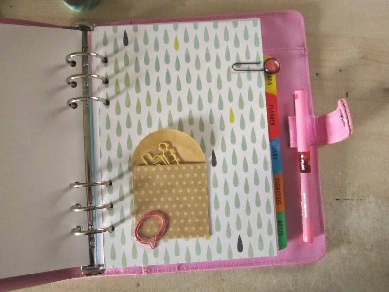
That was working in the ring binder now I've got a few customising bits and pieces I did in my A5 planner. Inside the planner I got from Paperchase, (the one I bought has sold out online now but you can browse through all the other planners here, make sure to take notice of the sizes because they come in pocket and personal sizes, the one I'm using is A5 sized) it has the dividers already made but they're all plain white so perfect for altering!
I started out with some paper, (this one was in the Sept/Oct Quirky Kit) and fixed it to the divider card with doublesided tape, placing it on the sheet so it butted up to the straight edge leaving the tab showing:

I've then trimmed it around the edges and re-punched the holes:


Flip it over and cover the other side and again re-punch the holes and that's as simple as that, instant cusomised index tabs.


I wanted to add a bit more so I used a mini envelope as a pocket and I can put clips or stickers or something inside it: 

The rub ons make great planner embellishments because they're flat and you don't want to make your planner too bulky so I added a few of those too. These Crate Paper rub ons were in the July/August Quirky kit.


OK a bit more embellishing! Inside the planner are things like these lined paper sheets. I'm forever writing to do lists so I for sure wanted some inside my planner and I picked out this really cute American Crafts DIY 2 self inking stamp to make a header and then just added a bit of washi tape underneath. easy peasy but it just adds a bit of extra cuteness to something everyday. 


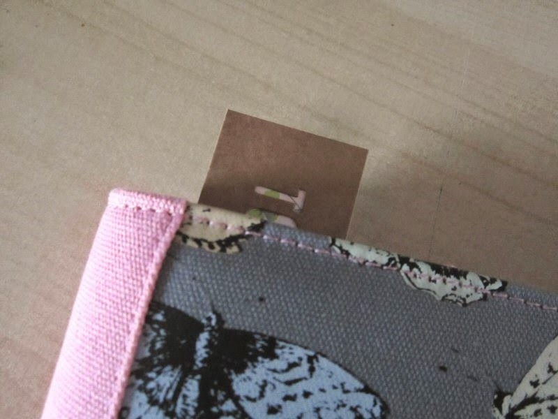
Another thing I wanted to show was a way to use tags as place finders in your planners. I used this one from the July/August Quirky embellishment kit and added a scrap of paper behind it:


Then all I've done is clip it on the top ring and when it's closed....


 ....you get a bookmark/place holder which is really handy when you need to find where you left off or in this case where my to do list for that day would be!


Last thing for today, a little cute planner charm. Again everything here was from my Quirky Kit stash. I used some twine, (Jan/Feb Quirky kit) and threaded it through the Maya Road charm, (March/April embellishment kit) and then threaded that through the hole in the zipper and tied in a couple of knots to seal it on there. Super easy and super cute! You could make charms with things like flair badges too if you glued two together with some twine in between or some of the larger wood veneer shapes we've had in kits or the Prima metal flowers from the last embellishment kit would be super cute too.


OK I'll leave it there for today but I'll be back very soon with more adventures in planner making!
x Leo

All kitted up

As I mentioned in my last post, I bagged up some bits and bobs from the Quirky Kits to take on holiday. It made holiday scrapping a breeze. I was able to put papers into some 12x12 plastic zip bags along with some embellishments. That cut down the amount of stuff I needed to take - I just added a few stencils, some embossing paste and distress inks and trimmer, scissors and glue.
I even packed one kit to use up papers from the last Beachy Peachy/Along the Pier Quirky Kits which I will also share.
But first a page using the most recent kits...
This is my bed in the 4 berth cabin on the boat to Shetland. You don't get a lot of personal space but there is this big thick curtain that goes around the bed. Being a Minister who spends a fair bit of time at Crematoriums I couldn't help noticing the similarity to the big thick curtains you see there. And that just needed scrapping!

I decided to pull out one of my Theresa Collins stencils and some texture paste. When it was dry I rubbed a red gelato over. The texture of the white cardstock being revealed was an added bonus.


I took a little longer than you might imagine playing about with all my strips of paper and deciding what would go where. I had fun with the sheer elements, layering onto and behind the netting and vellum.

When I was happy, everything was inked around the edge with Black Soot Distress Ink and adhered. I had gessoed one of the die cuts for a previous layout and then did not use it so cut it in two as an added feature here. The one on the top left should have the name of the Ferry on it - still on the to do list!
To help the glitter thickers to blend in, I used strips of the washi tape.
Then it was just a case of adding journalling, sprinkling sequins and gems and choosing where to put the star badge. The tiny letters in the title are Adornit from my stash  - I think I have had them for about 8 years now!

This is the layout that mostly uses up papers from the last kits
The placing of the photo is quite similar to the last layout, but hopefully there are enough differences for that not to be toooooo obvious! Because I had loved the vellums in that kit I had hoarded them so made myself use them all! I did my usual trick of gutting the aqua base cardstock so that I could use it again for my die cut title. The letters I cut also went through an embossing folder and were covered in Wink of Stella pen
There is lots of glitter over everything using that pen and also some prima sparkles! As you can see the journalling is hidden on a tag.
I used up more of the fabulous rub ons - even they got the glitter treatment!
Making up kit bags is the perfect way of ensuring that you make Quirky Kits work. I would like to say that now I have used everything up. Well, I don't have much paper left but with the generous amount of all the fab embellishments we get, some of those will be appearing on more layouts soon!


Letting the embellishments take the stage

I have just been away on a mini break. On rainy days my husband would go out for long walks and I stayed in with some scrapbook kits and an audio book (currently 11/22/63 by Stephen King). The Quirky Kits are brilliant for holiday scrapping as you can just gather the papers and embellishments together with a few other bits and the job is done. For these two layouts I spread out the embellishments from all three of the current kits and splurged them all over the place. (I find that ever so hard normally, but Leo is so generous I really don't mind)

The layout may look wonky. That is because it is. I have discovered that if I straighten the photo using Picasa then it goes a little (more) out of focus. So in future I am going to work harder at making sure I put them on the wall with a spirit level in my hand.
Anyhoo, I used chunks of paper, cut up some die cuts and die cut some paper (following?). I stuck some of the Prima flowers together with glossy accents and added gems as well. Then I stuck them in an arch shape around the bottom of the photo.
Now
I have just noticed that there is a flower missing from the layout. There should be one next to "Happy Day". There was one there. I have tidied everything away and haven't found a spare flower. Where can it be? Possibly back in Cosy Cottage...  (although I kept everything in bags)
 Sigh.
As this is a white space layout I added a little something to the top right hand corner just to break the space up a bit more. That die cut was perfect in expressing how wonderful the gift of the hat is to me.


One of the extra things I took with me was a pack of Gelatos which I "had" to have but then don't use that often. But they were perfect for adding a little colour to the background of this next layout without overpowering the patterned paper I was using
There are only three papers on this layout - the backing to "love this", the fussy cut Bella Boulevard paper and the Pebbles Pine paper that I turned into the background. When I picked the Pebbles paper I proposed to place the pics on the Pine pattern. (I won't tell you how long it took to make that convoluted sentence!)
When I got the photos out and plonked them on, it just looked too heavy. So I decided that I would use the text side but swoosh on some Gelatos instead. I don't have many but they are a pretty perfect match to the photos and leaves.
Then it was a matter of gathering up a few more bits and bobs to fill it out. The glitter thickers I again added in a few more places so that the letters blend in more - the washi tape helps too I think. I used a die cut but because it had an American spelling I chopped "favorite" down to "fave". Did you notice?
its a busy layout but I hope that the colour and the little bits and bobs complement the photos and that wonderful view rather than swamping too much.

Christmas Album - Finished pages and painting page protectors

Hi!

I've completed my foundation pages for my Christmas mini album using the new Christmas album Quirky Kit. I was thinking on what the best way to photograph the whole thing would be so if you wanted to you can copy any of the pages you wanted to so I've photographed them laid out all together so you can easily save the pic or print it out or pin it to pick out what ideas to use.
Everything I used was part of the kit apart from two things, some white acrylic paint and the gold sewing thread I pulled from the May/June Quirky Kit.

OK here's the first set of pages. The first page is a title page made from a transparent sheet, it was the packaging of the Pink Paislee foil number stickers actually. I just cut off one half of it, punched some holes in the side using one of the page protectors as a guide and then stitched around the edge with the gold thread then added the alpha stickers on top and one of the die cuts.
This first image shows one side of the pages.


This next image shows the same pages on the other sides. Do take advantage of the papers being doublesided because it makes it easy to decorate both sides at once.
One of these pages, the (4/5 one) is made from two pieces of the paper cut out and glued back to back for strength then I've added a pocket to one side made from a strip of paper and stitched on around the edge. All the other pages are page protectors and there's a jounalling card from the die cut pack which I've also glued more paper to the back of and punched in holes.


The white pages are the backs of the Pink Paislee counting cards. They have a delicate border pattern around the edges so I carried this on and use a Christmas stamp with Versamark ink to make a watermark effect. these could be a place for journalling or I may end up just adding photos to the whole pocket and cover them over but keeping them like this I've got both options open. Close up of the watermark stamp in the book.

Here's the next half of the pages. I've added some of the foil stickers over the top of the page protectors so I can fill the whole pocket with a photo. The clear stickers I've used over the top of the page protectors too every time I used them. When you see the photo overlays where the prints over the top or printed on some kind of transparency, well these stickers create the same effect. I absolutely love those stickers because they're like a stamp you can put over the top of anything but there's no chance of messing it up and if I end up needing to move it around I can do.


The twelve page was one of my favourites. I found these 2x2 pages really easy to put together and before I started I thought these would be trickier because of them being already divided up. I think it was the fact they're squares so it was like just making 4 mini layouts. I like how I could make one pocket a shaker one willed with the confetti from the kit and one transparent with the vellum and add a bit of paper to another and then there's a pocket for a photo too. On this one I glued some gems to the front, (these weren't in the kit either but they were from the Jan/Feb Quirky kit). I stabbed a hole in the page protector while I was sewing so I needed something to do a cover up with but I ended up really liking the dimension of the things inside the pocket and the bits inside.


Here's the other sides of those pages:


On some of the pages I've done some painting directly on the page protectors with white acrylic paint to make some snowy effect borders and pockets. Like these:


It's super simple to do, start out with your page protector, some acrylic paint and a paint brush. 


Use a small amount of paint and apply it a dry brush, don't try to water the paint down any as it won't cover the plastic.

Just go ahead and paint on the paint around the edge.


If you need to take some off or you want a lighter coat use a scrap of paper and scrap it off or scrap the paint around using the edge of the paper.


I wanted lots of this one so I've mushed it back around to make it more solid. You have a small window of playing time with it but it will start to dry fairly quickly. 


Once it is dry you can add things over the top. The clear white stickers I used over the top of mine to continue the 'snowy' theme. You can get photo overlays that are like these but doing it this way makes it more customisable. You don't have to stick with white paint either you could experiment with other colours.


 That's the whole album done! If you want any more close up images of any of the pages or need any how to's I've not covered let me know.
Hope you're having as much fun with your Christmas mini kits as I am!
x Leo