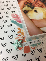
 I love to work on white cardstock and use patterned paper as the embellishment so I cut a 3 inch strip and adhered this to the left of the page.
I then cut a strip of the script paper and slotted this just underneath the strip of heart paper. I then used 3 different stitches using my sewing machine to firstly create a bit of interest but also to help keep the paper stuck securely to the cardstock. I love how using different stitches can create some interest. If you don't have a sewing machine then you could try pricking holes in your paper and hand stitching. You could even try some faux stitching with a black pen and creating dash's instead.
I then created 3 small embellishment clusters using the Jillibean Soup ephemera pack and I loved the colours in these diecuts. I used a mixture of flowers and feathers in both the bottom left cluster and the top right cluster. This was finished off with a little rubber charm from PinkFresh Studio (from the embellishment kit).
I then used the tiny word sticker from the Jillibean Soup sticker sheet (featured in the lite kit) and I also pulled one of my favourite things to use from my stash and these feature on most of my layouts, a tiny word sticker from Tim Holtz.
I then worked on the top cluster by adding in the same flowers and feathers and finished this off with a rubber charm from the same PinkFresh Studio pack and another tiny word sticker from Jillibean Soup. I wanted this top cluster to look different to the bottom one so I added in a tab and secured that to the top of the photo where the cluster was and again one of my faithful Tim Holtz phrase stickers was used to complete this little cluster.
When I look back at these clusters now, I can see that the Nuvo crystal drops would be a perfect addition so I think I might go back and add these in too. That is the great thing about looking back at your layouts, especially photographs of them. You can often find further inspiration for what else it might need that you maybe didn't notice at the time.
The bottom right cluster was where I decided to locate my title. I used the dreamcatcher die cut from the Jillibean soup pack ( I love love love this diecut) and started to layer over a few pieces of ephemera. I added the word dream to form part of my title and used a label from Elle's Studio Die Cut pack, along with the diecut that says "I love you". I added in a small row of hearts from the Jillibean Soup sticker sheet and finished it all off with using the small green alphas from the same sticker sheet to spell out "sweet" to complete my title.
I then drew around the 3 sides of my layout where there was no patterned paper to create some interest. When working with white cardstock, your eyes can almost wonder of the edge of the page and so a black border around these areas really help to train the eye into the focus, which is the photograph. I even added some hand drawn hearts along the border.
And this is the final result. Very simple, clean and understated but I love how this one turned out. I don't journal often on my layouts but there is plenty of room left to add your journalling if you wish.
Maybe try adding in some ink splatters if you prefer a less "polished white" look.
I hope this brings you inspiration for using your kit and I have many more lined up to share with you shortly.
Until next time..... x


No comments:
Post a Comment