And doesn't every princess deserve a bit of bling? Especially if she is an oriental princess?
and with gold and jade within the kit I knew it would be perfect for telling the story of the day I upstaged everyone because I wasn't given a solo part...
Yes, I used one of the sketches again - kind of. Sketch two has paper strips down the right hand side and two photos on the left with the title in the middle. I stayed true to that but my photos were smaller and I wanted the journalling to be in bits so that changed.
Before I stuck anything down I used some Heidi Swapp gold lame spray, sprinkling it using the thin end of the nozzle and also a dropper for the larger spots. This all needs to be left to dry for as long as possible!
I layered up my large photo with random papers from the kit. I added some glitter to the blue paper and the yellowy gold strip is from another of those tear off strips on the bottom. Another of those paper clips was used to anchor the mat. I thought the word "hope" was appropriate for me and that show!
Once I had added some strips of paper and some washi tapes (the gold is from the last Quirky Kit), I decided to bling up the wooden embellishment. I remembered that I have some glitter copic pens so used those to colour in the flowers. The photo doesn't really do justice to the sparkly loveliness - somehow the close up lost the shine! I also added glossy accents to the flower centres
Then my attention went to the left hand side of the page. I cut one of the Fancy Pants library cards in half and used that and some washi tape as a mat for the small photos.
Finally I used my cameo to cut out the title using a fairly oriental font. White cardstock was sprayed with the Gold Lame mist and then Glossy Accents added on the top. A Maya Road bird was adhered to draw attention to the title and all that was left was to journal the story of one small girls quest to be a star....
(And I really do remember feeling indignant at not having a solo and being on the stage. I don't remember showing myself up by singing along and spoiling it for everyone. Funny that...)
Tarted up
I took the idea of repeated photo mats from Sketch Six of the booklet but then ignored most of the rest of the sketch!
I wanted an opportunity to let that fabulous WRMK vellum paper shine. At first I had backed it with white cardstock but when I tried the yellow I found it both muted what had been quite a bright shade and it let the silver really sparkle. It also seemed like a good opportunity to use a hafty chunk of that Studio Calico Lemon Lush paper which I really, really love
Yes it is another trip down memory lane - this time the story of when I was about to get married. I was finishing a temporary job at Woolworths Accounts Office. They were very generous with gifts and cards but also insisted on dressing me up as a tart and parading me round the whole building. Why a tart? Well because when I got married I was going off to train as a Minister (or Vicar). Being the ONLY person in fancy dress is not that much fun to be honest....
I pulled out from the kit all the pieces that were silver, green and yellow. I also added some washi tapes (the bird one is from a previous kit). The squared paper is also from the last kit. I was going to journal on it at one point, changed my mind but kept it there anyway.
I wasn't going to go round everything with pen but the Jillibean Soup phrase just seemed to get lost on the silver. So I did. To be honest I could start almost every layout account with "I decided not to outline... but then I did" as I don't seem happy with the definition without it.
I had fun with the various clips I used
I like the word ones on the dark part of the photo as they give some interest (and hopefully draw the eye away from my ridiculous get up)
I wanted to add a little silver to the burlap embellishment so rubbed some silver ink onto them. The effect is subtle but it is there
I wanted an opportunity to let that fabulous WRMK vellum paper shine. At first I had backed it with white cardstock but when I tried the yellow I found it both muted what had been quite a bright shade and it let the silver really sparkle. It also seemed like a good opportunity to use a hafty chunk of that Studio Calico Lemon Lush paper which I really, really love
Yes it is another trip down memory lane - this time the story of when I was about to get married. I was finishing a temporary job at Woolworths Accounts Office. They were very generous with gifts and cards but also insisted on dressing me up as a tart and parading me round the whole building. Why a tart? Well because when I got married I was going off to train as a Minister (or Vicar). Being the ONLY person in fancy dress is not that much fun to be honest....
I pulled out from the kit all the pieces that were silver, green and yellow. I also added some washi tapes (the bird one is from a previous kit). The squared paper is also from the last kit. I was going to journal on it at one point, changed my mind but kept it there anyway.
I wasn't going to go round everything with pen but the Jillibean Soup phrase just seemed to get lost on the silver. So I did. To be honest I could start almost every layout account with "I decided not to outline... but then I did" as I don't seem happy with the definition without it.
I had fun with the various clips I used
I like the word ones on the dark part of the photo as they give some interest (and hopefully draw the eye away from my ridiculous get up)
I wanted to add a little silver to the burlap embellishment so rubbed some silver ink onto them. The effect is subtle but it is there
I also added silver to the letter stickers from last months kit - but they were kind of grey anyway. The gems are from last months kit. The yellow arrow was a last minute addition so that the larger subtitle points the way to the actual title. It comes from my stash and is by Studio Calico. I don't often do hidden journalling but the story I recounted above is given in a little more detail and stuck in the envelope. I added a little pull out tab to let the really curious know that there is more to see!
More sketch love
Well I think you can see Sketch 4 from Leo's awesome Simple Sketches here, altough photo space and journalling space have been swapped round
This is little me with my Uncle David. I am about 3 or 4 in this photo. I used a fairly small photo which got even smaller when I decided to place it within the Jillibean Soup frame. I thought the curved edges gave a lovely retro feel. I knew there needed to be red on the layout but how chuffed was I when I realised that the gold funky patterned paper was an almost perfect match to the dress I am wearing? I gave the layout a double frame so needed lots of black outlining to break the patterns up. I also used the red Snap card and love the way the pattern underneath peeks through.
The bracket pattern underneath the card comes from one of the tear off strips at the bottom of the papers. I think I have used almost every one of those strips from this month's kit. I love that little extra layering detail they give.
I gave the wooden plaque a little treatment by colouring over the word with a gold pen and a white pen. I was going to leave it in position as per the sketch but it sat so much better on the top right
The wood effect paper triangles were cut from the Studio Calico Lemon Lush paper and I used up my remaining cork hearts and burlap flowers to go round the edge of the layout. As you might be able to spot I didn't really use a sewing machine - just some faux stitching but having the pen work going over the triangles does help fool the eye just a little bit!
This is little me with my Uncle David. I am about 3 or 4 in this photo. I used a fairly small photo which got even smaller when I decided to place it within the Jillibean Soup frame. I thought the curved edges gave a lovely retro feel. I knew there needed to be red on the layout but how chuffed was I when I realised that the gold funky patterned paper was an almost perfect match to the dress I am wearing? I gave the layout a double frame so needed lots of black outlining to break the patterns up. I also used the red Snap card and love the way the pattern underneath peeks through.
The bracket pattern underneath the card comes from one of the tear off strips at the bottom of the papers. I think I have used almost every one of those strips from this month's kit. I love that little extra layering detail they give.
I gave the wooden plaque a little treatment by colouring over the word with a gold pen and a white pen. I was going to leave it in position as per the sketch but it sat so much better on the top right
The wood effect paper triangles were cut from the Studio Calico Lemon Lush paper and I used up my remaining cork hearts and burlap flowers to go round the edge of the layout. As you might be able to spot I didn't really use a sewing machine - just some faux stitching but having the pen work going over the triangles does help fool the eye just a little bit!
Know when to fold 'em
This layout started out with Sketch Three from the Quirky Kit Simple Sketches. I knew the kind of way I wanted it to go and then decided that I would start with some colour on the background. I used a Theresa Collins stencil and translucent embossing paste. When that was dry I covered it with blue gelato and washed it down
I adore the WRMK vellum paper and decided to try colouring a portion with watercolours.
I painted on the back so that the silver was still dominant
The small pieces (the flowers and the stripe strip that came on the bottom of the paper) did roll up but flattened out with glue on the back.
I then decided to make a layered photo mat rather than just a frame as in the sketch so gathered a few of the papers together, inking and outlining the edges. I cut the layers with scissors so that nothing was too straight. This is not just because I am lazy (well maybe a bit) but I do like to sometimes add the softness that non straight edges bring. Having stuck the photo mat together and having gathered a few embellishments to go with it, I went to stick the photo down but it just didn't feel right in the place the sketch suggested. So I moved it even more to the centre and suddenly it all worked so much better
I think it is key with sketches not to let them dominate the process - it was a great starting point and I think you can see the influence but it is not as directly used as the one in my last blog post. I inked the burlap anchor with Peacock Feathers Distress Ink and made the camera parts black rather than the original brown. I tried not to have too much that takes the eye away from the photo, but rather wanted to draw the eye in.
NB I have now straighted up the letter stickers. They needed extra glue as they really didn't like being stuck on vellum
I adore the WRMK vellum paper and decided to try colouring a portion with watercolours.
I painted on the back so that the silver was still dominant
The small pieces (the flowers and the stripe strip that came on the bottom of the paper) did roll up but flattened out with glue on the back.
I then decided to make a layered photo mat rather than just a frame as in the sketch so gathered a few of the papers together, inking and outlining the edges. I cut the layers with scissors so that nothing was too straight. This is not just because I am lazy (well maybe a bit) but I do like to sometimes add the softness that non straight edges bring. Having stuck the photo mat together and having gathered a few embellishments to go with it, I went to stick the photo down but it just didn't feel right in the place the sketch suggested. So I moved it even more to the centre and suddenly it all worked so much better
I think it is key with sketches not to let them dominate the process - it was a great starting point and I think you can see the influence but it is not as directly used as the one in my last blog post. I inked the burlap anchor with Peacock Feathers Distress Ink and made the camera parts black rather than the original brown. I tried not to have too much that takes the eye away from the photo, but rather wanted to draw the eye in.
NB I have now straighted up the letter stickers. They needed extra glue as they really didn't like being stuck on vellum
Making Miniatures
One of my current 'things' to do on my paper craft projects is making embellishments in miniature. I'm just liking the contrast of space interspersed with little bits of embellishment. I was having a play around with the current kits to make a new layout and I've used lots of miniature embellishing ideas.
I recently had a tidy out of scrapbooks and my craft space/ desk and I've found photos scrapped on layouts that I wanted to change around. This photo was on an 8x8 layout and I'm putting all my heritage photo layouts in a new 12x12 album so I decided to make a full 12x12 page for it. It's quite a small photo so I didn't want to do too much to it. It's on its own to go at the start of my grandparents section so it needs to have a page of its own. I also didn't want to add too much to the page to keep the photo the focus so putting all this together it made it the perfect project to use the miniature embellishments on.
I started with the Basic Grey 'Rue' paper from the main kit and cut out some of the circle shapes on the reverse of the paper. I then cut into the middles and glued the cut edges together to create a little slight 'cone' shape.
Once it was glued I've then pressed into the middle and it makes the middle 'pop' up to make these cute little paper shapes. They're kind of like large paper cupped sequins.
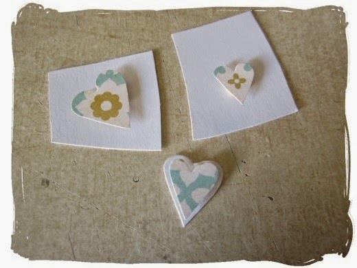
More miniature cut outs I've made are little hearts cut from patterned paper. This paper I've used is the Basic Grey 'Rosemary' one from the Lite kit. The heart shapes I've then glued onto white cardstock with 3D foam pads and re-cut them out around the edges to give a double layered effect.
Finally I've made a glitter enamel dot effect embellishment using drops of Glossy Accents covered with glitter. Leave the dots to dry once you've added the glitter and then tap and finally brush off the excess with a dry paint brush to get rid of the loose glitter.
Hope it's given you a few ideas to try or inspired you to have a go at making your own completely different miniature embellishments.
Have fun!
x Leo
I recently had a tidy out of scrapbooks and my craft space/ desk and I've found photos scrapped on layouts that I wanted to change around. This photo was on an 8x8 layout and I'm putting all my heritage photo layouts in a new 12x12 album so I decided to make a full 12x12 page for it. It's quite a small photo so I didn't want to do too much to it. It's on its own to go at the start of my grandparents section so it needs to have a page of its own. I also didn't want to add too much to the page to keep the photo the focus so putting all this together it made it the perfect project to use the miniature embellishments on.
I started with the Basic Grey 'Rue' paper from the main kit and cut out some of the circle shapes on the reverse of the paper. I then cut into the middles and glued the cut edges together to create a little slight 'cone' shape.
Once it was glued I've then pressed into the middle and it makes the middle 'pop' up to make these cute little paper shapes. They're kind of like large paper cupped sequins.
Another miniature embellishment idea on this layout I used was to make some leafy/foliage embellishments. I started off by hand cutting out the leaf shapes from paper. If you didn't feel confident just straight hand cutting something out you could stamp or print something out first to use and then cut that shape out
I've covered the whole shape with Glossy Accents and then sprinkled over glitter.
These I've used layered up with one of the wooden shapes from the main kit.
More miniature cut outs I've made are little hearts cut from patterned paper. This paper I've used is the Basic Grey 'Rosemary' one from the Lite kit. The heart shapes I've then glued onto white cardstock with 3D foam pads and re-cut them out around the edges to give a double layered effect.
Finally I've made a glitter enamel dot effect embellishment using drops of Glossy Accents covered with glitter. Leave the dots to dry once you've added the glitter and then tap and finally brush off the excess with a dry paint brush to get rid of the loose glitter.
On my layout I've mixed them up with enamel dots stickers from the Lite kit and some of the embellishments I made.
Finally here's the finished layout with all the completed miniature embellishments.
Hope it's given you a few ideas to try or inspired you to have a go at making your own completely different miniature embellishments.
Have fun!
x Leo
Trying something new
It is always a red letter day when a new Quirky Kit is delivered. And Leo has upped the bar even further this month, with wonderful packaging and some sketch suggestions. Always a fan of a sketch I decided that I needed to give one a go. So here is my layout which is a pretty simple rendition of sketch 1
I started off by getting out my watercolour paints and trying to find some colours that would tone in with the papers from the Good Day kit. I found a turquoise, a reddy brown and a dark yellow. I traced around my photo so that I would have something to work around without getting the photo wet. Then I took a deep breath and painted the wavy lines in a vaguely oval shape.
Well I tried...
One problem is that I chose to use textured Bazzill which may not have helped. The other is that I find it really hard not to write in a reasonably straight manner. I think this style is better if you can vary the height of letters. There we are.
Hopefully it kind of fits with the doodly frame round the photo.
I'd love to see what you do with the kit and the sketch so do link your layouts here so I can see them :)
When I had done that I was tempted to throw the whole thing out as I thought I had made a terrible mistake. But I decided to leave it whilst I worked on the paper embellishments.
I used various heart dies and circle punches, as well as hand cutting some of the larger circles. I put the washi tapes from the Lovely Day embellishment kit onto white card before cutting them out - it made it easier to move the pieces around and made the colour shine more. Everything was then given my usual outline treatment - a Sharpie pen traced along the edge and then a thin pen to go around everything. I started playing around with clusters. I stapled them together and then added a cork heart over the top to hide the staple.
That gave me the idea to add black lines to my watercolour doodles and I so prefer the extra dimension this gives.
I backed the Jillibean Soup placemat with one of the papers to stop it sinking into the background and added the title on top
When it came to the journalling I thought of a few different things to do but was really tempted to try script journalling which is all the rage at the moment. I have a brush pen and tried practicing a few times before I went for it.Well I tried...
One problem is that I chose to use textured Bazzill which may not have helped. The other is that I find it really hard not to write in a reasonably straight manner. I think this style is better if you can vary the height of letters. There we are.
Hopefully it kind of fits with the doodly frame round the photo.
I'd love to see what you do with the kit and the sketch so do link your layouts here so I can see them :)
New Kit Packaging
Hi!
So this month there is new kit packaging and I wanted to do a little post about how you can make use of it.
First of all there's the handy take out bag your kits are in:
On there you have the kit colour matches:
Here's another example, mixing in ribbons and trims. It all depends on what you want to use.
Some supplies are going to be patterned, not just plain colours so to mix in those place it beside the colours and see if the tones match.
So this month there is new kit packaging and I wanted to do a little post about how you can make use of it.
First of all there's the handy take out bag your kits are in:
You can grab your kit bag and add in your essentials like your paper trimmer, tape, glue etc and then you're good to go craft, wherever, whenever.
Inside your kit bag your Quirky Kits are inside a clear bag which has your kit info sticker on.
On there you have the kit colour matches:
Using this you can match up your exisiting supplies. These could be anything you have in yoru supplies like older bits and pieces you want to use up or it could be your other craft basics you want to use like ink, paint, or spray mists. Here I've had a look through my stash to pull out some colour matches. You're not going to get perfect matches but you can use it like a guide to help you get the right tones.
Here's another example, mixing in ribbons and trims. It all depends on what you want to use.
Some supplies are going to be patterned, not just plain colours so to mix in those place it beside the colours and see if the tones match.
While you're using your kit keep it inside its plastic bag, replacing any off cut bits inside it and then after you've finished up your kit and are left with the final bits and pieces you can use the colour matches again to match up your last bits to your existing supplies to make use of your left overs and make your kit go further as well as use up your older supplies.
Have fun with your new packaging!
x Leo
Subscribe to:
Posts (Atom)