And now for something completely different

For my last layout with the kits I have thrown it all together to see what I can come up with! Because Leo stuffs the kits full of goodies I still had loads to play with after all this time. Here is the result

While I was waiting to meet my friend the other Saturday I stood on the mound on top of Tower Hill tube station and pivotted around taking photos. You can see the Tower, a portion of the London Wall and the Shard, all without moving your feet. And put in proportion by the iconic tube signs! 

I wanted to create a layout that echoed the "old and new" side by side vibe from the photos and so used the chintzy, flowery not so much my thing as you can tell from their non appearance so far on any of the other layouts, "B" sides of some of the papers. I also made two schoolboy errors.

1: When you ignore the warning voice that says "move that other layout out of the way while spraying or you will get some on that too", you will pay. (Some of the sparkles on "first look" had to be added to cover red dots. I've left a teeny red dot uncovered as a reminder)
2: Sprinkling red mist as opposed to spraying it looks a bit like a blood splatter.

Oh well. On the patterned papers, which I decided to tone down with spray, I also added some brown mist on the top. On the cardstock it (hopefully) just looks a bit arty and not so much that I need a trip to A and E, stat. The idea was that the right had misting using a tile pattern mask would look old fashioned and the left hand sprinkles, more up to date funky.

As well as adding some spray to the papers I also distressed and inked the edges, added faux stitching, tore some edges and used my new Martha Stewart doily punches. I pushed the papers around until I was generally happy and then stuck them down and went around the edges of everything with a fine line pen for definition. "From sunrise to sunset" was written on the grey and yellow paper so I cut that out and used it as a subtitle. I used up my ribbons too - the rest of the wasp twill has been turned upside down, folded and stapled. My final two flags have been stuck  together at one end to create a tag and more of the fab leaves have been used, both together and seperately.

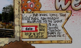
I do wish that I had adhered the title a little more to the left but only realised this after I had outlined the words in pen and it was too late. I added a few sticky pearls but apart from inks and pens everything else has come from the kits. Here is the journalling - a little blurred I am afraid but hopefully easier to read


I have had such a blast creating all these layouts from the kit and it has set my scrapbook album reflecting my old life and my new life off to a brilliant start so thanks very much Leo.

Snippets

One of my favourite techniques when using lots of patterned paper is to repeat a geometric shape on my layout. The Footnote kit features loads of lovely double sided papers and this way of using them means that you don't have the dilemma of which side to choose!
Here are two layouts that have the same idea at the basis but (I think) they end up looking quite different.

This one uses hexagons - made all the more easy by having a new die to cut the shapes out. The die also features hexagons stuck together and I used the off cut to create the zigzag border on the bottom of the photo. In real life the yellows of the papers match the yellow of the sign and the van perfectly. I love it when that happens.

I inked round the edge of everything with Vintage Photo Distress Ink and beofre sticking the paper pieces down I flicked some brown glimmer mist across the cardstock. I spent a while playing about with the shapes until I was happy with the flow and then adhered them down. I used an alphabet die to form the title and the subtitle was made using the fabby stickers that come with the kit. I then added the journalling, making the lines deliberately wonky and uneven to break up the geometry a little.

I love the ribbon from the kit and wanted to find a way to use it that would not overwhelm the page so I gathered it and added random staples with my tiny attacher.
Finally I sprinkled some of the circles and stars from the kit across the page and more or less stuck them down where they fell with some Glossy Accents.

This layout took very little time at all once the shapes were die cut. The other layout took rather longer as more maths was involved.
(ooh its a bit wonky close up isn't it)
This photo is very special as it is the first one I took of where we are going to live. It wasn't definate that we were going to live there at the time. I thought that I had lost this pic but it turned out it was on the camera that my son then took to University.

I had decided to try a grid pattern. I thought I would make it easy by using one of my square punches as they say what the size square will be. Only I had already given them to the Church card club as part of my downsizing, having decided I didn't need them AND Nestabilities. Wrong. Which meant that each square was quite a difficult size to measure. Each empty grid needed to be something like 2 1/8" square. Which took a bit of working out. But I think it was worth it in the end. I was hesitant to use real stitching as I often have a problem stopping (no, really, I always have a look of mild panic on my face when I machine stitch). So this is all faux stitching. An awful lot of pricking and then going over with black pen. But worth it I think. Having made the grid and inked the edges of the papers with Black Soot Distress Ink, I was going to place the photo in the bottom right corner. But somehow it landed top left and I think the balance is better. There was an empty space at the top right of the photo which made a good spot for a title made from small letters and also draws the eye into the layout.

I made some layered flowers using various punches (still got those) and cut two of the leaves from the fab suede effect ribbon. I stuck them down before adding the journalling

I finished it off with a few more of the gold sparkles.

I have one more layout to show you before the end of June - this last one will combine elements from both Observations and Footnote

A Footnote

Here is the first layout I have made with the Footnote kit - and it is the most paper heavy.


The observant might notice the slight cheat in that I did use some of the Thickers from the main kit. But I do like titles that use a mixture of letters and they fitted the spot so perfectly.
I started this layout as I often do by randomly chopping into some of the papers, punching edges and making small strips, then starting to layer them up. I don't stick anything down until I am reasonably happy with the placing. Sometimes I then make marks about where the papers should go. Sometimes I don't. Sometimes I do and then find the whole thing has shifted and I have to move something else to hide the pencil marks that never seem to rub out as well as I would like. The papers were all outlined with a Sharpie pen before sticking down.

To do this I put my patterned paper on some scrap paper and run a thick Sharpie down the edge which leaves a clean black line. I have done this for a while now and am quite good with keeping my arm loose and the flow good so I can just about do a 12" side in two goes (as I need to move my scrap paper around. You do end up with lots of black lines on your scrap paper too). BUT every now and then my hand will skid and leave an unexpected line onto the patterned paper. Actually I got away with it on this layout but it is rare. That is when embellishments are your friend. I needed them to come into play for a different reason this time...

These layers grew and grew and so left me less space than I had planned for title and journalling. I decided to add journalling on a small piece of one of the papers and added the strip of blue first to tone it in with the rest of the layout. And then discovered I had a LOT more to say than the space that I had. So fished around for another of the glassine envelopes and once more utilised it as a pocket. To be honest, this envelope was a lot bigger so I trimmed it to fit, decided to emboss it with a Cuttlebug Swiss Dots folder and then swoosh a little brown distress ink over it. At some point it became extra delicate and tore. Which helped decide the placement of the buttons!


I wrote on two matching pieces of patterned paper, punched a circle out of one of the other papers and sandwhiched it between the journalling to form a double sided tag.

I then decided to use one of the other glassine envelopes to create more embellishments. I die cut several circles and embossed them with the Swiss Dots folder then added either blue or brown distress ink lightly over the top. I adhered them with Pritt Stick. NB they really are fragile so you have to be careful.

Here are two in close up. They are easier to see in real life but still have a subtle quality about them

Last from the main kit

I've been very careful to keep my kits seperate just so that you can see what great value both the full Quirky Kit - Observations and the Quirky Kit Lite Footnote are. I've so far managed 5 layouts and a tag from Observations and am on my third layout from Footnote. I'm hoping to end by combining them - but that might have to happen at a later date as very soon I am going to have to shut up my crafting space ready for my big move to Devon in 2 weeks time.

This layout features the new house. And as you will see I added grey cardstock and a red button to the kit. This layout was inspired in part by the May 15th Stuck sketch and Leo's card for the Resin Inspiration Daring Cardmakers challenge

I started by using a mask and swooshing two grey toned Distress Inks over it. If I don't know how to start a page then I add a background layer with paint, ink or mists and a mask and already it isn't just a big blank scary space. I inked the edges of everything, then when each piece was stuck down I went around the outside with a fine line pen (I use lovely fine tipped felt pens from Wilkinsons - 99p for 5!). I added a further line just around the inside of every piece as well. This happened because when I made the flower with my Sizzix tattered floral die, it just all merged into one until I decided to add the extra edging. The grey butterfly was left over from my preparation for the first page. The red butterfly was a plain wooden one but I pressed it into a red Distress Ink pad.
 And you can see one of three little circles of tulle that feature on the layout but are VERY hard to photograph!

 The little white dots come from the American Crafts thicker pack.
I've had some lovely comments about my layouts - thanks so much! Including some about my hand writing. My writing was terrible as a child until a teacher suggested I start again with printing and then move on to joined up at the age of 14. It did the trick. I think it is important to use your handwriting on pages even if you don't like it (and sometimes I still think mine looks a bit messy) so that it makes a page uniquely yours.  If you are still not sure about it, why not try this technique? I  look round the web at stamp sites that have fonts I like and then try to reproduce them! I find that if I cut strips of paper to 1cm high, it makes my printed writing neater. As on this example
I can now write like this pretty quickly, without having to refer to an alphabet chart. It makes a fun change from my usual scrawl!
I'll be back soon with my first Footnote page, which also features the new place I'll be moving to

It's toofer day

Two (layouts) for you to see that is!
We are almost half way through June and I have still got a lot to reveal so I thought I would share with you a simple and a more complex layout today.

I have to say the simple layout is one of my favourites
 I really like the photo that I took of the windmill and didn't want to clutter up the layout too much. Because of the Jubilee the mill was decorated which added a splash of colour which I wanted to echo in the layout. Thankfully there were papers in red, white and blue to use!
I was wondering what to do with the tulle and had accidentally lain it down on the cardstock and placed the photo on top. I was immediately struck by the way it matched the slightly off white colour of the windmill and decided to use a large portion of it as a photo mat.
Before adhering it down, I sprinkled drops of blue and red glimmer mist on the layout and allowed them to dry.
I cut the triangles using the banner set of nestabilities but could have hand cut them really! I outlined everything with a black Sharpie pen and went round the edge of the layout with a fine liner.  I layered up some of the splendid union jack ribbon underneath where the photo mat would go. I stuck the photo onto the tulle which gave me an idea of where I could plaster the adhesive underneath. To keep the tulle from flapping I also added staples with my tiny attacher.

The triangles of paper were added at the top of the layout, but I didn't stick them right down to allow the pennants to look as though they were flickering in the breeze. In between the banner segments I added little bows made from more of the tulle and red thread.
A quick bit of journalling on one of the Elld's Studio tags and that is that
Disclaimer: my husband says that it is not strictly true that you can see the windmill everywhere. I did put almost though!

This layout contains a story that really needed telling of what creatures of habit we are. How great is this kit in that I used the same range of papers but it looks totally different
The kraft cardstock and the white above are from my stash, along with a little bit of white card on this layout. Apart from that I am still only using the kit so far.

The starting points for this layout were the orangy/red and yellow in the picture and also the way in which the pattern on the green paper reminded me of a placemat.
I picked out some papers, grabbed some punches and began to layer up around the photo.
I used a doily die to cut the green paper with the circle as near as I could make it to the middle, outlined the edge with a black Sharpie and adhered that to one of the doilies from the kit.
The one button I had left in the kit served as a plate with a Quickutz spoon and fork to finish off the place setting.

I spent ages pushing all the various bits of paper around the layout until I was happy with them, then stuck them down quickly whilst I could remember where I wanted them to go. I echoed the shapes and colours in clusters at the top left and bottom right of the layout.

When everything was stuck down I went around the papers with a fine liner pen. I had outlined the doily paper shape so that I did not risk pen ink going on to the real doily as that paper is very porous.
A little journalling later and another job done!


Time for a tag

I'm not really one for crafting outside the box. I like to make cards. I like to scrap. I don't do much else in terms of papercrafts. But the tag in the kit was calling my name - "embellish me" and the glassine envelopes were saying "don't just cut me up and emboss me" (much as I love the look when I do!) so I listened to their tiny voices and did something about it.
(Please don't tell me that your crafting supplies don't speak to you because I won't believe it) (A triple negative sentence, go me)

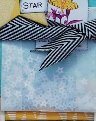
I (modestly) think this tag sums up what makes the kit so fabulous. Aqua blue, green and yellow with a dash of black and white mixed with some fun and funky embellishments. I cut a strip of the Kesi'art Alouette paper that would leave a narrow margin round the tag, inked with black ink and adhered it. Then I tore a larger piece of the same paper, using the design on the reverse and added this on top. I gathered up most of the silver stars and popped them in the smallest glassine envelope. I turned over the top edge a few times before sticking down to the tag.

I covered this with one of the stamps and tied the black ribbon round, cutting the edges into a "v" shape. I die cut a star shape using the My Minds Eye History Blooms paper, inked the edges and added the words using a stamp set. I thought it would be fun to stamp "Star" on a separate piece of paper and staple it to the star, which was then attached to the tag. I had lots of fun shaking up the envelope to see the stars move around.


Packing it in

These Quirky Kits are packed with so many different goodies. I do love a kit that puts together papers from different manufacturers. "Packing it in" also refers to the fact that we are now endeavouring to visit all the local sights we have put off for 13 years, before they won't be local any more. And this layout is about one of them

I'm not really into "matchy matchy" layouts where the paper colours all have to go with the colours in the photos. And that is just as well when the key colour in the photos is brown. One of the only drops of colour is the red breast of the cockerel so the Crate Paper Storyteller Trademark was a must. And the sunshine colours just came from there really. When using lots of different colours with colour photos I think it helps to make sure the photos are framed in some way and the papers are inked around the edges to add definition.  As the museum is full of curios I decided to sprinkle a variety of buttons across the page, all threaded with yellow floss.

Whilst looking through blogs I saw someone had used this very ribbon with sticky backed gems in between each image (sorry, I can't remember where I saw it )and that gave me the idea of adding a little bit of ruching with french knots
It was a bit fiddly and needed a lot of strong red tape underneath but I think it captures the rather eccentric feel of the tithe barn.
I used three  Elle Studio tags - if there are any with pointy edges (as with "Documented" I tend to cut round them more closely as I find this pleases my eye better than lots of rectangles. The American Craft thickers and some silver stars later and I was ready for the journalling.
I have a handy little gadget that is made from acetate that marks out even lines for you, which is why the lines are so neatly spaced. I draw them in pencil first in case I don't need them all but then go over with black pen without a ruler to give a more hand drawn feel.
Can you spot the new word in the journalling?
Sometimes when you make mistakes it is better to leave them there than trying to make it better. And it will teach me to concentrate when I am journalling. (Sigh)

Getting things down

This kit came at a perfect time for me as life is full of retrospection. This layout shares just a few observations about living at this house. Although there is a LOT of journalling, there is also a lot of detail, thanks to all the inspirational papers and embellishments in the kit.

I used the MME Follow Your Heart Be Happy paper as a base which helped to get my creative juices going. How?
Well firstly, on the bottom of the page are some printed strips saying "a few of my favorite things" which would have been perfect but for the American spelling of favourite. I looked through the Elle Studio tags and found one that would fit so now the title is "a few of my collected memories and things". I also outlined the faux strips of paper to make them stand out.

 In fact I utilised one of my favourite scrapbooking technique of outlining everything with a black sharpie pen. I always go a bit wrong somewhere which means that I have to be extra creative to hide the mistakes! (see behind the wooden butterfly for example).

Secondly, at the top right of the page were some little red tags printed into the paper. I liked them but wanted  to make a bigger feature of the tags so I hand cut pennants of different sizes and shapes from the papers in the kit that co-ordinated with my photo. I also fussy cut some flowers from the Studio Calico paper to soften things a bit.

As you can see from the close up I added a few dots of black glimmer mist to the paper. The honeycomb effect paper is in fact one of the glassine envelopes in the kit which went through a Spellbinders embossing folder. I really like that effect.

With regards to the journalling, I quite like going for stream of consciousness writing where I know what the subject is but not necessarily all I am going to say. I keep a careful eye on the space to know when to stop. it is easier than you might think so why not try having a large block of journalling on your next layout?


My first observation

Hello its Lythan here, the new guest designer for Quirky Kits - who is feeling very, very lucky indeed to have been asked to showcase Observations, the newest kit available. It has so much potential with a mix of sunny colours and some cool grey (sounds a bit like a British summer then). I decided to challenge myself to see how many layouts I could make using the kit. I'm going to limit myself to papers and embellishments from the kit but will add in a few punches, inks and sprays etc along the way.

Here is my first go...
my daughter left school (apart from exams) this week and wrote a long facebook post reflecting on all the things about to happen in her life. As well as leaving school we are soon to move from London to Devon which will be a big change. The post was so good I asked if I could scrap it, along with photos from her shirt signing. She said yes, but I also wanted to keep the words a little bit private, so here is my solution

Let's talk abut the rest of the layout first. I grunged up the edges of the cardstock with Pumice Stone Distress Ink (which I also used around the edge of everything else)

The green Kesi'art flowered paper was a spot on match to the writing on the back of the shirt - don't you love it when that happens? The butterflies come from the back of the same paper. I use butterflies a lot to symbolise change so these were perfect. I made sure that I cut around them before using a large portion of the green side on my page. I added a border using a deep doily punch.

I layered up more of the grey side of the paper with some of the MME Indie Chic History Blooms paper behind and the Lily Bee Buttercup Flower Pot paper on the top.

Now for the journalling layer:  I love the glassine envelopes in the kit and thought they would make a great solution to the privacy issue so I measured the inside of one of the large envelopes and trimmed some of the yellow bazzill to fit, which I printed the journalling on to. I made it into a tag using a circle punch and ribbon from the kit. I then stuck the envelope onto the layout. This allowed me to layer things on top but still pull out the journalling for people to read.


And then come more layers - the doily and butterfly stamp, the matted photo with button accent, the lovely Elle Studio "I treasure this", finished off with the awesome Amy Tan chipboard letters and a random sprinkling of shiny stars from the kit.

I hope this has inspired you to layer up with your Observations kit - and I have SO much more to use!