Hummmmmmmmmmmmmmm

Hello

I've got another card to share with you.  I've used the Hummingbird template from the latest set of Crafty Templates for this one - as soon as I saw it I knew it would make a beautiful silhouette placed on a sunset background.
 

I cut the bird and flower once, then cut smaller versions of the flower to add a little more
 depth to the picture.
When I placed the birds on a single layer of background it seemed to lack some ooomph, so I got busy with the inks again and made another piece to mat it onto.  The black and white layers
 really add to the definition, I think.

The first step to making both of the inky background pieces was to squirt some of the gorgeous  Kesi-art colour mist you'll find in main kit 'Candy Floss Cart'.  I used a damp baby wipe to swish it around on both pieces of car.  As you can see, you can control the depth of colour quite nicely. 

Clicking HERE will take you to a fab post Leo made recently on how to the best from this product :)

The reds. yellows and oranges of the background are made using Distress Inks and foam applicators,  or a baby wipe and just adding the colours from light to dark and giving them a good swish around.  The difficult bit is waiting for them to dry!

After layering up the inky, white and black card I added the hummingbird and flowers, then delved into my kit to see what else I could add ;)

I used:
From Crafty Templates; Hummingbird and Flower
From the Quirky Kit;  Kesi-art colour mist, Feather stickers (matted first onto card and cut out), Tiny Star sequins, Round Sequins*
From my stash; Black card, White card, Clear Dewdrops, Distress Inks

* I glued a couple of clear dewdrop "stones" on top of the coloured sequins as an experiment, I'm really happy at how it worked and the way the colour of the sequins shows through the clear plastic


 This is such a lovely template - probably my favourite from this set, but there's another bird template too and I can't make up my mind whether to use that or the gorgeous bows one for my next project :)
Anyway, that's all for now -I  hope you like this card and that you're having fun with all your Crafty Quirky Goodies this month

Thanks for looking

Happy Crafting!

Inspired by Project Life

Hi There!

I expect you've all heard the exciting news that Leo is soon to be bringing out a trial project life kit to run alongside the other fabulous kits in her range. I must admit I haven't yet moved on to project life but I love seeing what others create and I adore the products that are available now that it is becoming so popular.

It got me thinking that maybe I could dip a toe into project life by creating a layout inspired by some of the pages that I've seen browsing the web.

What turned out was quite a clean graphic page for me, I wasn't too purist about the size of the 'journalling cards' I made with PPs from this month's lite kit icecream stall I just based the size on the size of the photo. You can see I used various ways to embellish the 'cards' using the glassine envelope to make a pocket on one to pour in the confetti with a few dots of glossy accents placed randomly to catch some of he confetti before it all went into the pocket. I couldn't resist using some of the Amy T packaging off the remarks letter stickers from the main kit, it went so well with the colours of my page! The rest (apart from the stamps) is all lite kit though, I promise!

I soooo enjoyed using those delicious enamel dots, they give such beautiful texture and dimension to a page. I also love how the EP feathers paper cut and layered over the B side of the same PP turned out. In the main pic I have yet to do any journalling, but here is another pic with the journalling completed. I asked Adam to write in his current 'faves'...oh how I wish I'd not stuck everything down first, lol!

I'm sure I'll learn to love his little 'oops' in time :)

Ok I'm off before my inverted comma key wears out...

Will be back soon with more though, I have some fab pics of DS3 I can't wait to scrap and share

Nikki xxx

Simple Washi

One of the new templates from Crafty Templates has a few Faux Washi Tape strips.  These are great for adding some "bang on trend" decoration to your projects.
If you've ever looked at all the fabulous reels of Washi tape that are available to buy you'll know how difficult it is to choose just a few.  So here's a great idea for using your favourite papers and just making your own version!
Once you've cut out the strips from your Crafty Template, you can just glue them into place, or if you're after a more "authentic" feel, try running the strips through a Xyron machine and hey presto! your very own crafty sticky tape.

For this card all I've done is adhered the cut out Faux Washi Tape strips onto the card base.  I've cut one of the wider "tapes" on plain white card to make into a banner for the sentiment and used off-cuts to make some bunting.
 Materials and Tools
from Crafty Templates: Faux Washi Tape strips template
from Quirky Kit: all papers, "Happy" letters
from stash; Baker's Twine, black card
Hand cut bunting
Tiny Square punch
Craft Robo to cut black lettering

It's always good to have a few quick and easy card ideas up your sleeve, so I hope you like this one and will find it useful.

Happy Crafting


Photo, Photo Matts

This is an idea I was playing with a while ago and I decided to pick it up again working with this months' kits. I was thinking of how some people mention how they like the photo to work with the paper behind it and what easy ways there are to do this. Most of us now I think work with digital photos or we have scanners so we're scanning in photos to print out too. So as I was uploading photos from my camera and dropping some I wanted to crop into my paint program I got to thinking why not play around with some of the photos I was cropping and create a photo matt for the photo I wanted to use using the same set of photos? So that's what I ended up having a play with. It was a really simple process just taking one of the photos I was working with and picking out a section of it and then printing that photo section out on to white cardstock. You could use the whole of the same photo instead of just one section or zoom in on one area and crop it out to use like I did so you get the same colours but a different picture.
Once I had the printed photo I stitched around the edge in a haphazard border then cut around it to create the photo matt. The papers and embellishments I've used are a mix up from both the main kit and the Lite kit.


Hope it's given you some ideas anyway of mixing and matching your kits with your photos. :)
x Leo

Break it down with Quirky

Hi there!

Have you been following Shimmelle's class on UKS? I have been, but going at my own snail's pace and have managed to complete the first class a mere 2 weeks late!

And of course I used my Candy Floss Cart Quirky Kit to play along...

Starting with the Kesiart anti cyclone over the grey cardstock I spritzed over the mist using a sunburst mask to help bring the PPs together and because I felt the rays needed a little more definition I lightly sketched over the borders with a black pen. I used another mask with black ink to give more contrast where I knew I wanted the embellishments to go, using spatters and a touch of doodling for extra detail. I made a banner with the wide pink ribbon and put this behind the vellum photo mat. the circles are punched from kesiart fete, and stapled together with a few sequins, perfect perls and some of the cork stickers to further embellish. A few more dew drops, circles and punched file tabs later and we are good to go!

Why don't you head on over to Shimelle's break it down and see what you can create with your kit? I would love to see what you come up with!

see you soon!

Nikki :)
Hi there!

So glad to be sharing a layout with you today! The main kit is lots of fun to play with and I love all those misting ideas Leo shared yesterday, I wonder how many of them you can incorporate into your layouts?

I used a few techniques for this layout which I'll explain after you've had a look...

OK, so the first technique with the turquoise mist was just plain ol' misting...the nozzle gives a lovely fine spray unlike some other misting products out there. I dabbed off the ink with paper towel straight after applying to the card to stop the colour from being too intense.

The second technique with my own darker blue mist was to apply a small amount of ink directly to the card and then use a large acrylic block to kind of smoosh it around randomly, I especially like how it shows up the texture of the background paper. I recommend you practice this first though just to see how much ink you want to apply, a little can go a long way, and don't forget your kitchen roll! I also used this ink to make a few splodges (technique 3!)

Technique four was to spray both inks lightly onto the organza ribbon provided with the kit to help it tone in with the beachy coloured theme of my page.

Want to take a closer look? Here you go...

Aren't those transparent alphas just divine? Perfect for this page :) You will be seeing lots of sunny pictures from me in the next few weeks, everytime the sun comes out so does my camera! Any questions about this page? Ask away...

Until next time,

Nikki xxx

The rest of the paper

As I said on my last post, I wanted to use the other side of that lovely spotted paper so I carefully cut out an 8" square from the back which I knew would be covered by cardstock and so was able to use it on this one. The green was just a fabulous match for the green of the grass
I had begun to arrange the papers on the layout but it just didn't seem right. Then I thought "I wonder if some gesso would help?" So I sploshed a thin layer on the papers and somehow it gave a lighter tone and the unity that I had been looking for.  A strip of the ribbon and some of the vellum paper added to the airy feel.

Then it was a case of chopping and layering until I was reasonably happy. You may notice that the spotty side of the paper features as well. Lets just say that the cutting out of the middle was not as straight as it could have been... but it did lead to these little strips. I saw that idea on a scrap video and I have searched for that and can't find it so you'll have to take my word for it... and thanks mystery inspirer!

I added a few drops of mist and some washi tapes (including one from last months kit) that suited the colours of the layout perfectly. And aren't those feathers just so cute?
I wanted two different fonts and found these letter stickers from a past Quirky kit - Footnote. And as I didn't want a repeat of last time I tried to get the see through stickers straight I decided to go for the deliberately wonky effect!

As per usual I ended up with a few spots and dots - the sequins from the kit and the larger dots are made using Beads in a Bottle left to dry on acetate overnight


Ways to use your Kesi'art colour mist

This months main kit 'Candy Floss Cart' has a bottle of Kesi-art colour mist to play with so I've done a quick demo of different ways you can use it on your projects.

 
Here are all the effects I covered in the video in more detail:
 
 
Hope it's given you some ideas to try out with your mist.
x Leo

Quirky Life Kits

If you've seen the questionnaire on the shop website you'll already know I'm working on a new Quirky Kit to compliment the 'Project Life' scrapping style. The new kit will be 'Quirky Life' and the first trial kit will be available to purchase around the end of next week. I'm also working on a special page on the website where you'll be able to purchase Project Life essentials to add to your kit like pocket page protectors, basic grid cards and albums. The Quirky Life kits will fully co-ordinate with the current main kit and lite kit so you can mix and match the kits together. They'll also be inspirational ideas using the kit right here on the blog. The first kit is coming together and I've arrange a little sneak peek to share today. This is only a small portion of what's coming up in the kit but you can get a feel for it already :)
 
The kit will be based around the 3x4 and 4x6 card basic sizes and include a selection of embellishments especially selected for scrapping at this size and of course will have the feel of the regular Quirky Kits. I'll keep you updated when kits are available to order.
x Leo

Going a bit dotty

I was positively giddy when I realised just how well the papers in the kit this month matched the photo that I wanted to scrap.
 The pink photo mat? Exactly the same colour as the cup that the icecream is in. The greeny yellow paper reflects the  colour of the little plastic spoon and the grey cardstock and paper - a wonderful match to the icecream. Yup, it is not a photo printing failure, the icecream really was that shade... Something that needed to be scrapped and so it made my heart very happy that the kit set it off so well. I am beginning to think Leo's powers extend beyond good taste to something psychic!

There are also a lot of dots and sprinkles going on. Feel free to yawn and say "boring" as almost all my layouts have dots and sprinkles at the moment but do you know what? I like them and I don't care if my layouts are obviously going to scream Summer 2013. That's just what I enjoy right now. (Plus a lot of them were in the kit so the boss obviously agrees!)

The big shiny spots are the glassine envelope
confession time: I had torn mine open in the excitement of getting to the contents and so had to think of a way to use it, as it features in the embellishment list. So I die cut circles from what was left (!). Initially I painted the glitter paste on and stuck it face down with the idea that the glitter would shine through. But it didn't so I had to carefully peel them off and turn them over.

I loved that spotted background paper but I also loved the other side so carefully gutted it. You will see the rest on my next layout. I covered it with some of the grey cardstock. Everything has been inked with Pumice Stone distress ink. The green/yellow paper strip was stuck down and some of the grey ribbon was glued on top. The word "elephant" was die cut from some of the grey patterned paper. I was initially going to stick the Amy Tangerine letters direct to the page but they got a bit lost so I mounted each one on some of the spare grey cardstock and stuck them on using foam pads.
All that was left was to add the journalling and lots more dots. The sequins are from the kit, as are the glass beads. I also added on some of my Liquid Pearl "blobs".
And another important holiday story is documented


May/June Pinterest Pointers


I've been tottering around the internet and Pinterest again looking out for inspiration for you. This month I've been looking out for ombre and watercolour looks. Hopefully there's something here to kick start a few ideas for you. I know once I get going looking for pins I straight after want to get the paper out and start to scrap! :) Check out this months' board so far. I'll add more to it through the rest of month too, http://pinterest.com/craftytemplates/candy-floss-cart-and-ice-cream-stall-mayjune-2013-/

x Leo

Sew There!

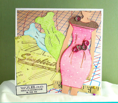
I've been playing with the set of Fashion templates from Crafty Templates this week and have a couple of cards to share.
Bubble Dress

I cut the template 3 times in different sizes
To make the "cutting board" background I used an image I found on the net, cropped, resized and printed it directly onto a piece of A4 card.  I then folded and cut it to achieve an 14cm card blank  square card.
I knew I had some paper featuring sewing patterns and notions somewhere in my stash - in fact I'm sure I have two different sorts, but despite a good old search I could only find the one, so have used it on both cards.
The little care label is another internet image, which I used Paint Shop Pro to change the wording on before printing.
The flower decorations are made with Card Candy and Stickles, I added some tape which has measurements on it and a couple of coloured-headed pins

Full Skirt Dress
This one has a bit of a vintage feel, I think so the chintzy, 
flowery paper works well
I cut the dress template twice, trimming off some of the upper section on the flowered print to reveal the plain "petticoat" layer beneath
I've used seam binding to make a scarf collar and tie, plus a gathered cummerbund
More of the Sewing patterned paper along with Ribbons, button, velvet ric-rac and a few flat-backed pearls to finish.

Find out all you need to know about Crafty Templates and Quirky Kits by clicking HERE!

That's it for this time
Happy Crafting

Don't do as I do...

This layout isn't quite how it was going to be
Mostly because I am very clumsy...
but I think I have just about salvaged it!
 
 It started quite well. You will have to take my word for it that the spray in the Candy Floss Cart kit is almost a perfect match for the front door in the photo (I think it may not have come out right because there is a photo of a photo. Or it might just be my bad photo editing skills!) So I decided to take a break from Florence and document this fab story

I used some Paperartsy grunge paste and a dotted mask. When that was dry I used the Kesi-art Pschhiitt ink spray as a mist,  then I splattered some drops and then I painted a few of the raised dots with the mist.

I layered up my papers and then decided to soften the red of the large patterned piece with some Gesso. Why I am not quite sure as it was a great match to the jumper before. I think I hoped that the red would stand out more and anyway it is lovely and strong on the vellum. I also sprayed the paper I cut to journal on with yellow mist and added a few dots of yellow mist around the place. 

Sticking down those narrow strips was hard. I did it the wrong way round. I should have started from the bottom and worked up. I got myself in a sticky tangle and there is more vellum showing than I intended. But it is all good.

I cut up the tags and added them to the right hand side of the journalling spot. Their right edges are raised with foam pads for some extra dimension. I also distressed the edges of the main piece of paper with my fingers.

Then came the major disaster: I have seen "proper" scrappers line up stickers on a ruler to get them straight and then lay them on the layout and it all looks perfect. I tried and failed big time, I just couldn't get them off the ruler and onto the layout the way I wanted to, so started taking them off the ruler one at a time. Only I hadn't checked where I had put the sticker/ruler combo down until I came to pick up the next letter which had now stuck to the photo. And when I tried to pull it off - some of the coating came off the photo as well. 
Hurray for cork embellishments that can just about cover up mistakes I say!
And of course - oh the irony - the title still isn't straight.
but I do love those stickers - they have a letterpress look on the white cardstock.

I cut up one of the Elle Studio tags to write the date and place. Here is another tip - don't just write on top of your layout where you might end up running out of space and leaving a black spot in the middle of your white space where it would spoil the effect of the layout to try and cover it up. No - lean on scrap paper you dozy mare. (that is a note to self by the way. And did you spot the black dot? Bet you do now!)

However one thing that went right was the little dots. I added some of the glass dewdrop beads from the kit and some yellow Liquid Pearls. I also added some of my DIY Liquid Pearl Enamel Dot type things - they are the red ones. You can see how I did it on my blog. OK you don't really need to bother as all you do is make big blobs on thick acetate and leave them to set!


Starting Lite

Normally when I get my box of lovely goodies I start with the main kit and then break open the lite kit but this month I decided to dive straight into the wonderful Ice Cream Stall

Firstly I printed my photos which I had turned into polariods using Picasa (its free!). I chopped up small elements of the papers, including the arrows from the Chalkboard Quotes paper. As I so often do, I outlined everything with a black Sharpie. I do find I like something to define my patterned paper edges and a Sharpie pen is, well, sharper. Always have some scrap paper underneath if you do this. I place my paper on the scrap and just draw a line down the side using the Sharpie pen. Half makes a lovely black line on your paper and half ends up on the scrap.

I cut the banner from one of the other papers and cut out the tags that were part of it. I often do this with printed on features like this as it makes them more dimensional. I punched out various heart shapes with different sized punches. I also chose some elements from the sticker sheet to outline. I do this by peeling them off and sticking them onto the back of the sheet so they are easy to remove again when you want to use them on your layout.

When I was happy with placement I stuck down my papers, stickers and photos. I knew I had a lot to say so made sure there was a big space on the left hand side. Initially I used the sticker sheet alphabet to make the title but it was a little too soft - I needed something more graphic so resorted to pulling out some old Thicker Sheets. Of course most of my old Thicker sheets are running out of vowels so a little bit of improvisation went on!

Once I had finished my journalling marathon I sprinkled some of the darling teeny confetti over parts of the page and used Glossy Accents to stick them down. Enormously fiddly but worth it!
 These kits have come just in time for me to record my recent trip to Florence and the colours are just right to showcase some stories full of love and sunshine. I do hope you are enjoying  the kits as much as I am - I bet you are!