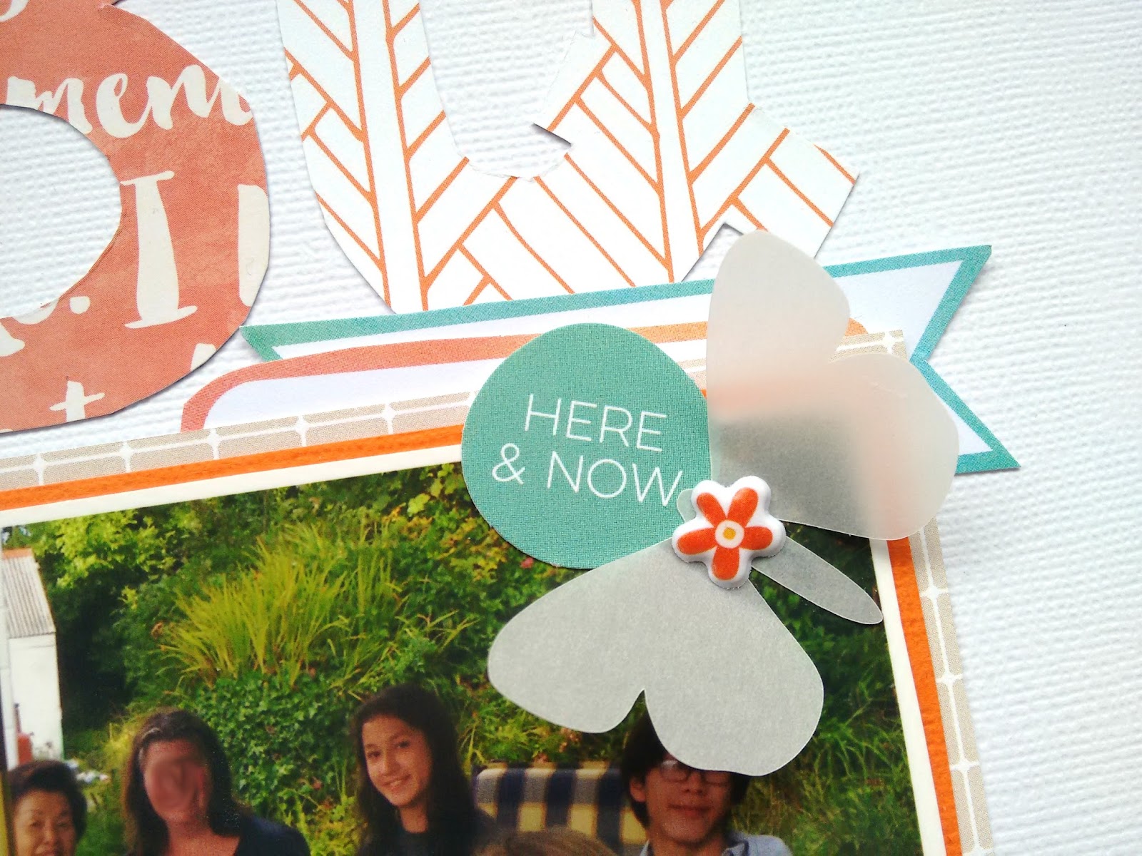
BBQ In The Summer

Did anyone participate in all the iNSD fun on Saturday? I was busy all that day but I've been looking through to see if any challenges inspire me. This one was to use a big title, although it wasn't too much of a challenge because big titles are one of my favourite looks! Harder was my self imposed challenge to use a very orange based colour scheme and I'm really happy with how it turned out, plenty of white made it somewhat less daunting. 
 My big title is cut out of pattern papers from the kit, the easiest way I know to make the alphabet match the layout. This layout also has a fairly large photo so there wasn't too much left to do.
 I stitched on some coordinating embellies. My stapler wasn't quite strong enough for this rubber shape and I don't have appropriate glue, luckily stitches look really cute.
 I did a small cluster on my photo trying not to cover my brother's face too much. I've said it before and I'll say it again: I LOVE these vellum butterflies. I trimmed around the cut apart labels to make them more subtle.
I added a final cluster at the top of my layout, repeating the papers in my title so I wasn't adding anything drastically new to the page. Thanks for reading, if you want some inspiration Leo linked up loads of stuff on the Quirky Kits facebook group over the weekend.

My new superpower

I have been able to read backwards and upside down for a long time. I try to keep that secret because it means people leave things out for me to read backwards and upside down! But I have just discovered that I can also write backwards which proved very useful for the next sketch challenge layout
 I used the sketch that was all about squares. My photos are a little closer together and the squares a little bigger than on the sketch but really mostly stuck too it. (Those sketches just make scrapping a breeze)

I decided that I wanted a big title but not with the big letters. I remembered that Kirsty Smith does wonderful hand lettered titles  and thought I would give it a go. But then was too lazy to work out how to print backwards on cardstock so wondered if I could write backwards in cursive
Yes, is the reply. The backwards green is not as pretty as the forwards orange but it was close enough. So I wrote on the back and played about until the letters were thick enough to cut out. I was going to cut out the middles and be delicate and pretty but... lazy remember? And I quite like them as they are.
I did then need to outline the letters. The trick to getting the letters right so that the unders and overs work is this
start at the end and go backwards
basically writing backwards again! So I went from the bottom tip of the "s" back to the "c" in cliffs. The letters were mounted on foam pads cut small and added to the papers.
I cut some 1cm paper strips and got writing.
then it was just a few finishing touches and job done


Simple but effective

I love the shattered glass effect suggested by Leo this month.
I am rubbish at putting it together. It may look fine, but despite carefully measuring and muttering, none of the pieces are where I planned for them to go. Still, it doesn't matter in the long run!

 I chose the papers that I thought went best with the sliver, blue and yellow of the photos. I also picked out a square and a cut apart card to go on the layout. After giving everything an outline with black pen (I do like a defined edge when using lots of patterns) I basically slavishly followed Leo's sketch (well as much as badly measured papers will allow!) I rooted through the die cuts to find suitable tags and also added in some of the gorgeous watercolour tags. 


The sun was given a little bit of shine with wink of Stella pen 
I wrote my journalling 
and added the title (cut with die cut letters) Its not a spelling mistake but a pun on God's risen Son at sunrise.
Then added the butterflies. They do have amazing symbolism - on a recent page they were about change, here they represent new life, sometimes I just add them to look pretty! I glued them down with Tombow glue and hid that with the Nuvo drops

July 2016 - Event packed month

Hello everyone,

After a holiday and quite few bank holidays, I'm back with a lot of layouts to share with you, also the new kit we received inspired me. But as I mentioned previously, I'm catching up with my Project Life album, so today I will share the rest of the pages from July, as this month is quite photo heavy month (many events packed in one month - a visit from America, volunteer work, work anniversary and graduation ceremony). While ago you saw from me a post where I scrapbooked my graduation ceremony. But few things were happening beforehand and after that, so these three pages I'm sharing with you today is connected with those posts.
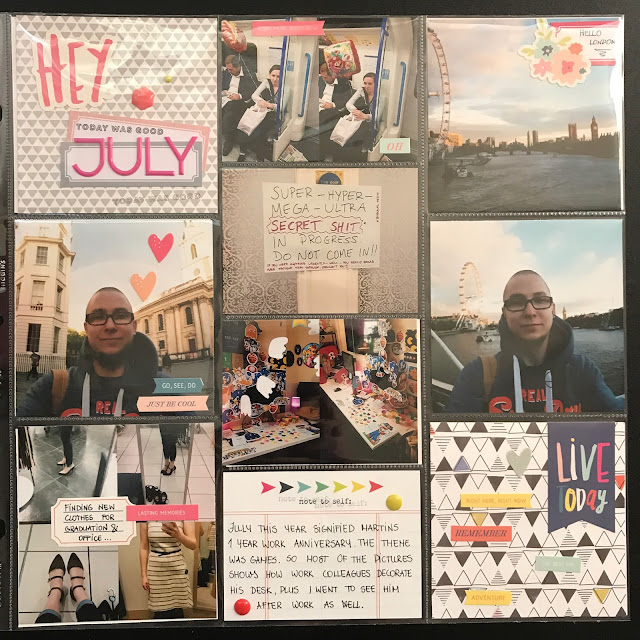
So you might think that the first page is different in colour scheme than others, the reason is the location of the page, it's put together with the layouts you saw in the previous posts - June ending. For that reason, I used some of the same elements - labels, stickers and the pink undertones throughout the page. The beginning of July signified my husbands' work anniversary - 1 year, here are some of the pictures from that day. As everyone knows both of us love playing video games, so his colleagues decorate his desk space and gave balloons to him. While during this period I was on a mission to find graduation and interview dress and shoes, these pictures were sent to my hubby to have a second opinion. At the end I went with the black shoes on the top-right corner, they look amazing but the most uncomfortable shoes ever. I got blisters at the bottom of my feet, which I had never had before in my life. 😄

And this page in the album is located with the graduation layouts for that reason I choose to use the navy, yellow and neutral tones in the layout, which was part of our kits a few months ago. My favourite Pinkfresh collection - had 2 die-cut packs and I have used all of it. This page mainly focused on the relative visit from America and my final volunteering for my scholarship. This year my volunteer work was a bit different because I was in charge of social media, which meant I had to take a lot of photos of the ceremony. However, the next day I had my ceremony to attend, so this is where the Graduation layouts would be located.


The final project life layout for today is the memories of the July end, which was a difficult period for me because I finally had to realise that's it - the university is over, and I'm unemployed. This meant a lot of applications and interviews, here are few highlights before and after an interview. However, this days' interview went quite horrible which resulted that I was sitting next to Tate and was feeling sorry for myself a lot :D. Sometimes even those bad times have to be recorded, of course, I got over it the next day. The final event for this month was Martins quarterly work event, and this time it was a boat trip.


I hope you enjoyed this, talk to you soon and look out for more from me, Agnese :)

The day job

Another of Leo's creative suggestions this time round was to make a background out of the cards and cut apart sheet. I rummaged through the kit and the photos I had ready to scrap to see what would work best and the colours came together like this. (perhaps more in my head as I know the colours of the skirt I am wearing which is orange, yellow and black with little foxes on it, this is the dress version, fact fans). Also helped by being next to Macmillan with their green logo!


This came together really quickly as I just picked out the cards that appealed either by colour or what they said or even better, both.
The final look of the page was driven by trying to find letters to spell out "the day job". My craft space floor was covered with loads of old thicker packets trying to find enough vowels to make up the words. Finally this set from an old Quirky Kit came up trumps. But it did mean that everything else had to have the goldfinger treatment. I covered up the paper while I threw gold mist all over the place 

I added gold metallic pen to that lovely little heart and used it to write my journalling - which does make it harder to read from a photograph
And finally the Nuvo jewel drops from the kit came to play alongside gold and green liquid pearls to tie everything together
 

Little Bit Chilly

This layout was me trying to get out of my habit of doing very monochromatic layouts recently. I wasn't really sure where I was going as I started, just that I wanted the title to use the big Jillibean Soup alphabets.
 As I arranged the title beneath my photo I realised both were so tall it was creating a column down my page. I LOVE column based designs so I decided to roll with it. I cut down a couple of the embellishment cards in colours from the title to build the column.
 I backed each card with patterned paper so the width of the column was more consistent and popped them up on cardboard for dimension.
 The right side was looking a little bare so I added a thin strip of paper and a few little embellishments to fill it up a little. I find that mixed media can also spice up a basic column!
 I used Elle's Studio die cuts, Nuvo jewel drops and black ink splatters to add some embellishment to the main column.
If you're daunted by how bold the alphabets are, choose them from a limited colour palette and layer them so they take up less space. I was afraid they wouldn't suit my style but because they're thin card they are so versatile. Thanks for reading!

Leo makes it easy

I'm always so pleased when there are sketches and ideas included in the kits. Is it because I am lazy or I like to riff off someone else's inspiration? You decide!
This layout used a sketch from the kit that was about layering up papers on either side
 I immediately thought of these photos of a set of canal locks in Bingley that we visited in February. Just amazing!

I stuck pretty closely to the sketch. I think that the letters would have got a bit lost on the blue so giving them the white bit to rest in is perfect.

I tried to pick out the most watery patterns that were in the kit, often using both sides of papers. They were all outlined with a silver pen.  I had decided that some white mist drops would be great for the page - and then covered most of them up...

I also realised that there was an empty space in the middle that just didn't seem right so the butterflies came into play again. I gave them silver pearl bodies and also used white opal liquid pearls to add more dots of white