Going 'Outside the box' Project Life scrapping ideas

Hi!

Today I've put together a project idea using goodies from the Quirky Kit main 'Golden Moments' and the embellishment kit 'Shine out Loud'.

Now I'm not really a Project Life scrapper but I do like to mix my page styles and this year while I've been experimenting with the 9"x12" album size for my everyday album I've found myself making more and more pocket pages. But because I'm never really 100% traditional with anything scrappy my brain tends to think naturally of ways to break out of those little pockets or 'boxes'. I've also been really inspired by autumn, you can't fail to want to go out and crunch some leaves and take photos of all the colours it's so lovely outside in the UK right now, (well when the fog shifts enough to actually allow us to see anyhow!) I wanted to capture all this on a page. I also had this lovely layout in my head that is just one of those layouts for me that makes me want to sit down and scrapbook! So putting all the ideas floating around together here's what I ended up making:

The base is a Project Life page design F page protector cut down to 9", (cut the last row of pockets off). This is both sides the front above and the back bellow.


I started off with the leaf embellishments that were cut from the Kaisercraft 'Gleam' patterned paper using a Silhouette cutting machine. I also made some circles making use of all the spaces between the leaves. The leaf shapes I found on google images, (looking for leaf stencils) and just traced them. You could just as easily hand cut some leaf shapes out, I'm just really lazy!


To start building the page I picked out one of the Everyday Edition Specialty Project Life cards from the embellishment kit. I went with a 6x4 one so I could have the same design on both sides. To get this I cut the card in half to make two 3x4 cards and then rounded the cut corners to make two separate cards. I glued them together back to back then put it inside the middle pocket.


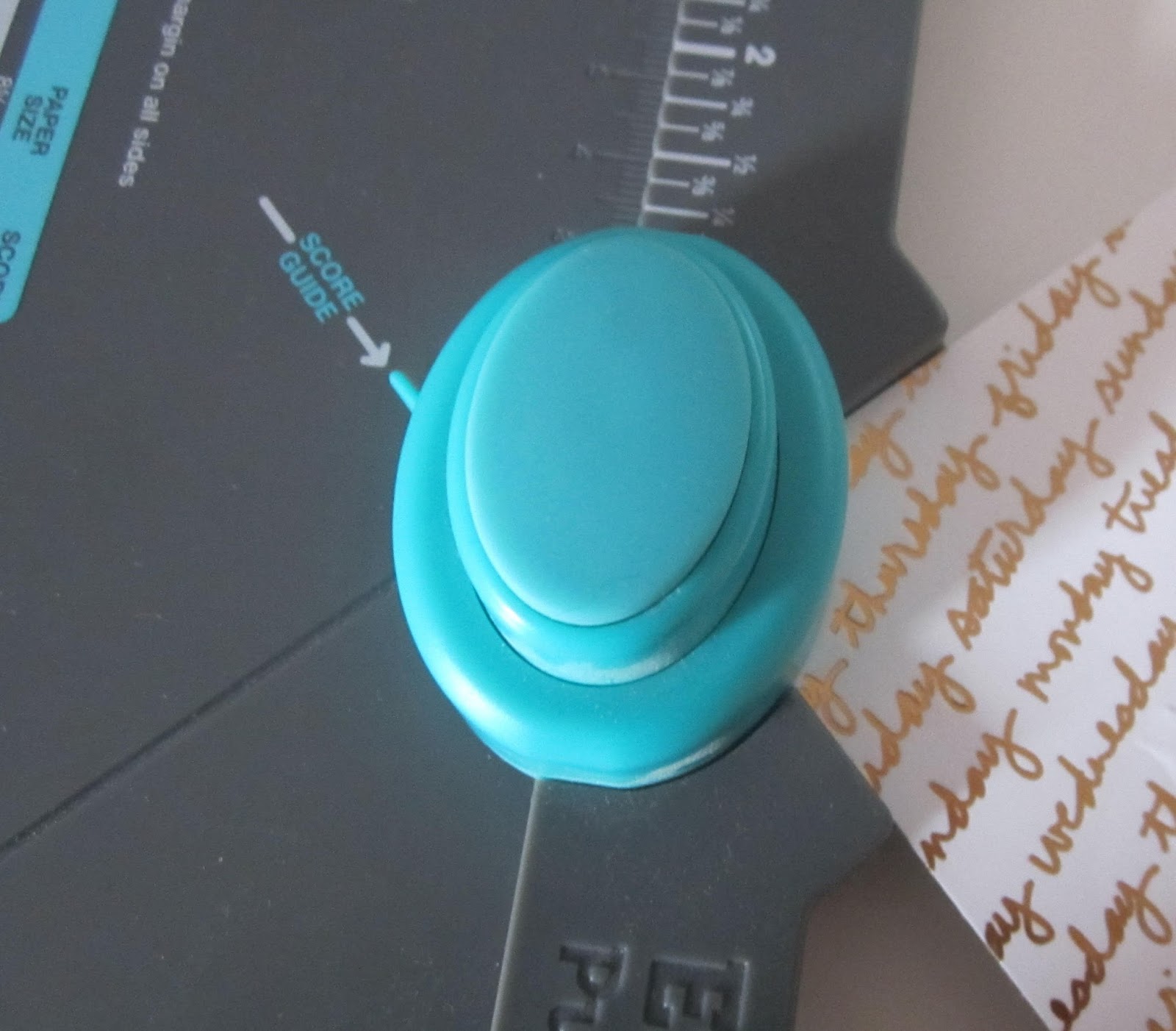
I use my We R Memory Keepers Envelope Punch Board to round the corners on Project Life cards because it's exactly the same size of corner as the ready made cards and it's something I already have in my stash. I will show a different way later too.
Next, I filled the middle row of pockets, either side of the card on the page protector with the paper circles:

The to 'break out of the box' I've layered the leaf cut outs right over the top of the pockets. I went for a randomness with them to reflect fallen autumn leaves. I used my sewing machine to fix them in place and to also seal the circles of paper inside the pockets. There's some extra glue too just to hold everything in place.


From there it was just a case of filling in the rest of the pockets using a mix of my photos and more of the Project Life cards from the embellishment kit. 
Here's another way to make your patterned paper match your Project Life cards too.
Just cut a piece of patterned paper to 3x4 inches. Stick a Project Life card over the top, (use removable tape if you want to take it off again) then trim around the edge with scissors. Easy as pie way of customising a card and/or making your own cards from patterned paper.


You can customise with stamps too. My trusty old date stamp made an appearance adding the date stamp to the 'Today' card.

I used a rolling alphabet stamp to add some text to the 'fave' card. These cards are all from the same pack in the Quirky Embellishment kit the 'Everyday Edition' specialty card pack. I also used some of the Simple Stories Bradz and MAMBI clear stickers from the embellishment kit on the back page of the spread to add some little extras. The labels were cut out from the Pink Paislee Memorandum 'labels' paper.


Hope this has inspired you to think 'out of the box' with pocket scrapbooking and given you some ideas for using and mixing up your kits with your Project Life.
x Leo


It keeps on going

These kits are just crammed full of goodies. this is my 8th layout to share with you and I think I have just enough paper left to squeeze out one more when I have some time available.
I cut out the flowers from the Jen Hadfield DIY Home Ivory Inlay paper to use on a different layout (I think it was Underwhelmed) but it just didn't look right so I saved them for this one. I went round all the shapes with a black pen and I love the way it brings the patterns to life - especially the Carta Bella Fall Blessings Autumn Day under the journalling strips
When I was happy with the placement of my papers (some of which I cut in half to make them look like larger pieces than they really are) I stuck them down and then added the Ivory Inlay flowers on the top with foam pads.
The fun apple, pear and acorn don't really have anything to do with the layout but they make a cute corner alongside a foil sticker and a rub on.
The title was made from a rub on, a sticker and some of those gold Thickers in the main kit
the little puffy sticker triangles and clothes peg helped to fill an awkward gap.

This layout came together really quickly and I am pleased with how it turned out


the graphic look

I'm not really very good at clean and simple but had an idea of using quite a few of the various kinds of word stickers and thickers in the kits all together and I think it kind of worked.

I started off by placing my photos behind one of the Project Life Everyday Edition Speciality Cards. I then decided that everything would benefit from the black pen treatment and had to very carefully go round the inside of the photos hoping my hand would not slip (as it sometimes does. I cut strips from various papers and layered it all up. I usually make sure that all my papers touch in some way but I really like the result of leaving some of the small strips floating on this one.
I then added my variety of words to the left, filling in spaces with puffy hearts, brads and one of those dear little bows from the embellishment kit (I used a rolled up glue dot to secure it). 
Those fab Gold Foil Thickers are great as there are loads of each letter. I placed this next which gave me an idea of how to space my journalling. To be really graphic I should have created journalling lines to keep it neater but there is only so much "clean" I can do!

It is Cardigan, CARDIGAN you fool.

On holiday we went to Cardigan Castle one day and the country park another. I have made three layouts about these trips (so far) and on two out of three I have just discovered that I wrote Camarthen instead of Cardigan. Now I am going to have to think about how to correct it. Dimwit.

Here are the layouts anyway....

This is not a great photo. Taken at 3pm and already the light was failing. I'll try and replace it soon. The photo on the scrap page is not great either. The original wasn't too bad but my printer was running out of ink and I only had cheap photo paper left. But I was desperate to scrap so decided to use it anyway. Especially as it tells the story of a less good time.

I used the papers from the Lite kit but added in items from the lush Shine Out Loud embellishment kit. And after I had made it and was onto another I decided to sneak in the rub on from the main kit as I though "Oh, ok" said it all really.

I used the Pink Paislee Cedar Lane Greenspacepaper as the background and added some Heidi Swapp gold lame mist sprinkles. Whilst that was drying I painted some of the mist onto the fabulous die cut tree, a label that I cut using a die and two of the lush vellum leaves. The vellum is so thick that it didn't shrivel although they did bend a little.
I layered up my papers with one of the Project Life Everyday Edition Speciality Cards which I cut in two. It took me a while to work out what to do with the title as I had used quite a few of the gold letters by then but I thought using the black and the gold worked ok.

I added in the fine washi tape from the last kits and once I had done my (wrong, wrong, wrong) journalling, finished it off with some of the awesome Simple Stories We Are Family Bradz and a cute layered sticker owl. I used some black enamel dots as well but mine are not as matte as the ones in the Embellishment kit.

Here is the other layout with the big mistake
This one mixes up leftovers from all the kits. I began with the  Bazzill Smoothies cardstock in Waterfall from the main kit. Yes, that Gold Lame mist is out again. This time I tried very hard to make proper splodges with the ink rather than delicate droplets.  

I matted my photos and layered them on toning papers, adding little punched out labels and the ampersand from the Dear Lizzy acetate sheet. That also had a "Party animal" circle that I cut out, stuck to some spare paper and layered stickers on top of to create my title (the letter stickers are from my stash - Simple Stories DIY boutique).
I tried to be fairly random in the positioning of the brads, rub on and stickers but I find that quite hard!
I was pleased with the idea of using the Pink Paislee Memorandum gold foil frame embellishment to frame my writing. Less happy when I realised the error... 
A few puffy stars and hearts finished things off.
Now... how do I change the word to Cardigan, any ideas?

Veni, vidi, scrappi

I came, I saw, I scrapped it the same day!
Its very rare for that to happen but we had a lovely day out last week and it still left enough time for me to do some crafting in the evening. Result! I used the Catch a Leaf Lite kit only
The lovely Dear Lizzy Documentary Gold Foil Acetate speciality paper makes it quite difficult to photograph properly...

I layered the Patina and white cardstock, cutting out the middle of the Patina cardstock first. I sprinkled some Heidi Swapp Gold Lame glimmer mist onto the white cardstock and left it to dry. I used a LOT of that mist with these kits as you can never have too much gold in my opinion.

I cut strips of the Pink Paislee Memorandum Ledge, using both sides of the paper, plus a strip of the Pink Paislee Cedar Lane Walnut Street paper to stop the whole thing being too pastel. I stuck the camera from the Dear Lizzy paper into the top strip

 and layered the "happy" over the large middle strip. I like the way that you can see the pattern beneath as well.
The letters for the title are from the Pink Paislee Memorandum alphabet sticker booklet - another reason for the brown paper addition otherwise they would have been lost altogether.

The photos were then added - the bottom photo had foam pads stuck under it and a clothes pin on the top for decoration. A punch was used to create a little scallop border underneath using some of the spare patina cardstock.

Final touches were the lovely paper heart, some sequins from my stash and the journalling. I felt that black pen would be too harsh but the gold is quite hard to read, I have a grey pen somewhere and must dig it out as that might have been better.


Be still my beating heart

I actually gasped when I lifted the Pebbles Jen Hadfield Homemade Gold Wood speciality foiled cardstock out of the kit box. It is so, so, so beautiful.
So I knew that it had to be the centre piece of a layout. I was tempted to cut it up and use it in lots of little pieces but in the end I was glad that I used the whole thing as my base
I was also delighted to note that the Memorandum Time Clock Paper featured a red spot pattern very similar to that on my dress (my husband says that I look like Minnie Mouse in that outfit). So I chopped up lots of the strips of the paper and layered them behind the photo. I also layered in the Oversized roll ticket shape tag and added a big square of the Carta Bella Fall Blessings Autumn Trees B side behind the photo.


When it was all stuck down I wanted some more definition and so did some outlining with black and white pens. I used one of the words from the Memorandum Gold Puffy Stickers and some of the wonderful gold Thickers for the title.  

I was going to rub on all of the rub ons but I did find the first one that I tried (the flowers) quite hard going. So I put all the others onto vellum and it was much easier. It also meant that I could play about with the placing until I was happy.
I was able to add in some more puffy stickers and the feather clip at the bottom (except I thought that it looked like a leaf, so that is what I am going to call it). 
The weather was lovely on our day out but the place not so great - however the amazing Quirky kit turned the whole thing wonderful :)

Golden Moments

Its a lovely name for an absolutely gorgeous kit from Quirky Kits this month, full of wonderful patterns and fabulous little details. Here is how it first inspired me
These photos  - and I think the set of the show had an orangy cast which meant that the Mango cardstock  was a perfect foil. Leo included some sketches again this time and although her suggestion was to use white cardstock in the middle and a patterned backdrop, it made more sense for me to reverse it. The Kaisercraft A Touch of Gold Razzle patterned paper in black and white made a great base.

I trimmed some other pieces of the papers from the kit. I added some black stripes to the Kaisercraft A Touch of Gold Gleam paper to better echo Jack's striped suit. I also added more black, gold and orange triangles to the other side of the paper but in the end most of them were covered up!

I took some of the lovely American Crafts Dear Lizzy Documentary Rub on transfer embellishments and rubbed them on to white cardstock before cutting them out. I loved the circle from the Memorandum Gold Puffy Stickers so carefully trimmed out the words from the inside and laid it around the rub-on phrase that makes the subtitle.

I layered the photos, the two smaller ones are raised on foam pads and I added in the large gold paper clip.

I adore those great big American Crafts Gold Foiled chipboard Shoebox alphabet stickers and was going to try and eke them out a bit more. I stuck on the "24 hours" and then added die cut letters with some of the spare Mango cardstock (I gutted it before layering on the Touch of Gold Razzle paper). But the letters just didn't look right so I peeled them off and added more of the large ones. It was worth it (although don't look too hard at the paper underneath as not all of the die cut stickers came off as easily as they might do)

Just a sprinkling of more of the lovely gold embellishments and the layout was done -  and some golden moments captured