Hi there!
Just enough time to squeeze in a little more inspiration using previous kits before we get all excited about the new kits that must surely be due to drop through our letter boxes soon!
Inspired by the Carta Bella pinwheels PP from the skyline kit, I decided to pull out all my Quirky monochromatic PPs for this latest layout. I did a happy dance when I realised that the mint green TC enamel dots were an exact match to the echo park PPs from a previous lite kit (Twinkle Twinkle?) and my colour scheme was set!
I was able to achieve lots of dimension with those cute little Melissa Frances Frames, the wooden button (which I used the back of because my layout is so neutral) and of course lots of layering!
All the PPs and embellishments are from Quirky kits past and present, it's been great mixing it up this month and making a dent in all those scraps I can't bear to part with!
I hope you're mixing it up too!
Nikki x
Mixing it up, Quirky Style...
Hi There!
Another layout which demonstrates just how well all the Quirky kits work together especially when you add the essential elements in the form of the wonderful embellishments Leo sources for us. I used the Skyline kit again as the basis for my Layout and scraps from previous kits to build upon that base. How many do you recognise?
Do you see the woodgrain label peeking out from under the photo mat? That's the packaging from the TC enamel dots! I really went to town on those dots, it's so tempting to hoard these because they are so gorgeous but really, what use are they tucked away in a drawer? I also discovered, while I was working out where to place my dots and keeping them on the clear-backing and positioning them around your page...that they are spaced on the plastic perfectly. Or, to put it another way, once you decide where you want your dots to be, use their placement on the packaging as a guide to putting them on your layout...still confused? Wow, it's quite hard to explain in words, I think maybe a few photos would help, but that's for another post!
I hope you enjoy what you see today, and keep looking out for the sneaks of the next kit!
Nikki xxx
More new kit peeks!
All the papers for the new September/October kits have now arrived so I've done a couple more quick sneaky peek snaps for you.
Here are the main kit papers together:
The next kit 'Stitch in Time' has been inspired by sewing and fabric textures/patterns. As well as the patterned papers there's also one of the cool new Amy Tangerine die cut papers with die cut letters that you can fold back or cut out from the sheet. The pattern on the paper is just like a sweatshirt/jersey texture too, very fun!
I've made sure all the reverse sides of the papers are all nice neutrals too so if you're not feeling these sides you can flip them over and work the neutrals instead:
Here's a peek of all the new Lite kit papers together for you too:
The papers for both kits are all from brand new collections, Crate Paper 'Close Knit', Amy Tangerine 'Cut&Paste', Basic Grey 'Persimmon', Dear Lizzy 'Polka Dot Party' and Pebbles 'Front Porch'.
Lots of really fun brand new goodies to look forward to in the embellishments too! I'll share those as soon as they arrive.
Current subscribers look out for the extras store opening at the end of this week, (should be Friday) you'll get the usual email to let you know when it's open.
x Leo
A sunny skyline layout
Hi There!
I'm back into the swing of things now the summer holidays are over and I must admit it has been nice getting back into a routine. Leo sent me the skyline lit kit to play with and a few extras from the embellishment kit so I looked over my holiday snaps and the one that shouted "scrap me!" first was an adorable pic of DS3 wearing his older brother's bright orange shades. So I printed it off with the 'Hello Chevron' PPs fron Carta Bella in mind to use however my printer decided to make the sunglasses the exact yellow of the gorgeous Heidi Swapp sunburst paper, it was a fait accomplis!
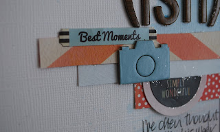
So, after cutting the sunburst out and distressing the edges I flicked yellow inks et it too. I then layered it over the beautiful Carta Bella PP that reminded me of the summer sky making sure I had the darker part of the paper at the bottom of the page. After the base of the layout was complete I made my main embellishment, the banner, using the chipboard stickers in the kit and my own die. I layered the photo over the 'hello' journalling card and added vellum doilies, stamped and embossed in white. A few more strips of paper from the other side of the Heidi Swapp PP completed the photo mat. I coloured the white BG stickers Pink to make up the title and used an alpha from a previous Quirky kit to complete it. To create the visual triangle I made the 'snapshot' banner out of black CS and the black flair button is from my stash. I still felt the Layout needed more texture so I lifted the edges of the sunburst and added strips of 'bird on a wire' PP (also from a previous kit, I love that everything works together!). To finish I added one of the chipboard cameras over stamped with text in grey and a wood veneer camera embossed in yellow.
And that's my layout! Thank you for reading today, I hope you are having fun with your kits too!
Nikki x
New Quirky Embellishment Kits
Hi!
So these last couple of weeks I've been super busy organising the brand new Quirky Embellishment kits! The first kit was a limited edition and it sold out really quickly so I guess I failed in guessing how many of you out there would want to grab one! The kits are now available on subscription so you can grab a place and go on my list for the next kits being made up now to make sure you get one. Subscriptions are running just like the regular Quirky Kits and Quirky Kits Lite subscriptions. You can grab one to mix up with either of the kits too if you're a current subscriber to either kit as the Quirky Embellishment kits are put together to work with the regular Quirky Kits too. I'm also trying to keep them neutralish, so they're easy to mix in with your own supplies as much as possible as well as adding in items following current trends and fashions. My hope there is that it'll help to give a little bit of a kick to getting your older supplies and papers used, throw in some new embellishments to give them a new lease of life. It'll also be a good kit for cardmakers, art journallers and Project Life scrapbookers; anywhere where you've got all the basics but are looking to add a little more quirky embellishment! You can read more about the new kits and subscribe from the Quirky Embellishments page in the store here. There's links to all the new kit subscriptions from the store homepage too, www.craftytemplates.co.uk
Would you like a sneak peek at just a few of the embellishment goodies coming up in the September/October Quirky Embellishments kit?
x Leo
So these last couple of weeks I've been super busy organising the brand new Quirky Embellishment kits! The first kit was a limited edition and it sold out really quickly so I guess I failed in guessing how many of you out there would want to grab one! The kits are now available on subscription so you can grab a place and go on my list for the next kits being made up now to make sure you get one. Subscriptions are running just like the regular Quirky Kits and Quirky Kits Lite subscriptions. You can grab one to mix up with either of the kits too if you're a current subscriber to either kit as the Quirky Embellishment kits are put together to work with the regular Quirky Kits too. I'm also trying to keep them neutralish, so they're easy to mix in with your own supplies as much as possible as well as adding in items following current trends and fashions. My hope there is that it'll help to give a little bit of a kick to getting your older supplies and papers used, throw in some new embellishments to give them a new lease of life. It'll also be a good kit for cardmakers, art journallers and Project Life scrapbookers; anywhere where you've got all the basics but are looking to add a little more quirky embellishment! You can read more about the new kits and subscribe from the Quirky Embellishments page in the store here. There's links to all the new kit subscriptions from the store homepage too, www.craftytemplates.co.uk
Would you like a sneak peek at just a few of the embellishment goodies coming up in the September/October Quirky Embellishments kit?
Quick cards with the leftovers
I had a couple of larger scraps from the kit that were too pretty to abandon so I made a couple of cards
The Glitz paper provided a colourful background. I found some toning scraps which I turned into balloons (Clearly Besotted die). Initially the yellow piece with the holes in (Dienamics die) was bigger but it needed something behind it to stop it overwhelming that fab paper at the back. So I used a Spellbinder die and one of the more neutral papers to tone it down. A Clearly Besotted sentiment on a Dienamics die cut strip and 'twas done.
I cut out one of those lovely little typewriters (every time I have cut them out I have cut off the handles as they are too flimsy. Did you notice?) I used the colours from the "hair today" layout but added a little pop of red. The Clearly Besotted "smile" fitted perfectly onto the typewriter page. The yellow and white check paper is actually one of the Elle Studio cut out cards. I added a few Enamel Dots to finish it off.
I have a few stickers and alphabets left (as we always get such a generous amount) but I am pretty much done with papers. Now I am waiting for the next kits with great anticipation!
You two
Another watercolour background here, featuring bits from both Quirky and Lite kits
It was a "try not to think too much about it" kind of layout (can you tell?) with the addition of a Clearly Besotted dotty square stamp. I cut up the largest pieces i had left and just went for a technicolour look. I hope that thr green that peeks out from left and right provides enough restful colour for the eye! And as per my usual style, in order to make a border between each of the papers I outlined everything with my Sharpie pen
I knew I had to get this sticker in somewhere...
In amongst my sequins were the two little hearts. The top one might be part of an arrow that broke off but it looked like a heart on a stick to me. So I added two more wooden people from my stash and echoed them with the two from the sticker sheet.
I love the typewriter paper even though I didn't really have any type style photos to scrap so I decided to go with a pink and blue for boy and girl instead.
(note that the sticker is back in its rightful place on this photo)
I think it would make a cute basis for a wedding card with "him" and "her" written on the typewriter's paper. But I haven't got enough of the paper left to do that with!
Deep soul journalling
I recently treated myself to an online workshop on Two Peas - Scrapbooking form the Soul by the awesome scrapper Jill Sprott. She encourages you to go a bit deeper in your journalling and express something deep.
It inspired this layout which turned out way different than I imagined.
It again uses the Skyline kit - but you would never think it was the same set of papers as my last layout
I was first inspired by the sunburst paper and had decided to use the two photos and chipboard frames a little like they are now. It was as I pondered where to put the journalling that I felt compelled to write the whole story of the big chop and how I feel about it.
Initially I had a picture in my head of some black ink dots and lots of words with the photos etc covering up some of the journalling permanently. I had also meant to stick down the triangle that I had cut from the corner of the other side of the yellow paper but lost it temporarily on my desk (as you do). So I merrily splodged away with black Mr Huey and then began to write. The paper actually makes it easy as it has a subtle grid pattern on it that keeps the writing straight.
I'm not sure how heartfelt it really is - but it is long!
And once it was written, although I liked the concept of losing some of the words, I found I didn't want to. So I came up with a plan B which was to add a transparency top layer.
Which is what I did.
I found an A4 sized transparency, trimmed it down slightly and added it on top of the page with a strip of Washi tape (from the I'm with the Band kit). As I was playing with transparency I decided to turn one of the slides into a little shaker embellishment. I simply sandwiched some of the sequins from the kit between two small squares of transparency, stuck with thin red double sided tape. I did add some black sequins from my stash as black was such a strong colour in the layout.
and one of the stickers provided a finishing touch.
I took a while thinking of the title and was pleased with the punning half a phrase I used. I don't actually write "gone tomorrow" anywhere because you either get it or it doesn't matter. And it is about H's hair, today. I started by placing the thickers on the chipboard slide au naturel. I do like the subtle woodgrain effect but then felt they would be better black. Like the camera in the bottom right hand corner. And the frame at the top. I am very fond of black you know
I snipped up a sticker for the feature in the bottom right (slightly squiffily it seems)
I spent a fair while playing with the elements in the top left corner. Painting the frame black helped. All the black was added with my trusty Sharpie pen. I say pen, would it surprise you to know that I have a few on the go at any one time?
The last touch was adding the yellow inky dots to the bottom left as it was feeling neglected.
Distress Stain Watercolouring
I don't have any watercolours but love the effect that is becoming very "on trend" as Gok Wan would say. I'm trying to cut down my spends a bit (hollow laugh there) but before I splurged on some I thought I would look around and see what else I could use. I have some Twinkling H2Os but when trying them out I found the colour a bit too intense. So instead I thought I would see what Distress Stains would be like. They are brilliant! Mind you I don't have many of those either so it is only a short term solution!
You can't really see H's face on this photo of a photo so here is the original. Isn't that a lovely smile?
I used the Skyline Quirky Kit Lite for this layout.
I wanted to keep the rest of the layout light so just cut a few strips of paper with my scissors.
I really liked the phrase "these moments make the best memories" from the Elle Studio paper but it was a bit too green so I decided to add some extra fine blue glitter onto the thick green lines with a glue pen.
I found the "time, date" etc wording on the strip on the bottom of the Elle Studio paper so cut it carefully and stuck it to the top right of the layout.
I punched two circles with a circle punch (Woodware yellow) and added the stickers from the kit - one of which I halved to use in different places.
I used the Thickers from the kit as the title.
As a finishing touch I added some of the sequins from the kit. I thought it would also be nice to add some mica flakes, added with a glue pen. They look nice but got EVERYWHERE - as you can see.
I love this layout and the sweet summer memory it envokes
I squirted some of the stain out onto a craft mat and then with a heavily watered thick brush stroked some of the red down on the bottom of the layout - it was so watered down it was the right shade of pink. I then added blue, overlapping the red a little bit. I flicked some of the blue distress stain and also some Picket Fence ( a more opaque white) over the layout as well.
I also brushed more of the two colours onto a spare piece of card ready for punching out later
You can't really see H's face on this photo of a photo so here is the original. Isn't that a lovely smile?
I used the Skyline Quirky Kit Lite for this layout.
I wanted to keep the rest of the layout light so just cut a few strips of paper with my scissors.
I really liked the phrase "these moments make the best memories" from the Elle Studio paper but it was a bit too green so I decided to add some extra fine blue glitter onto the thick green lines with a glue pen.
I found the "time, date" etc wording on the strip on the bottom of the Elle Studio paper so cut it carefully and stuck it to the top right of the layout.
I punched two circles with a circle punch (Woodware yellow) and added the stickers from the kit - one of which I halved to use in different places.
I used the Thickers from the kit as the title.
As a finishing touch I added some of the sequins from the kit. I thought it would also be nice to add some mica flakes, added with a glue pen. They look nice but got EVERYWHERE - as you can see.
I love this layout and the sweet summer memory it envokes
Subscribe to:
Posts (Atom)