Paris Mini Album

As new kit posting draws closer, I have a final project with my July/August kit and it's a little different. I made a holiday mini album, it's 5x5 inch and I think it's adorable. This post would be far too long if I posted pictures of all my pages, so if you want to see my full album and hear more about how I made it, scroll down for a video.
Of course I had to use my favourite paper as my front cover, especially because it's definitely a good one for the travel theme. 
 I managed to pack around 60 photos into this so it's great if you want to make sure you record something before it's too late.
 I used different sized pages and photos to add interest throughout. I also used various bits for layering including the tissue wrapped around the kits and some packaging!
 Photo collages are a good way to pack even more into an album. I have lots of photos I like but don't see as 'important' enough to take up a whole page.
This double page spread really sums up the magic of Disney for me: getting to see your favourite characters come to life.

Thanks for reading, if you have some papers left why not try a mini album?

Happy Little Man | ScrappyNerdUK (Claire) | July/August 2017

Hands up who squealed when they saw the Kite paper in the Maggie Holmes collection - My hand is firmly in the air!! So, when I saw this in the Lite Kit - I knew straight away that it was going to get fussy cut.


I teamed the kites up with clouds for a dreamy/sky feel. I used a cloud cut file and cut these using my Cricut (but you could draw a basic cloud shape and just cut them out with scissors instead). I backed these with different patterned papers from the kit and arranged them around the photo.

I then added in the kites ensuring that no 2 colours were too close together. So, there was some yellow to the left of the photo. I made sure that I used a yellow kite to the right to bring that colour to the other side of the page.


I then added in some black elements, mainly the tiny word stickers from Pretty Little Studio (I love these stickers!!)

Oh and the wood veneer sun from the Lite Kit went PERFECTLY too.


And here is the finished layout. Is it ok to say its one of my favourites?!?!

Fancy watching the process video then head over using this link to watch - https://youtu.be/prsTc8WH_fw

See you all again really soon!!

Claire xx


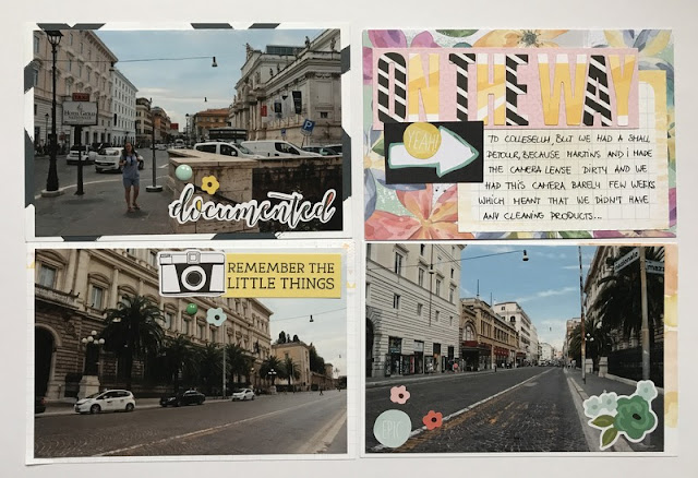
Travel Album - Day 2 (A walk to the next stop)

Hello everyone,

I hope all of you have been as productive and inspired like me. I have been really enjoying working on the travel album. Not while ago I had few days off, so I took the full advantage on catching on documenting our trip to Rome, the smaller size of the layouts have further motivated me because I don't feel overwhelmed. But if it's too much of these types of layouts for you then let me know, and I can change it up because there are three additional projects on my catch-up list. You know the usual scrapbooker adventures - so many things planned but not enough time as there are other things to deal with, especially if we require to take care of everyday responsibilities - work, family, etc.

The product I used from June/August kit:
  • Crate Paper Maggie Holmes Carousel 'Belle' 12"x12" doublesided patterned paper
  • Crate Paper Maggie Holmes Carousel 'Marquee' 12"x12" doublesided patterned paper
  • Kaisercraft Happy Snaps Sticker sheet
  • Sweet Talk co-ordinating labels
  • Pretty Little Studio Dream Big Die Cuts pack
  • We R Memory Keepers Cool Colors enamel shapes pack
  • To The Moon including die cut shapes
  • Wonder kit pocket cards
  • Previous kit leftovers - journaling cards, die cuts and patterned paper and stickers
  • From my stash - Simple Stories Posh Stickers, die-cuts, alphabet and heart dies and stamps

  • Now the first thing I did to create this page is select my pattern paper, and my inspiration has come from the die cut on the right side top card that says Best Day Ever, I pulled from that card four colours - teal, yellow, pink and black and white. I actually love to work with all of these colours, although it's just missing navy and then it's for sure my favourite lineup. But let's get back to the page, once I selected patterned paper, I cut all of them to the size I need and then brought some die-cuts and stickers from previous kits. Also, this time I wanted to use both my stamps and alphabet dies because I had quite a bit scraps left from last month kit and I wanted to use up.


    Similarly to the first picture I used 4x6 patterned papers and the card that has the title was my basis for selecting the other papers for this page. I forgot to explain one thing, all of my 4x6 pictures have to be overlaid with paper because they are not true 4x6 size, which annoys me greatly. This mishap happened because of the printing place I used - my local Boots closed and I had to order online, and the Boots online photo printing is run by Snapfish. And Snapfish always has been doing this, so I don't order from them. Today I guess I have short attention but when it comes to this page, I added few die-cuts and from my stash Simple Stories Posh stickers.


    The next page was even quicker to make, as it was more photo heavier. I backed my 4x6 photos and added one 3x4 card from the previous kits. I was saving this card as I loved it so much, but it went so well with these pictures that I had to use it. Once the basics were done, I started to embellish, and my usual style is to start with the labels and then die-cuts or stickers to finish the page.


    Continuing with the other layout style, the main card of this page is the left side 3x4 card that says Snapshot. One of the things I have noticed is that everyone had the same idea of using Crate Paper Maggie Holmes Carousel 'Belle' paper and I was no exception. I love that even though everyone had the exact idea, but the various ways it can be used and still looked different. And final touches that bring the layout together are embellishments - die-cuts and stickers.


    I hope you enjoyed this post and talk to you soon, Agnese.

    Happy Moment | ScrappyNerdUK (Claire) | July/August 2017

    I loved how the quirky made elements of this kit matched perfectly with the colours from Maggie Holmes Carousel. I couldn't wait to incorporate something from both into this layout. 


    My first job was to fussy cut the words from the Maggie Holmes Carousel "Happy Go Lucky" paper from the Lite Kit. I used this for my title "Happy Moment" and also cut some more for embellishments.


    I then layered vertically some of the ephemera pieces from the main kit and added in a few of the fussy cut words to create some interest to the right hand side of the page. I also used some of the stickers from the 12x12 Kaisercraft Happy Snaps sticker sheet from the Lite Kit to fill in some of the areas where the ephemera overlap.

    I love love love the "Fairgrounds" paper from Maggie Holmes which featured in the main kit. But it was far too busy so again I decided to fussy cut 2 elements from the paper. This is such a great way to make your paper and kit go so much further. Its a labour of love but so worth the effort with the end result. I fussy cut one of the ferris wheels (how sweet is that as an ephemera piece!) and also one of the carousels. These were added to my embellishment cluster down the left of the page. I then finished this off by adding some of those fussy cut words whilst popping some up on the foam pads from the kit to create some dimension and interest.

    And using that woodgrain background really sets it off nicely. This layout was simple (took a while due to do the fussy cutting) but demonstrates how to use those busy papers and really stretch your kit.

    I hope this brings you inspiration and feel free to give it a go!!! I would love to see your interpretations of my page.

    See you all really soon!!

    Claire xx

    Sweet Summer Layout - getting down to using the last bits of a kit

    Hi Leo here!

    I have just random bits left over of my main kit right now so I set to working on a layout to use up what I have left. I have lots of scrap paper pieces and a few die cuts and lots of the stickers. I also had one full sheet of paper to use so I decided to use that as my background so I can use the whole sheet at once seeing as the point of this one is to use up as much as I can!

    I've put together a process video so you can follow along with my as I made the layout. Apologies for all the umming on this one I didn't really know where I was going with it to start with - I usually have a plan but this time my plan was just use what I have in front of me so there wasn't a set vision I went with making it up as I went along!


    Sweet Summer Layout Process from Crafty Templates on Vimeo.

    If you don't want to watch the video here's a quick couple of photo stills one is of the layout when I'd added the paper layers with just the photo to be added on top and then the second one is the completed layout. I added some sketched circles with my compass before I glued down the paper layers as markers for where I added the stitching. I added the stitching in hand embroidery thread with a darning needle and used a simple back stitch.


    Have a go at seeing what you can create with your leftover pieces. x Leo

    Chilling | ScrappyNerdUK (Claire) | July/August 2017

    Hello Friends!!

    I'm back with a fun bright layout which is super quick to do (with a little preparation).

    I loved the bright pink cardstock and I had a photograph that I had been meaning to scrap for a while. I was wearing a pink t-shirt and it went perfectly with the cardstock (don't you just love it when that happens!)

    So, preparation is the key with this one. I loved the Belle paper from Maggie Holmes carousel from the Main kit and it just has to be fussy cut. This makes the paper stretch so much further and you can create multiple layouts with it then.


    I sat for about an hour (trust me, its worth the patience) and fussy cut these out. How pretty are they!

    I lined these up all along the bottom edge of the cardstock and overlapped them so there were no pink gaps showing through. I then backed my photo on white cardstock and added a doily behind. I then used some of the chipboard from the lite kit and added the amazing "today" perspextive from Bramble Fox which can be found as an extra in the shop.


    The layout needed some interest so I created another cluster to the top right of the layout using the fussy cut flowers. To this I added a chipboard label for the date and a Pretty Little Studios label to add a little bit of journalling (to be added still).

    And finally the title. I used the Freckled Fawn puffy alpha stickers to title my layout "Chilling". And its finished. So I used in total roughly half a sheet of patterned paper and a few embellishments. When you use a coloured cardstock background, especially a bright one, this really helps you to stretch your kit!!

    See you again really soon!!

    Don't forget to head over to YouTube for the process video!!
    https://youtu.be/kF9SU4mRjJQ

    Claire x


    Traveler's Notebook

    So today I have something a bit different for me, my first photo page in a Traveler's Notebook! You may recognise the photo, I used it in a scrapbook page but I accidentally printed it again in a smaller size so I decided to try this new format with it.
    The biggest challenge for me was probably the different ratio of the page, my original idea was to use a double spread but I wasn't quite sure what to do with the fold. I will definitely have to look at more pages for inspiration haha.
     I used my favourite technique of fussy cutting florals to add some embellishment (hint: that floral is actually cut in half so I don't cover up the pretty bit in the middle). I also thought a doily would look so nice and delicate in this smaller size.
     I added number embellishments for the 3 of us sitting on the sofa and chalk ink splatters (hint: try harder than I did to cover your photo because the ink goes a little strange on the glossy paper).

    Overall I really enjoyed this format, especially how quick it was. Next time I print off photos I will definitely think about printing some in a smaller size to fill the rest of my notebook.

    Paws Down I'm the Cutest

    Hello everyone!

    I am back with my 4th layout using the July/August Quirky Kit. Be sure to pop on over to Quirky Kit's  subscribers facebook group and also Instagram using the hashtag #quirkykits to check out the photo's of 8 more layouts I've created using this beautiful kit!

    Here's what I used and how I created this fun, cute layout:


    • Fancy Pants Dream Big Follow Your Dreams 12x12 patterned paper
    • Fancy Pants Shine Bright 12x12 patterned paper
    • Crate Paper Carousel Belle 12x12 patterned paper
    • Crate Paper Carousel Fairgrounds 12x12 patterned paper
    • Carousel Sticker Sheet
    • Tourist Label pack
    • Pretty Little Studio Dream Big die cuts pack
    • Pretty Little Studio Dream Big Hello Word Navy stickers
    • Thickers from a previous Quirky kit.
    I started this layout by cutting a frame for my white cardstock using the Fancy Pants Follow your Dreams patterned paper. The width was 1/2 inch all the way around. Before I adhered it to my page I used the left over piece of Carousel Belle paper I had and adhered it to the bottom of the white cardstock and then lay the frame over the top and adhered that.

    I proceed to mount all of my photo's on various patterned papers (all listed above) and then decided I wanted a large title so I placed the biggest photo off to the right hand side and the two smaller ones at the bottom left.


    Then came the title. I used some Dear Lizzy thickers from a previous Quirky kit as I really wanted the title to 'pop'


    I used the Pretty Little Studio die cuts pack and scattered some of the flowers around my photo and cluster at the bottom, and also added some of the rose stickers and stars from the Carousel sticker sheet. 
    I finished off with two of the tags using the Tourist label pack layering one on top of another. Popped on one of the Hello Word navy stickers, Wrote my journalling and voila! Layout complete :D


    I can't tell you how easy I've found creating layouts with this kit. The style and colour palette are right up my street! 
    I have a tiny bit left of this kit after the 11 layouts I've already made, so I will try and get at least one more out of it, but anything left will be shown on my September Kill a Kit video on Youtube which I will link on here once it's up.

    I hope you have a great rest of your week, and don't forget to come and say hello on the Subscribers facebook page! We'd love to hear from you x

    Happy Scrapping...Zoe xxx

    Happy Day - Natalie


    Hello everyone,

    I'm back today with another layout using the Jul/Aug Quirky Kit! 

    This time I was inspired by Zoe to create a wreath using those beautiful florals!
    I actually cut out all these flowers over summer when I was at home from university and didn't have many scrap supplies, so this layout was very quick and easy to make as all the hard work had already been done!


    I really love using subtle patterned papers as my background, particularly woodgrain, so I chose to use this beautiful grey woodgrain (Echo park Summer Fun "Sweet Treats", Lite Kit).

    The floral paper is so beautiful (Maggie Holmes Carousel "Belle", Main Kit) but very delicate so rather than fussy cutting straight against the lines I left a thin white border around the flowers, which I actually really like. Around the floral wreath I alternated sticking the flowers straight on the paper, and layering with foam pads (Main Kit), to give dimension. As the picture below shows I cut out some of the smaller flowers and used the foam pads to add them on top of the bigger floral piece, to add even more 3D dimension. Unlike Zoe I decided to leave the flowers uncoloured.


    For the title I decided to use this fussy cut phrase (MH Carousel, "Happy Go Lucky", Lite Kit), again I had already fussy cut all the phrases from this paper ready to use. From this one sheet of paper you have so many title options, it's brilliant!
    I really liked how the bright yellow contrasted with the more muted tones of the rest of the layout. And again I used foam pads to lift the title off the page.


    Around the wreath I scattered these small blue and yellow flower die cuts (Pretty Little Studio Dream Big Die Cuts, Main Kit), to add a further pop of colour. 


    I added two of these chipboard tiny word phrases (Freckled Fawn, Lite Kit). I love these as they just add so much more dimension than normal tiny word stickers, and I love the type writer font.


    Finally I added a small amount of journaling, which I typed on my computer using a typewriter font. 


    I hope you like my layout, and it gives you another way to use that beautiful floral paper!

    Natalie x


    Greatful

      Sometimes in life you've got to remember to be grateful of what you actually have in your life and not get carried away with all the other things we want but don't need!

    So this layout took  me 3 days to make in total. Not because it was difficult but because me and fussy cutting don't mix very well lol...I used to love cutting up paper etc. But now I'm impatient and want things done ASAP! It just show's with patience and perseverance something beautiful can come out of it. 

    So here is my layout, what I used and how I created it...


     What I used:

    • Maggie Holmes Carousel Belle 12x12 Patterned Paper
    • Black and White Stripe Ribbon
    • Labels from The Tourist die cut pack
    • Pretty Little Studio Beautiful Day Hello Word stickers
    • Pink Tulle fabric
    • Pebbles Jen Hadfield Heart of Home Hannah Word Phrase Thickers
    • (From my own Stash Crayola Pencils for colouring the flowers)
    I started this layout by cutting out lots of the flowers from the Carousel Belle 12x12 patterned paper and colouring them in with Crayola pencils (yes not many people realise the shading and dimension you can get by using bog standard Crayolas)


    They really do leave a beautiful finish. I believe they can also be used as watercolours as well either with water or baby wipes (although don't quote me as I've never actually tried out that method...yet!)

     Before I stuck down my photograph and flowers I mounted the photograph onto the pink tulle. I adhered the black and white stripe ribbon across the centre of the page and I think with the black and white photograph and the bright coloured flowers, it gives the look real impact.

    Using the Pebbles Jen Hadfield thickers, which I bought from the extra's store, I placed the word grateful down over the flowers at the bottom of the photograph.


    I finished off this layout by adding a label and flag from The Tourist Die Cuts pack from the main kit and one of the Pretty Little Studio Hello Word navy stickers on that reads "enjoy the little things."


    Such a simple, yet really pretty layout. It was the colouring and the cutting that was the most time consuming part of the layout, but that's only because I'm quite particular with my colouring.

    I hope you like this layout and I've inspired you to have a go at fussy cutting those flowers...also don't be afraid to paint, colour or even paper-piece the flowers. You'll love the result, I'm sure!

    Until my next post...Happy Scrapping everyone! xxx

    California Here We Come | ScrappyNerdUK (Claire) | July/August 2017

    Hello Quirky Peeps.

    Do you ever struggle with theme paper? A picture or pattern that fills the whole of the 12x12 paper? Well, you'll be gladded you stopped by the blog today as I show you how to use the paper without it being too distracting from the photographs.

    For this I used the paper "Follow Your Dreams" from Fancy Pants which was in the main kit. My first priority was to contain the layout so I cut off a 1/4 inch strip around each edge of the paper and backed it with a piece of 12x12 white cardstock.


    Next up were the photos. With a themed background, its very important to keep the photo layers very neutral. So you'll see that I chose to matt by photos on some white cardstock only. I trialled a couple of patterned papers and it was just too busy. I like how the white border around the photo matches the white border around the paper.


    Next up was the title. I needed a title that would stand out on this background and so used the stickers from Kaisercraft 12x12 sticker sheet from the Lite kit. I used the natural edge in the paper to rest the word "California" on and placed the rest of my title in the blank space below. Its very important to lay your alphas on top of an area that isn't busy as it can be extremely hard to read the title. If you struggle then try using some gesso which will be a more messy look but will help tone down the background for you to lay your title on top.


    The final thing now was to embellish. The paper itself did all of the hardwork for this layout. So I decided to layer a quarter of the doily in the corner and used a die cut from the ephemera pack from the main kit. I then added some banner stickers from the sticker sheet from the Lite Kit and some tiny word stickers from the main kit.
    I added the banner chipboard from the lite kit underneath my title to draw some interest down to that area. I then felt the area to the left of the photos needed something so I grabbed the circle ephemera piece from the main kit that said, Lets Go (perfect!!) and added another tiny word sticker and a few more chipboard word stickers.

    This layout is going to be the opening page to my Las Vegas - San Francisco album and I love love love how this turned out. 

    Quirky Kits does it again!!

    See you all again - very soon.

    Claire x


    Snapshot of Summer - Natalie

    Hey everyone,

    I'm back with a second layout made using the lovely July/ August kit. 
    This time I decided to focus on the Customs Card Kit, and how you can use it to create 12x12 layouts as well as Project Life style layouts. 


    I started by backing my white cardstock with this black and white striped paper (Crate Paper Carousel Rose Park - Main Kit). I gutted the middle of the paper so I have the rest to use on another layout. 

    I then used my Blush Heidi Swapp Colour Shine to add some pink splatters in the top left and bottom right corners. 


    This whole layout was based off this pink floral patterned card. I loved the pattern and so went searching for some photos to match. I found these photos of my family and I eating flower shaped ice creams in Italy this summer, which went perfectly. This floral card was originally 4x6 but I cut it in half to 3x4. 


    I used 3 of the custom cards and 3 3x4 photos to make a grid. Grids are such an easy way to use the custom cards on layouts. As well as the floral print I chose a card which has a pink gingham pattern, and then the "snapshot" card, which I planned to use as part of my title.
    As usual all the colours in the cards co-ordinate perfectly so it was so simple to put the grid together.


    To go with "snapshot" I added the acrylic "summer" piece (Bramble Fox, Extras Shop), which is the perfect colour pink to match! I was going to use the Freckled Fawn white alpha from the Main Kit to add the word "of", to make the title "Snapshot of Summer", however I felt the letters were too cursive,  so it was quite difficult to see what it was saying with just two letters from that font. 

    I added an adhesive chipboard heart and two chipboard tiny word stickers, which I absolutely love and are summer themed! (Freckled Fawn, Extras Shop). 

    The floral print is on several of the custom cards, so I used some of the other cards to fussy cut out the flowers. This was quite difficult as the cards are made of a lovely thick cardstock, so it took some time. But I think it was definitely worth it in the end! So I added 3 of the fussy cut flowers beneath the tiny word stickers.


    To the gingham card, I added a polka dot heart (again fussy cut from one of the custom cards), and some more of the flowers. And I used the white space to add some journalling.


    And so here is the final layout, I hope you like it, and it inspires you to use the custom cards!

    See you soon with another layout.

    Natalie x