Super quick pocket scrap!

Hi Leo here!
I'm not one for keeping up with a regular weekly, (or monthly!) dose of Project Life style scrapping in my albums but I do every now and then like to sprinkle in a pocket page to my albums. I also appreciate the quickness of a pocket page. I still enjoy the artistic process of scrapbooking I get from making more detailed full page layouts but as life moves on and other priorities come up it's also nice to be able to still have time for a bit of scrapping while also not really having much of that time!
I put this page together using the current Quirky Kit Custom Cards Kit in under half an hour, (mega quick for me!). I used a Project Life Design F page protector as my base and filled the pockets with a mix of the pocket cards from the kit embellished with the labels and ephemera from the kit too.


When I do attack a pocket page my favourite tool to use is my trusty mini stapler to add the ephemera. 


What's your record for super quick scrapping? I'm going to use the Scrapbooking day Sketch Marathon challenge to challenge myself to do a few pages within the hour. I can do it!!

x Leo

You can't always be strong | ScrappyNerdUK (Claire) | March/April 2019

I just love the cut files that have recently been included in the kits. Although I have a Cricut at home, it really helps to have pre cut designs that are ready to go!!

So I was really inspired by the "Brave" cut file in this kit. I thought really hard about what photos I could use of someone being brave, like doing a bungee jump (not me!!) or someone doing something that steps them outside of their comfort zone.....and then it struck me that I did something brave during the week.

Now to some, this won't seem like a brave thing to do but for me it certainly was. So I started with a new company back in August last year and they have celebrated 25 years in business this year so they took all employees out for afternoon tea at a lovely stately home. For me, sitting with 100+ people that I can't say I know very well was my worst nightmare. I struggle to socially interact in bigger groups where I don't know people that well.


For me, this was a brave moment where I decided to still go and try and beat those social anxiety demons.

I needed some smaller alphas to create a longer title so I grabbed some from my stash and teamed them up with the gorgeous gold glitter alphas and the cut file to complete my title.

I love mixing alphas to create a longer title and this is a great way to use up alphas where you don't have enough to create a title.

And adding in a cut file as part of the title is another way to create a difference in your title too.

I then used the Apple Blossom paper by Maggie Holmes to fussy cut all of those flowers out (and I cut the whole page of flowers ready to use on other layouts when I need them).

I tucked these into little clusters around the layout, almost in a diagonal fashion to have them appear to be floating down the page.

I even added one of the flowers into the centre of the cut file.

Finally, I added in the circle die cut from the Cocoa Vanilla Studios ephemera as this created a perfect spot to add in my journalling.

And a few stickers from the Joyful Day stickers and my layout was completed.

One final thing to note - I fussy cut the floral piece from the Cocoa Vanilla Studios paper (see my previous blog post) and managed to salvage the outer frame and I used that on this layout to create my border.

And here is the final layout. 

2 for 1


Hello, it's Nicola here.

I'm delighted to have been asked to create some layouts with this kit as part of the design team. So today I'm popping on to share a layout that uses one of the gorgeous butterfly cut files in a slightly unconventional way...

Who else is loving the cut files that we've been receiving in the last couple of kits?! I know I am but I personally don't always have the time or patience to fussy cut backing papers for them. Lately life has gotten in the way of my scrapbooking a bit, it happens doesn't it, so I've been trying to find some simple but effective layout ideas that I can create in a relatively short time. 


So to create this layout I first laid the cut file down on to my white cardstock and taped it down in a couple of places using washi tape to create a stencil.

I then took a couple of Copic markers and my airbrush tool and spritzed over and around the cut file and once I was happy I carefully removed the cut file.

By using this spritz method, the cut file is very much still useable so I'll get 2 layouts out of it for the price of one and who doesn't love making their supplies go that little further?

Now I know this is quite a specific tool I've used but a similar effect could of course be achieved using watered down inks and a brush or for a bolder look you could even use your cut file as a stencil for a heavier mixed media background, although then it might not survive for a second layout.

Then I just matted and layered my photo on to a couple of the gorgeous Maggie Holmes and Pinkfresh papers from the kit and roughed up the edges to add dimension.

To finish it off I fussy cut a couple of the flowers from the Crate Paper All Heart paper and added a few elements and title from the CVS collection.


Simple but effective I think. 

I plan to share some more of these quick layouts with you over the coming weeks to maybe inspire those of you who are also short of time or who are maybe in a bit of a scrapbooking rut as I know I find that sometimes forcing myself to make a quick layout, even if I'm not all that happy with it, is enough to get me motivated again.

Happy Scrapping!
Nicola x

Shape up Challenge Week Two

Here are the details for the next of the Shape Up challenges. If you need to get up to speed with week one the details for week one and the intro to the new challenge is here.

How it works:
I'll post a new challenge up every week over the next four weeks, (this being the first). Each new challenge will be posted here on the blog and also in the Facebook Group for you to follow along with.
Complete all the Shape Up weekly challenges to be eligible for an extra goody in your next kit box! The closing date to complete all four of your Shape Up challenge projects will be 22nd May 2019. All projects must be new projects made specifically for this challenge. You can use any stash you choose but it's a great opportunity to dig into your kit box and not leave it unused! 

Ready to see the second challenge?
For your second Shape Up challenge you'll need to create a page/project based on the shape: Cloud
If you need a template to use there's one to download and print here: http://www.craftytemplates.co.uk/CloudShapesTemplates.pdf
If you can't print a template you can draw a simple cloud shape or use a punch or cutting machine to make some. 
To get you kick started with an idea of how to use a cloud shape here's a sample I created using the templates sheet.
To start out with I cut out some of the cloud templates and sketched around them onto pieces of white cardstock then cut them out.


I then cut out a heart shape from patterned paper and glued it near the centre of my background cardstock, this was also white card. I wanted to create a rainbow effect coming from the clouds so dived into my stash to see what I had in rainbow colours. My most readily available item was sewing thread so I picked out purple, blue, green, yellow and red. I then sketched out some lines with my compass in close together arcs across my page.
Then it was just a case of using my sewing machine to stitch lines along those lines. I left the lower thread the same and just switched out the upper thread when changing the colours.


I added some watercolour paint in similar rainbow colours to my cut out cloud shapes then added them to my page putting them at the bottom and top of the stitched rainbow.


It was then just a case of adding more embellishment. I decided that it was looking a little plain so I added some of the labels cut out from the Pinkfresh Studio Joyful Day Perfect Moment paper, (in the Lite kit) around the edge to fill the page more. I also added some of the Pinkfresh stickers from the main kit and die cuts from the Custom Card kit. The red phrase is from a card in the Jan/Feb Custom Card kit.


Ready to have a play yourself?

Once you've finished your creation upload it to your platform of choice.
For Instagram tag @craftytemplates and mention it's for the Shape Up Quirky Kit challenge so I can find it.
For Facebook add it to the Quirky Kits Group - they'll be a post for each new challenge there to share it to or else mention it's for the Shape Up challenge when you post it so I can find it.
For blog add a link to your project from your blog in the comments below any of the Shape Up challenge posts, (like this one).
Or if you'd prefer to keep your project private you can email them directly to Leonora@craftytemplates.com

Have fun!
xx Leo

Learn to Love Yourself | ScrappyNerdUK (Claire) | March/April 2019

It's been a while since I've posted on here.

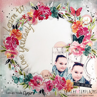
With navigating my way through what life throws at you, you sometimes forget the importance of taking time for yourself and to do what you love - and for me that is scrapbooking. So I set aside everything that has been going on around me, cleared my desk and just scrapbooked for the evening. It was everything I remembered it to be!

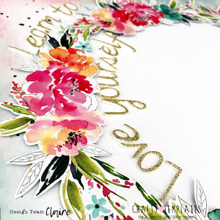
Since I was indulging myself in a little "me" time I thought I would scrap some photographs of me too!! I knew when I saw the Cocoa Vanilla papers and ephemera in this kit, I had to use these right away to create a layout. The floral wreath was always destined to be fussy cut. I managed to retain a small 1/2 inch frame from that paper to be able to use as a border on another project too!!

I was going to cut the wreath in half and use it in 2 sections but just couldn't bring myself to do it, so I kept it as it was and used it as a complete piece.

Before I stuck the wreath down, I grabbed some Heidi Swapp Colour Shine in Black and added some ink splatters, mainly on the outside of where the wreath would sit. The background paper I used was also Cocoa Vanilla and this was the "Sprinkles" paper. I would love to have used both sides of this paper as it was equally as great but I decided to use the B side as it looked like the edges were treated with mixed media already and it formed a natural background paper for my wreath to sit upon.

I added some foam behind my wreath to give it some dimension and shadows. I then added in 2 photos of myself. They are slightly different but very similar and I like this technique where you have 2 photos and cannot decide on which one to use.....just use both!  I didn't back these at all, just added a little bit of foam behind them to make them the same height as the wreath.

I thought long and hard about my title. Originally it was going to be Love Yourself but found that adding in Learn To made the title seem more complete.

I added some final flourishes but including more florals from the Cocoa Vanilla die cut pack and a few circle stickers from the Pink Fresh Studios stickers (love these stickers and they co-ordinate really well too).

And my layout is finished.

This kit has really spurred me into getting scrapping again and I am already planning my 3rd, 4th and 5th layouts with it.

Thanks for sticking around and I'll see you again really soon with some more inspiration!!

Love This

Hi Leo here!

I've delved into the new kits again and created a new layout to share. As soon as I saw the new Cocoa Vanilla goodies it inspired me to get out my watercolour paints so that was my starting point for this layout.

I began by painting some scraps of white cardstock in watercolour paint colours I'd mixed to match the colours in the Cocoa Vanilla die cuts.


When those were dry I used the smaller half of the butterfly cut file from the main kit to add the pieces behind. I added glue to the back of the cut file, glued on pieces of the watercoloured card then left them to dry before cutting off the excess from around the outside.


The finished piece I then added over the top of the Cocoa Vanilla 'So Fresh' paper from the main kit. I'd previously trimmed this paper sheet down a little on the edges and glued it to a sheet of navy blue card, (this was part of an older Quirky Kit but I don't remember which one! I'm on a mission to use up some of my coloured card that's long been neglected!). I used some 3D foam pads at the lower half of the cut file and glued the top 3 butterflies down flat as this is the area I wanted to add my photograph.


I fixed my photo to the layout used a line of 3D foam pads down the centre top to bottom. This allowed me to then add other embellishments tucked underneath:


I used a mix of the both the Cocoa Vanilla Happiness die cuts from the main kit. This tassel one I added some thread to to give it an extra flourish. I punched a hole in the top and tied the thread through then fixed the ends down with a 3D foam pad behind the cut file butterfly.


As well as the die cuts I also added some of the Pinkfresh stickers from the main kit again creating a layering effect by tucking them under and also adding die cuts over the top.


As a last touch I added to the splashes already on the paper by embellishing them with sequins, (these are from the embellishment kit). I ran out of Glossy Accents recently that I usually use for adding sequins and after a tidy up found my old Nuvo drops, (again also from an old Quirky Kit!) and decided to try out gluing sequins down with them as it seemed similar to using Glossy Accents and it works brilliantly. I think it actually holds them on stronger! The orange colour worked well with my layout too so I also added some drops of the Nuvo on their own.


Finally I decided the inside of the wreath looked a little plain so I echoed the splashes on the paper and added more splashes of watercolour paint in similar colours. I used my paint brush to dip it in the paint then water then flicked the brush with my fingers to make the splashes. If I was going to create this layout again this is something I'd do before adding the photo though so if you are going to get splashy do it as a first step. I was really weary of getting it one my photo!


Hope this has given you some ideas to get diving into your kit!
xx Leo


New Kit Weekly Challenges! Week One of Shape Up

Hi Leo here, happy new kit time!

Here are the details for the first of the new weekly challenges. The new challenge is called:

Shape Up

For this new set of challenges you'll be tasked each week with creating a layout or other papercraft project based around a particular shape.

How it works:
I'll post a new challenge up every week over the next four weeks, (this being the first). Each new challenge will be posted here on the blog and also in the Facebook Group for you to follow along with.
Complete all the Shape Up weekly challenges to be eligible for an extra goody in your next kit box! The closing date to complete all four of your Shape Up challenge projects will be 22nd May 2019. All projects must be new projects made specifically for this challenge. You can use any stash you choose but it's a great opportunity to dig into your kit box and not leave it unused! 

Ready to see the first challenge?
For your first Shape Up challenge you'll need to create a page/project based on the shape: Half Heart. 
If you need a template to use there's one to download and print here: http://www.craftytemplates.co.uk/HalfHeartTemplate.pdf
If you can't print a template you can draw out one on paper very simply.
To get you kick started with an idea of how to use a half heart shape I've detailed one below using the template size half heart. How you create your project though is totally up to you.


 To begin with I sketched around the half heart on to the patterned paper.
Next I cut around the heart edge but left the straight edge uncut and instead scored along it.
Finally I folded over the heart to create the shape. 
For the finished layout I added paper behind the cut out half of the heart and painted the folded over part. I then painted more on a white card background and trimmed down the patterned paper before adding it over the top. I then added die cuts tucked inside the half heart shape.

Ready to have a play yourself?

Once you've finished your creation upload it to your platform of choice.
For Instagram tag @craftytemplates and mention it's for the Shape Up Quirky Kit challenge so I can find it.
For Facebook add it to the Quirky Kits Group - they'll be a post for each new challenge there to share it to or else mention it's for the Shape Up challenge when you post it so I can find it.
For blog add a link to your project from your blog in the comments below any of the Shape Up challenge posts, (like this one).
Or if you'd prefer to keep your project private you can email them directly to Leonora@craftytemplates.com

Have fun!
xx Leo