We Found a Waterfall | ScrappyNerdUK (Claire) | March/April 2017

I'm back again with another layout. I was inspired to make a big title layout with the Jillibean Soup Bowl of Dreams Die Cut Alphabet Set.

So I started with some white cardstock (pretty usual for me) and selected my photo. I chose a selfie my husband took when we were on holiday in Wales last year when we went on a trek (I nearly didn't make it!!) to go and find a waterfall. 
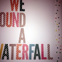


So I had to decide where I wanted to place my giant title. I knew I wanted it to the left of the page and the photograph to the right.

I trialled my title in a couple of positions before committing to it and sticking it down. I lined my title up so it was parallel to the left edge of the cardstock.


I then also lined it up so the title was parallel to where the photo would be placed and I found that I liked this placement much more.

I committed to this placement and got it stuck down but some tacky glue.

It left too much of a white space to the right so I grabbed the Wish paper from Pink Fresh Studios from the Main Kit and placed a strip of this down the right of the page. I loved the symbolism of this paper as it reminded me of a waterfall with those falling triangles. 


I then moved onto my paper layers. The colours in this kit really speak to me and I love that there are a lot of colours to work with. This helps with having lots of options when embellishing. 

So I grabbed my papers and started cutting rectangles from Jillibean Soup, Bowl of Dreams, Think with Purpose paper (both sides) and Jillibean Soup, Bowl of Dreams, Make Magic. I then tore some of the edges to give it a little bit of interest and stuck all of my layers together.

You'll notice that I try and make sure I have the same colours on both sides of the photo so where I have the paper with the crosses on to the left of the photo, I have also mirrored this over to the right to balance it.


Then onto the embellishing. So I decided to create almost a waterfall of embellishments down the right side of the photo. So I used the Elle's Studio Live Laugh Love Bits and Pieces Die Cut Shapes packed and placed a label banner and a date die cut above the photo. These colours matched in perfectly with the browns in the alphas to the left.

Then I continued to the bottom of the photo with another label tab, a camera from the Jillibean Soup Pea Pod Parts Die Cut Set from the Lite Kit and a sticker from the Jillibean Soup Bowl of Dreams alphabet and embellishment sticker sheet, also from the Lite Kit.


I felt it was a little imbalanced so added a small strip of the paper from the right to the left, used some arrows from the Jillibean Soup Pea Pod Parts Die Cut Set, a few tiny word stickers from the Jillibean Soup Bowl of Dreams alphabet and embellishment sticker sheet and finally a rubber camera from Pinkfresh Studio Dream On, Rubber Chips embellishments from the Embellishment Kit.

I love how this layout turned out. So colourful. No need for journalling as the title tells the story.
I hope this inspires you to try a layout with a big title.

Until next time.....

Explore | ScrappyNerdUK (Claire) | March/April 2017

Hello Friends.

I'm here with my latest layout using March/April 2017 kit and I really wanted to inspire you to use the fabulous custom cards to make a layout. I love project life to document my every day life and if you're anything like me then you'll swoon over pretty journalling and filler cards.

If you think that the these cards are purely for pocket pages then you are mistaken and seriously missing a trick. My challenge to you is to use these cards in your other scrapbooking formats, traditional 12x12 layouts, 9x12 layouts (or A4 if that's your preference), Smashbooks, Travellers Notebooks and so on. These cards (custom cards from Quirky Kits) are so versatile and I'll show you how.

I chose to make a 9x12 layout using only (well 99%) custom cards and this will make your kit stretch so much further.


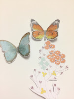
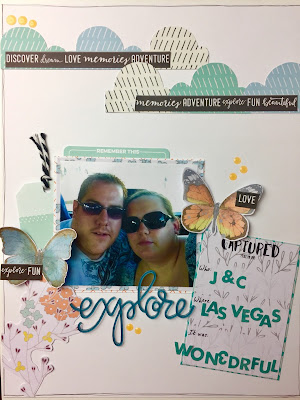
I started with a white piece of cardstock and I knew straight away that I was going to create my embellishments from the custom cards. So I went through these cards and found there were 2 cards with butterflies and another with a beautiful floral print.

This gave me the inspiration to make a start. I fussy cut the butterflies and the floral out of the custom cards and already I had 3 pieces of "ephemera" to use.


I knew that this wasn't going to be enough to embellish my page with (and that is completely my style to add all the things!!!!). So I found there was a 4x6 card that had these clouds (photo to the right) and "weather report" written on it. I set to work by fussy cutting those flowers to add to my page.

I was loving where this layout was taking me. As the cards are all colour co-ordinating, you do not need to worry about getting your embellishments to match, as its already done for you!!

Next I decided on the photo. I know a lot of people start with the photo. I like to be the odd ball and make a start on my layout and then find a photo that will work (I have hundreds of photos printed so I have a lot to choose from). I then used another of the 4x6 cards to layer behind my photo, with an added velum layer in-between. (velum from my stash - if you don't own velum then you need to go and buy some!! Its great for layering and it can also tone down those loud papers)


Next I used the journalling card that had the "captured" title and this was a perfect space to add my journalling. I'm not one to add much journalling (if any) to my layouts and so I used this space and some tiny alpha stickers (from the lite kit) and filled in these details with minimal information.

If I had a bigger story to tell then there is plenty of space to write on this card. I did cut this journalling card down slightly and backed it with another co-ordinating 3x4 card to make it pop off the white background.

I used the acrylic word "Explore" for my title and set to just getting my embellishments stuck down. No procrastinating!!!! I used the branding strip from one of the 12x12 papers to layer over the clouds to bring some of the black tones up to the top of the layout. This also created some interest at the top.


And here is the finished layout. I used a couple of the words from the branding strip to layer over the butterflies also. I then used a tag from the Elle's Studio Die Cut Pack from the Main kit and added a bit of black and white twine. Its not a tag without twine! I also added the "remember this tag" above the photo to bring some of the green colour down into the photo layers.

Then all finished off with those AMAZING Nuvo Jewel Drops.

So, I used a total of 7 custom cards, 1 branding strip, a tag, a label die cut, a tiny bit of twine, an acrylic word for my title, a few small alphas for the journalling and a small amount of Jewel drops.

I'm not one to toot my own horn, but I LOVE how this layout turned out and I would say that it really challenged me - but it didn't. Once I looked at the card individually, I could see straight away that there were lots of inspiration on all of them.


REMEMBER - My challenge to you is to grab your custom cards and make at least 1 layout with it. Whether you scrap traditionally or TN's or even if you scrap in Project Life format - grab those cards and do something different with them.

Don't forget to upload these to the Crafty Templates Facebook Group!!

Keep your eyes peeled for more layouts using the custom cards.

See you all next time!!

Claire

Laugh and live colourfully with friends

Hello everyone,

Now continue with the project I shared with you in the previous post, especially the first best friends story. I'm coming back with new layouts again. But you might have noticed that I didn't use this months' kit in the previous layouts. Although in today's post I have used it plenty, and also I used the monthly inspiration booklet we receive with our monthly kits. I loved to use it as a basis for these layouts as I had a creative block due to unusual size - 8x8.


The main colour inspiration of these layouts actually comes from the Jillibean Soup embellishments pack, as I think those word phrases worked amazingly as a title of these pages. Besides, the picture matched quite well, as the main idea of both pictures is the fun times my sister had with her best friends at various overnight trips they had. As you can see the main colour scheme I chose was orange and mint/blue with white through both of the pages in order to calm the brightness of the papers and heaviness of the black background. 

About the first layout, I started it by drawing in pencil the placement of the papers, then by using the paper corner and one side of the straight paper, which mean that I needed only to cut one side and shorten it. To finish all of it, just added a label and few embellishments.

The second layout is even more straightforward, just cut out 5 rectangular pieces of paper, backed the picture with black&white paper to lessen the impact the bright colours have on the picture. As the picture needs to stand out, I added again label to tell a story and two hearts, the one works as a title.


I hope you enjoyed this post and talk to you soon, Agnese.

Beach camping memories

Hello everyone,

I have loved this month's kit, and also I have finally started to work on one of my wishlist projects - sister's album. It has kept me so occupied that I haven't done anything regarding posting and sharing these layouts with you. So today I decided enough is enough and I need to share this with you as it might inspire you and also you might have suggestions for me. As this is a very different style of project, usually I do either 12x12 project life and 12x12 traditional layouts, but my sister wanted a smaller, less expensive and quite simpler in design album. After some research I finally decided to use Hobbycraft 8x8 black album, which cost only around £3, so a total bargain in her and my book. Of course, this size of album caused few challenges, the size and quality of pictures, also more pressure not over to embellish, as the smaller size can faster become too busy.

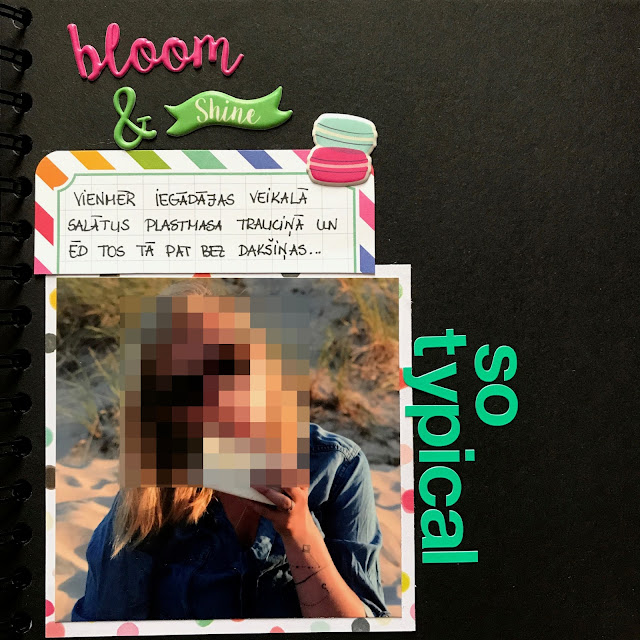
But in any case, this is how far I have gotten at the moment, but first, let me give you an idea of the project itself. My sister's album would consist of three parts - her two best friends story's and then final part is her favourite pictures which represent important memories. Today I will start sharing with her first friends part, but you should keep note that I have blurred faces on these pictures and also notes of the pictures are written in my native language - Latvian, but you can see the rest of picture and layout. :)


The first page is the beginning of this friends' section when you open the album, then next two pages can be seen underneath, and for that reason, there is a common underlying tone - green. Most of the things I have used are either from my stash or previous months' kit, and I tried to use up these puffy stickers. The first picture showed the memory when my sister with her friends had a velo (Bicycle) trip which also included camping on the beach, and the next picture shows that my sister typically can eat salad even without a fork on the beach. :) She is quite active and loves outdoors, both of us have spent most of childhood around beach, see and various outdoor activities.


I hope you enjoyed it and watch out tomorrow for the next layouts from this project. Talk to you soon, Agnese.


Hello everyone!
I'm back with my second layout using the Mar/Apr kit. 

This photo is me at my college's summer ball last year, which had "Biophilia" as the theme, with "humans becoming animals, and buildings coming alive". There were beautiful illuminations of animal prints, eagles, unicorns and butterflies on this building all night. I thought the bright pink, yellow and greens in the windows matched the florals perfectly.

For this layout I started off with the gorgeous Bella Blvd Make Your Mark "Magnifique" paper which is the beautiful big florals! However I thought the paper by itself was too busy for a background, and I didn't want to cut it into smaller sections, so I decided to fussy cut out all of the flowers.
I laid these on to this beautiful blue background, which was a B side of one of the Jillibean Soup papers. Because I didn't use the central flower which I cut out, this left enough "white space" on the page for me to add my photo and title. 

I used foam pads under the leaves and some of the flowers to add dimension to the layout.


I used the beautiful vellum butterflies again, and copied the idea of using the Nuvo Jewel Drops to decorate them, from Alice and Lythan! 


For my title I used the explore acrylic piece from Freckled Fawn, and then a plain white alpha from my stash. 

I made an embellishment cluster at the bottom of the photo with pieces from the beautiful Elle's Studio "Live, Laugh, Love" Bits and Pieces pack! And a floral and an arrow from my stash. I had to use foam pads to lift the cluster up to the same level as my photo.


As well as the small amount of text in the embellishment cluster, I also added some hidden journalling. This is a really good way to include journalling you don't want everyone who looks at your scrapbooks to read. However on this layout I added it simply because there wasn't room on the rest of the layout! I added foam pads behind my photo, but left room for the tag to slide in and out. The tag is also from the Elle's Studio ephemera pack, which was in the Main Kit. 


I hope you like this layout, and it gives you some ideas of how to use the floral paper without it overpowering the layout! I had a lot of fun making it!

Natalie xx

Hello everyone! 
I hope you have been enjoying using your March/ April Quirky Kit.
The current main kit is called "Rainforest" and is inspired by watercolour patterns and spring. 
So when thinking about what photos to use I decided to go back to some photos I took in 2014 up a mountain in China. This photo is of a column of a pavilion juxtaposed against the forest behind.


I knew I wanted to keep the layout colours as black, white and green to match the photo. 
The background paper is "Wish" from Pinkfresh Studio's collection "Dream On", and was in the main kit. I love having a patterned paper as my background and this paper is beautiful but subtle enough to work as a background.
I then backed my photo using the B side of Elle's Studio "Woodgrain" paper, which is beautiful black drawn hearts. And then the beautiful green succulents paper from Kaisercraft.

For my journalling I used one of the cards from the custom cards kit but covered the motif in the bottom right with these beautiful succulents which I fussy cut out from the flip cards in the main kit. 


For my title I used an ephemera piece from my stash and the Elle's studio mint alphabet from the embellishment kit, to write out the name of the town. I used one of the Freckled Fawn label stickers from the custom card kit to put my date on. And added a matching mint enamel heart which was from the Extras shop, and a small wooden heart from my stash. Putting the hearts here stopped me from having "trapped white space" between the title and the label. 


I really like diagonal designs so in the top right and bottom left corners I sprayed Heidi Swapp Colour Shine in "Seafoam", which matches the mint colours in the kit perfectly. 
And added some of the beautiful vellum butterflies from the embellishment kit, which I absolutely love! This is my third layout in a row using them, they are just the perfect addition! 


I hope you like my layout, it's very soft and simple but I love it.
 I'll be back soon with my second layout using this beautiful kit!
Happy scrapping!

Natalie xx

Sweet Dream | ScrappyNerdUK (Claire) | March/April 2017

Hiya friends. Claire from ScrappyNerdUK here and I am pleased to be sharing with you a layout I have made using the March/April kit.

I love to work on white cardstock and use patterned paper as the embellishment so I cut a 3 inch strip and adhered this to the left of the page.

I then cut a strip of the script paper and slotted this just underneath the strip of heart paper. I then used 3 different stitches using my sewing machine to firstly create a bit of interest but also to help keep the paper stuck securely to the cardstock. I love how using different stitches can create some interest. If you don't have a sewing machine then you could try pricking holes in your paper and hand stitching. You could even try some faux stitching with a black pen and creating dash's instead.


 I then created 3 small embellishment clusters using the Jillibean Soup ephemera pack and I loved the colours in these diecuts. I used a mixture of flowers and feathers in both the bottom left cluster and the top right cluster. This was finished off with a little rubber charm from PinkFresh Studio (from the embellishment kit).

I then used the tiny word sticker from the Jillibean Soup sticker sheet (featured in the lite kit) and I also pulled one of my favourite things to use from my stash and these feature on most of my layouts, a tiny word sticker from Tim Holtz.


I then worked on the top cluster by adding in the same flowers and feathers and finished this off with a rubber charm from the same PinkFresh Studio pack and another tiny word sticker from Jillibean Soup. I wanted this top cluster to look different to the bottom one so I added in a tab and secured that to the top of the photo where the cluster was and again one of my faithful Tim Holtz phrase stickers was used to complete this little cluster.

When I look back at these clusters now, I can see that the Nuvo crystal drops would be a perfect addition so I think I might go back and add these in too. That is the great thing about looking back at your layouts, especially photographs of them. You can often find further inspiration for what else it might need that you maybe didn't notice at the time.

The bottom right cluster was where I decided to locate my title. I used the dreamcatcher die cut from the Jillibean soup pack ( I love love love this diecut) and started to layer over a few pieces of ephemera. I added the word dream to form part of my title and used a label from Elle's Studio Die Cut pack, along with the diecut that says "I love you". I added in a small row of hearts from the Jillibean Soup sticker sheet and finished it all off with using the small green alphas from the same sticker sheet to spell out "sweet" to complete my title.


I then drew around the 3 sides of my layout where there was no patterned paper to create some interest. When working with white cardstock, your eyes can almost wonder of the edge of the page and so a black border around these areas really help to train the eye into the focus, which is the photograph. I even added some hand drawn hearts along the border.


And this is the final result. Very simple, clean and understated but I love how this one turned out. I don't journal often on my layouts but there is plenty of room left to add your journalling if you wish. 

Maybe try adding in some ink splatters if you prefer a less "polished white" look. 

I hope this brings you inspiration for using your kit and I have many more lined up to share with you shortly.

Until next time..... x

What its all about

I love paper. I love embellishments. I love pairing them together with photos. But what I like best is capturing memories and this is what I did here
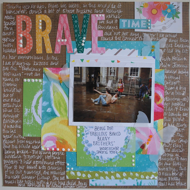
 I was a bit naughty with this one and used the original photo (gasp!) but it did mean that I scrapped it rather than putting it back in the album it fell out of. I don't remember the exact date but I do remember the fear I felt doing this street theatre in the middle of Worcester.
I had run out of full sheets of paper so went hunting for something. I found some old Bazzill papers that echoed the ground that the two Baked Beany Brothers are rolling on. 

And that gorgeous flowery paper looked a bit like the top I was wearing (to be honest it is much nicer! I bought that top for my 21st birthday party - what was I thinking? I know it was the 80s but still...) which is what started me off on creating the page really

I chopped up various papers that toned and slipped in and cropped some of the die cuts and cut apart pages. I added the title. (I adore those big letters) and then I started writing and wrote and wrote all about the feelings and the memories and the whole thing about being a group of young people working together. Two of us are married 30 years on, one is a grandmother, one has died, one I've lost touch with. So, so much comes out of one picture. Would I remember it all if I hadn't scrapped it? Maybe, but I'm not convinced.


And it is the kit and those wonderful butterflies skimming through time again, that have helped me capture these memoties. If I hadn't been struck at the patterns of top and paper I would probably not have this story of moments and months of being brave.


(As well as the background paper I did also add in some white enamel accents) 

BBQ In The Summer

Did anyone participate in all the iNSD fun on Saturday? I was busy all that day but I've been looking through to see if any challenges inspire me. This one was to use a big title, although it wasn't too much of a challenge because big titles are one of my favourite looks! Harder was my self imposed challenge to use a very orange based colour scheme and I'm really happy with how it turned out, plenty of white made it somewhat less daunting. 
 My big title is cut out of pattern papers from the kit, the easiest way I know to make the alphabet match the layout. This layout also has a fairly large photo so there wasn't too much left to do.
 I stitched on some coordinating embellies. My stapler wasn't quite strong enough for this rubber shape and I don't have appropriate glue, luckily stitches look really cute.
 I did a small cluster on my photo trying not to cover my brother's face too much. I've said it before and I'll say it again: I LOVE these vellum butterflies. I trimmed around the cut apart labels to make them more subtle.
I added a final cluster at the top of my layout, repeating the papers in my title so I wasn't adding anything drastically new to the page. Thanks for reading, if you want some inspiration Leo linked up loads of stuff on the Quirky Kits facebook group over the weekend.

My new superpower

I have been able to read backwards and upside down for a long time. I try to keep that secret because it means people leave things out for me to read backwards and upside down! But I have just discovered that I can also write backwards which proved very useful for the next sketch challenge layout
 I used the sketch that was all about squares. My photos are a little closer together and the squares a little bigger than on the sketch but really mostly stuck too it. (Those sketches just make scrapping a breeze)

I decided that I wanted a big title but not with the big letters. I remembered that Kirsty Smith does wonderful hand lettered titles  and thought I would give it a go. But then was too lazy to work out how to print backwards on cardstock so wondered if I could write backwards in cursive
Yes, is the reply. The backwards green is not as pretty as the forwards orange but it was close enough. So I wrote on the back and played about until the letters were thick enough to cut out. I was going to cut out the middles and be delicate and pretty but... lazy remember? And I quite like them as they are.
I did then need to outline the letters. The trick to getting the letters right so that the unders and overs work is this
start at the end and go backwards
basically writing backwards again! So I went from the bottom tip of the "s" back to the "c" in cliffs. The letters were mounted on foam pads cut small and added to the papers.
I cut some 1cm paper strips and got writing.
then it was just a few finishing touches and job done


Simple but effective

I love the shattered glass effect suggested by Leo this month.
I am rubbish at putting it together. It may look fine, but despite carefully measuring and muttering, none of the pieces are where I planned for them to go. Still, it doesn't matter in the long run!

 I chose the papers that I thought went best with the sliver, blue and yellow of the photos. I also picked out a square and a cut apart card to go on the layout. After giving everything an outline with black pen (I do like a defined edge when using lots of patterns) I basically slavishly followed Leo's sketch (well as much as badly measured papers will allow!) I rooted through the die cuts to find suitable tags and also added in some of the gorgeous watercolour tags. 


The sun was given a little bit of shine with wink of Stella pen 
I wrote my journalling 
and added the title (cut with die cut letters) Its not a spelling mistake but a pun on God's risen Son at sunrise.
Then added the butterflies. They do have amazing symbolism - on a recent page they were about change, here they represent new life, sometimes I just add them to look pretty! I glued them down with Tombow glue and hid that with the Nuvo drops